KSYOS
KSYOS is the largest digital healthcare institution in the Netherlands. They offer specialist medical care to 1,500 patients every day through teleconsultation. Close to home and without waiting time, with the aim of making healthcare smarter, better and more human. We gave KSYOS a new visual identity and a new website.
Working on your health
Ksyos has grown from a lone idealist into an enthusiastic company that makes impersonal care personal. That treats its patients like people and gives them the freedom to work on their health in their own homes. After all, your health should be up to you. It can be that easy. So why make it difficult?
Non-medical look
This philosophy is the starting point for the Ksyos brand and identity. The logo stands for a holistic approach: the whole spectrum of consumer, patient, specialist and GP. In terms of main colours, we opted for warm pink and orange. Supported by a palette of bright colours. The use of colour exudes fun and gives the brand a non-medical look. The tone of voice fits in with the total concept: understandable, easy, quick to get to the point.
Photography concept
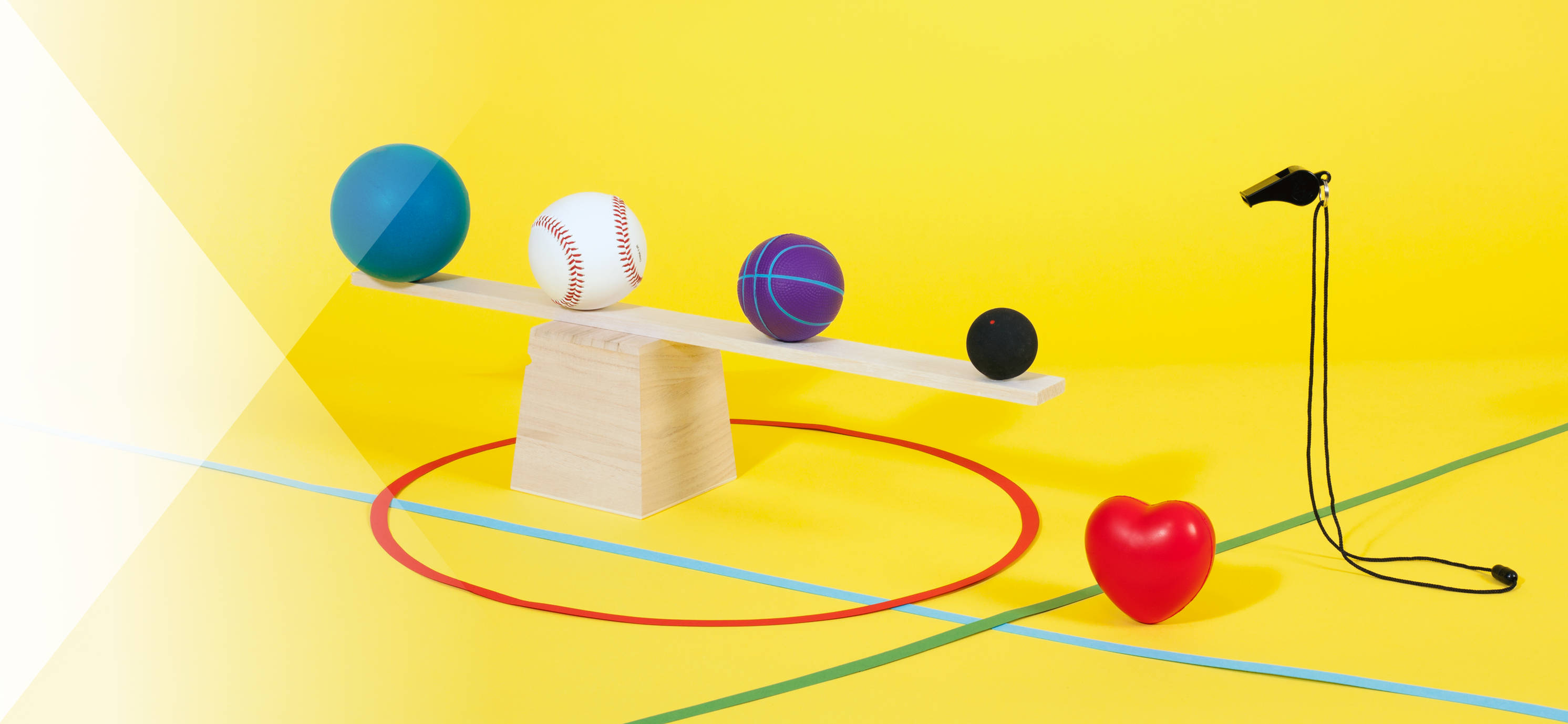
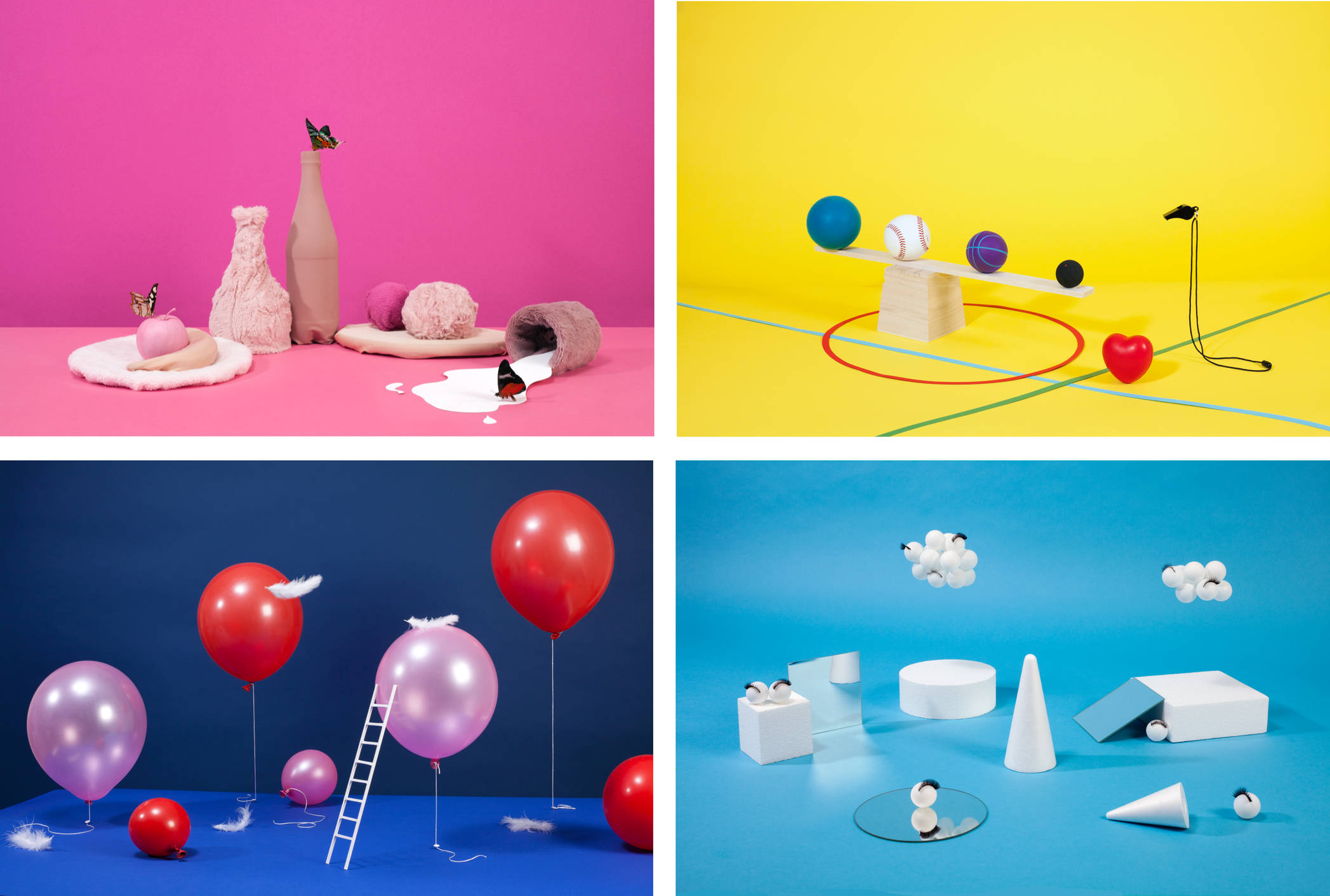
For the pictures we have chosen to photograph small scenes per speciality. The images tell the viewer something about the specialism, without showing the type of scene you would normally expect from a medical institution. The photography concept was to take pictures in which there are no people or medical contexts.
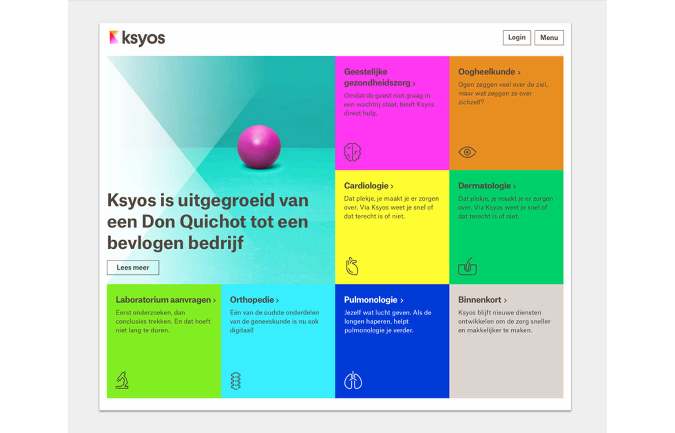
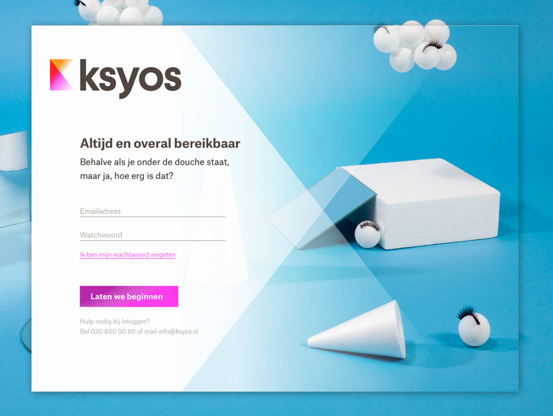
A colourful, cheerful website
Progressive and human(e), exactly what Ksyos stands for. Currently the site is still mainly aimed at general practitioners and specialists. Next year will see the leap to consumers.