Scottish Ballet
Artistically, Scottish Ballet (Scotland's national dance company) wants to improve, to experiment and to surpass any artistic boundary. But they also want to connect to a somewhat broader audience. Research proved that audiences had very little understanding of Scottish Ballet as a brand and where in need of a narrative.
Exceptional entertainment
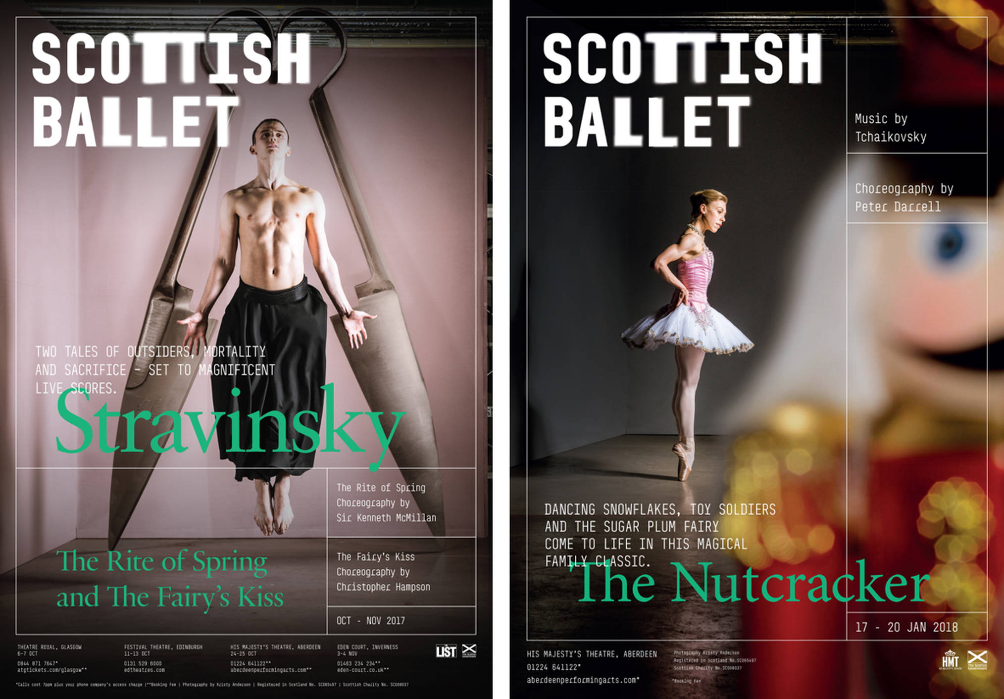
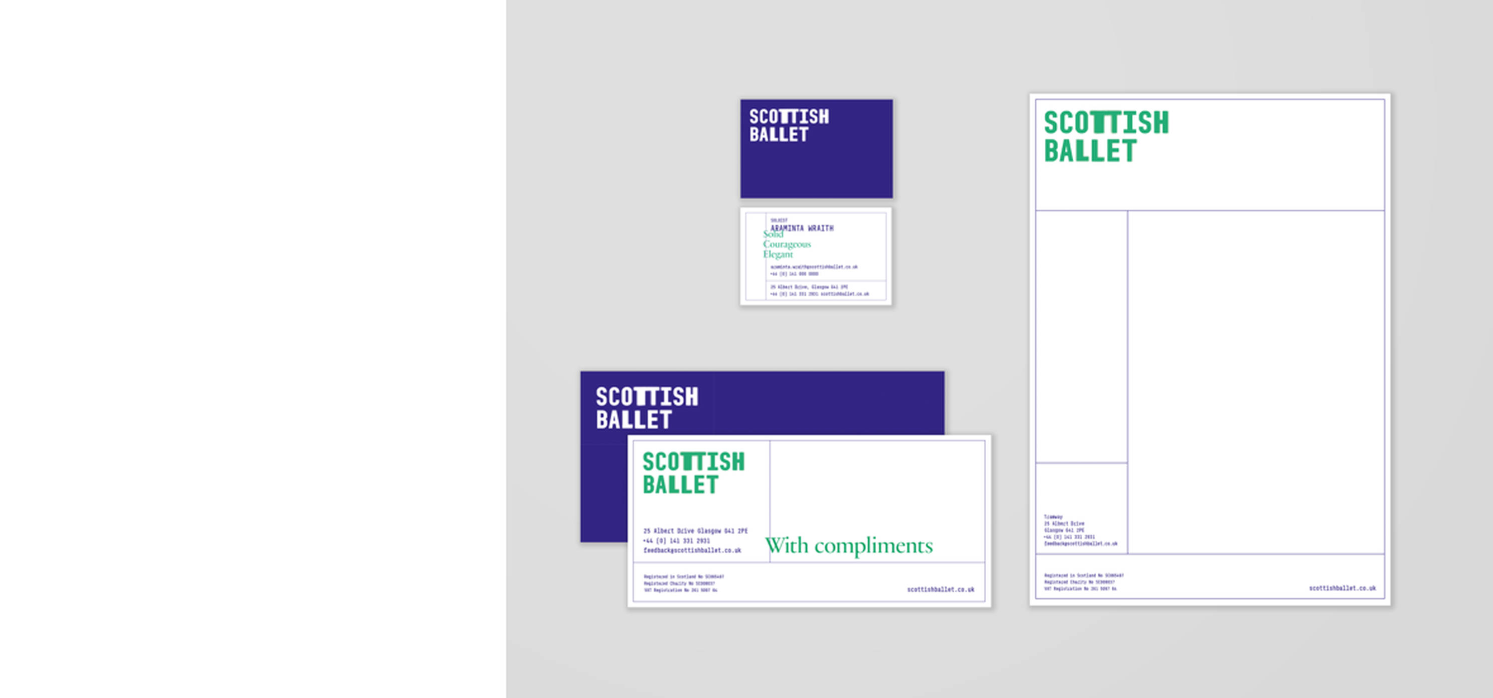
We defined a new brand essence - Exceptional Entertainment - to marry artistic excellence with the need to entertain audiences. The new logo conveys the movement and energy of dance as well as the light, fleeting moment of it all. To create recognition, the word mark is always used at a large size. In that way, we boost brand awareness and cross sell.
Flexible grid
At centre stage of the identity stands a dynamic grid that represents the stage and discipline of the ballet. This ‘flexible grid’ creates a consistent design language that provides a point of continuity across all means.
The brand distinguishes us from other ballet companies and reflects our personality while we try to communicate who we are; adventurous, lively and empathetic.
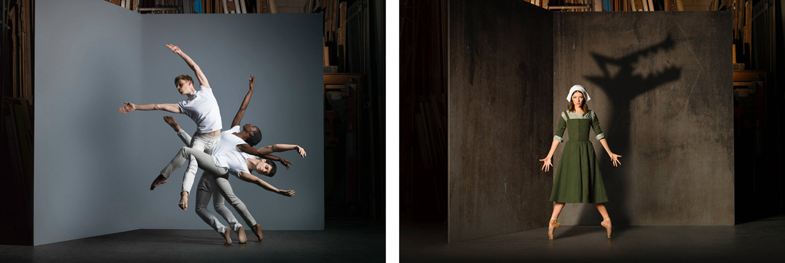
The posters always stage a prop and a dancer. Together they tell the story. A little bit over the top with a kind of weirdness, to trigger attention and interest.
A wide variety of means
Posters, booklets, animated logo’s, a sound logo and a redeveloped website. But above all a brand that reflects the personality of Scottish Ballet: adventurous, spirited and empathetic. Distinctive and recognizable but non-pretentious.
Together with
Research: Frankly, Green + Webb, logo animation and sound logo: RoboMG, DTP: Charlotte Nieuwland.