Always different, always Erasmus
We used the signature of Desiderius Erasmus as the starting point. We zoom in on the signature, as if we want to research it. This creates a fascinating form language, which everyone can use in their own way.
Inalienable and recognisable
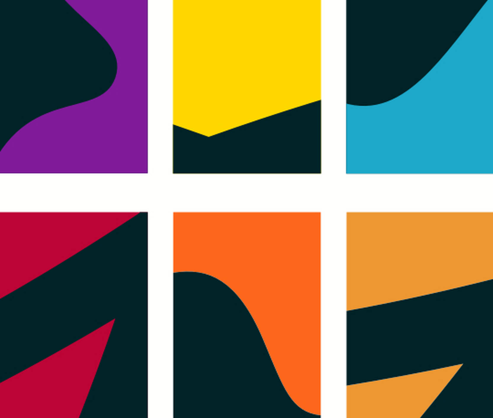
Each faculty or institute was given a unique form set. Its own spot colour, which contrasts with the overarching corporate dark green of Erasmus University. Together, the forms and colours realise an inalienable and recognisable picture.
Each discipline has its own form
Erasmus' hand runs like a thread through all means. Together with the various faculties and institutes, we have developed forms that suit their field. For example, in Law we looked for forms that are "decisive" and "balanced," in Economy, "progress" and "personal growth" were key principles.
Photography concept
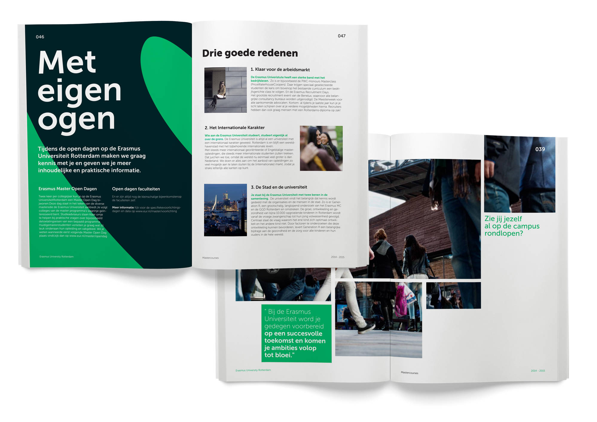
The photography shows confident people; sober and motivated. Just as we zoom in on the Erasmus signature, we are also literally on the skin of the portrayed while taking close-ups. People show guts and character by looking straight into the camera, with which the university sheds away the years of modesty for "ambitious thinkers and doers".
Typically Rotterdam, typically Erasmus
Rotterdam values such as sincere, honest, cheerful and genuine form the basis of the tone of voice. We added the "contrast" principle to this, because ambition and performance go hand in hand with a healthy dose of sobriety at Erasmus University.