Ghent University

Ghent University consists of many organizational units, which always communicate from their own identity. This led to a fragmented image. We developed a clear brand strategy and new visual identity. From website to business cards and meters high signing on buildings.
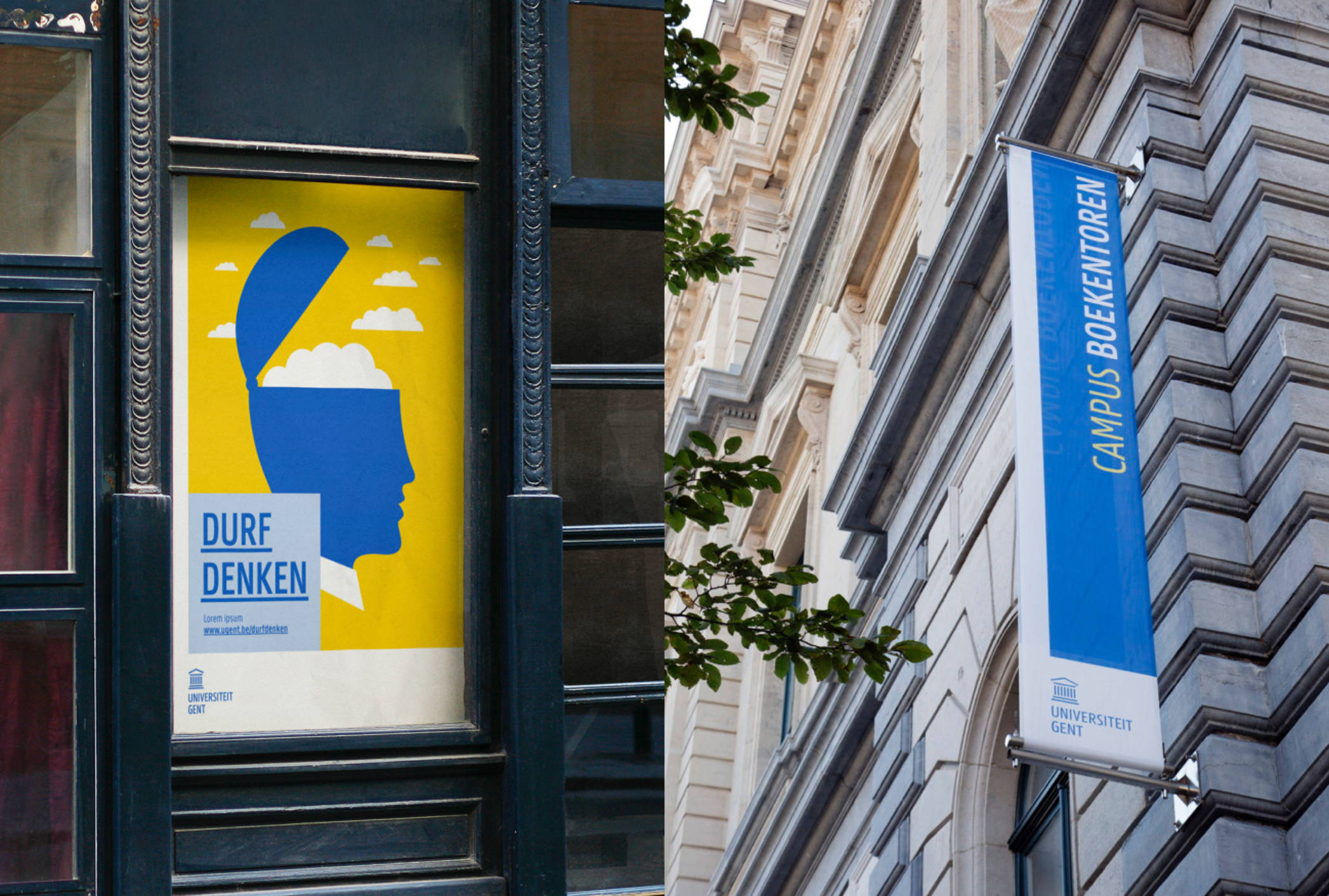
Dare to Think
Ghent University encourages students to think outside the box. We used their motto ‘Dare to Think’ as the starting point of the identity.
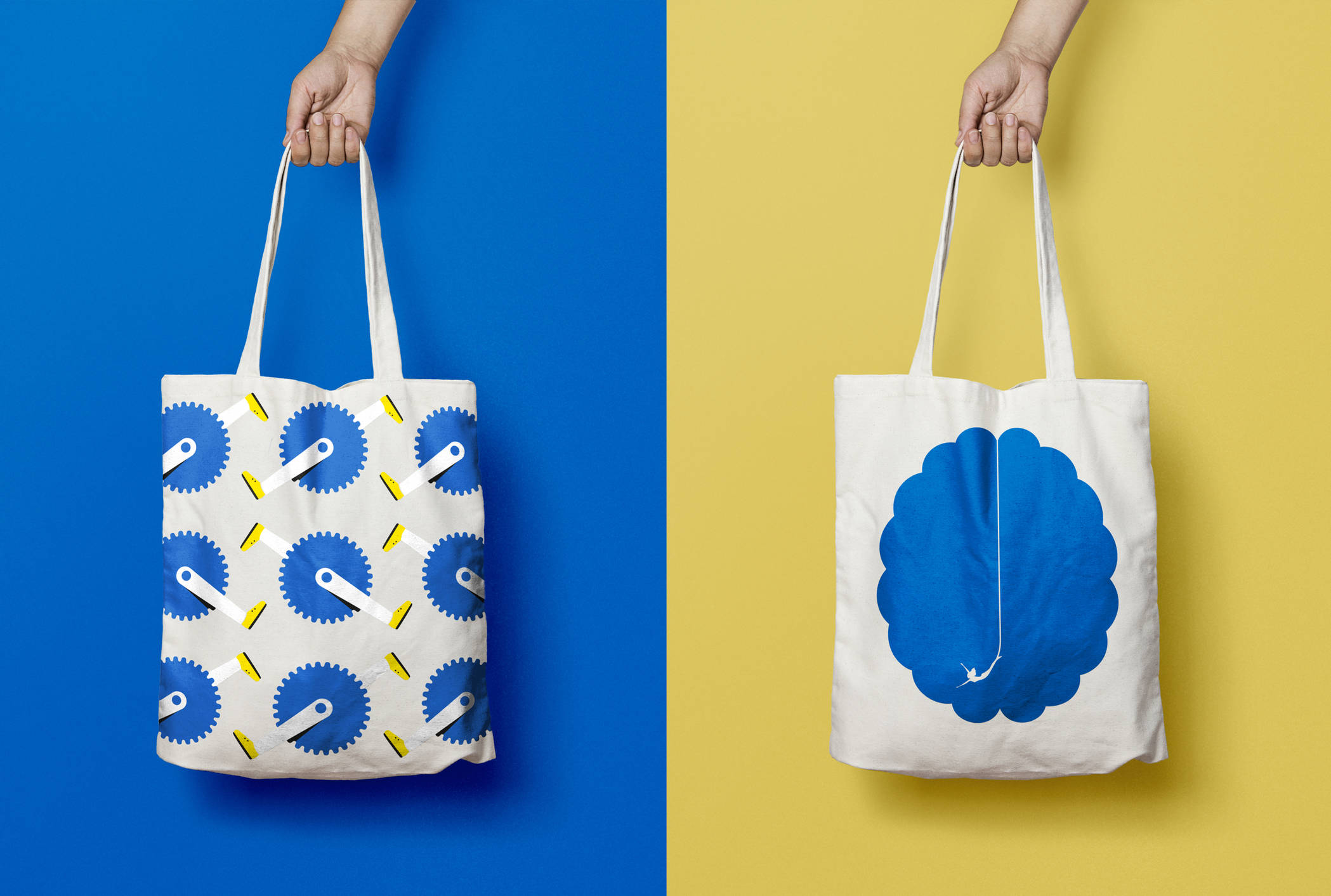
The characteristic illustrations of Noma Bar and Aad Goudappel challenge the mind and get the visitor thinking. Arjan Benning’s quirky photography stimulates the imagination.
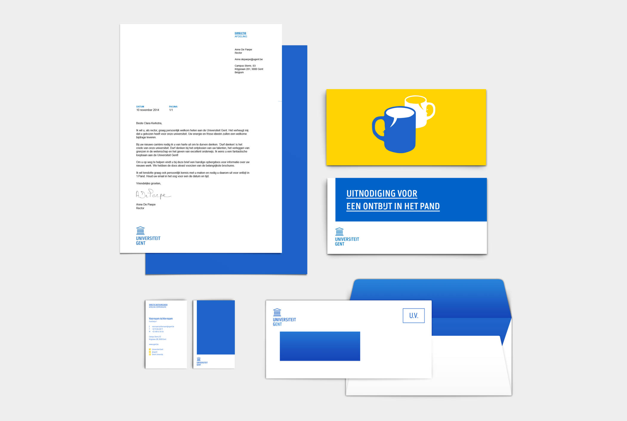
All means
We really included everything when it came to implementing the identity. Logo sets, fonts, banners, student cards, signage, stationery, business cards, website, social media, brochures, videos, merchandise, the welcome kit…even the trucks.

Each of the 11 faculties got their own icon and colour, whilst they clearly form one visual family. All other parts of the university communicate out of the mother brand.