Edinburgh International Festival
Every year, Edinburgh International Festival brings the best in theatre, opera, dance and music to Scotland. But there are also other festivals in the city at the same time. We wanted to know how we could still grab people’s attention.
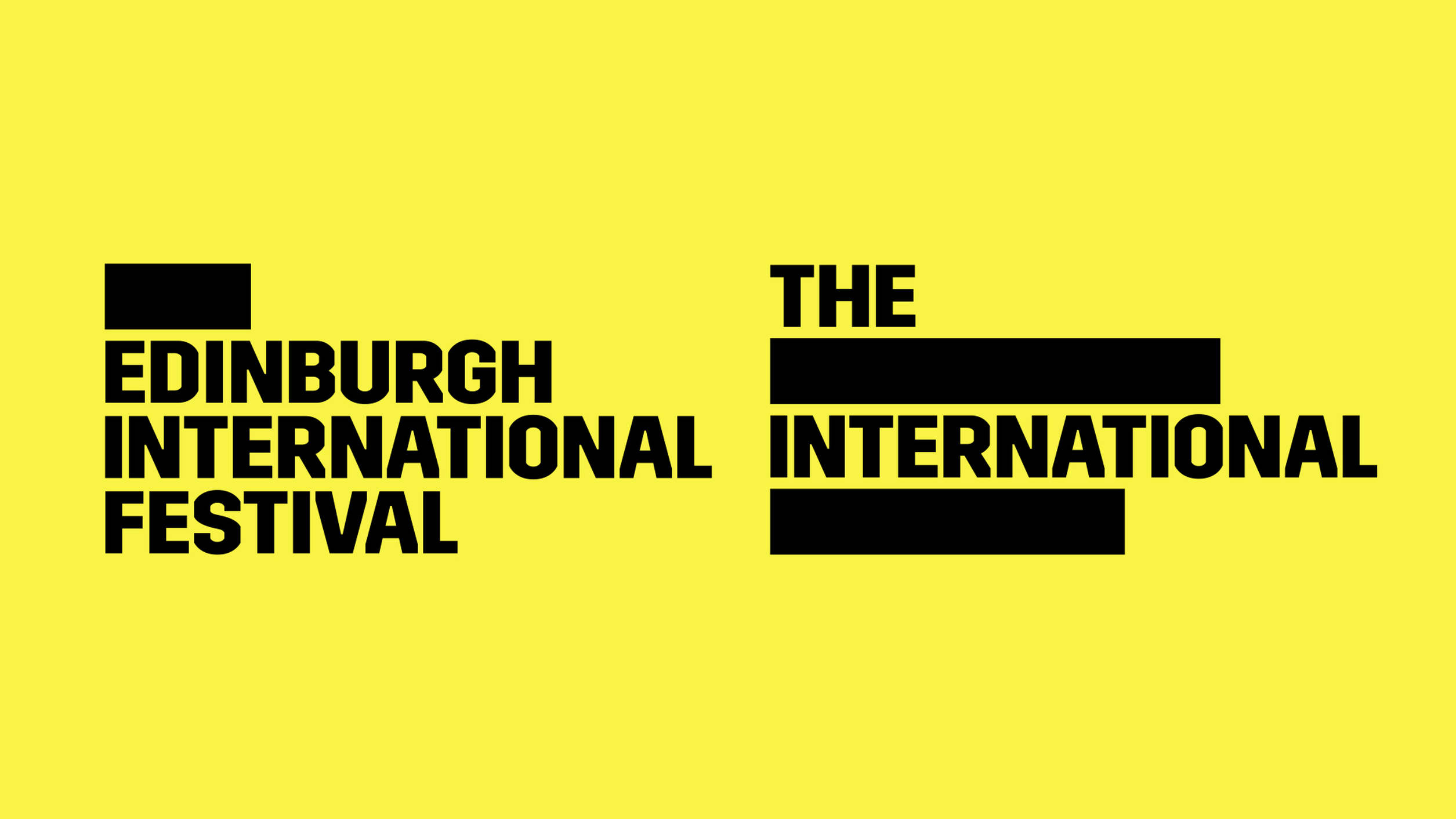
Curious yellow
Edinburgh International Festival was once the first, but became snowed under by other festivals. In strategic sessions with the organization we decided to let go of the modest, elitist look and to emphasize the festival’s vibrant character. Impulsive, short-lived, but always good quality.
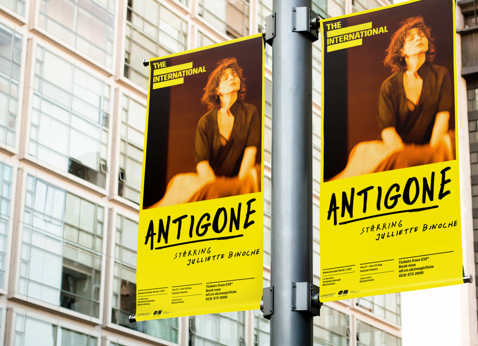
Handwritten font
We created a powerful identity that immediately stands out in the streetscape. A word brand with strong, black letters. Very yellow. And a handwritten font to contrast with the robust logo. Taken together the look is not posh, but accessible. That is exactly what we want to communicate: everyone is welcome.
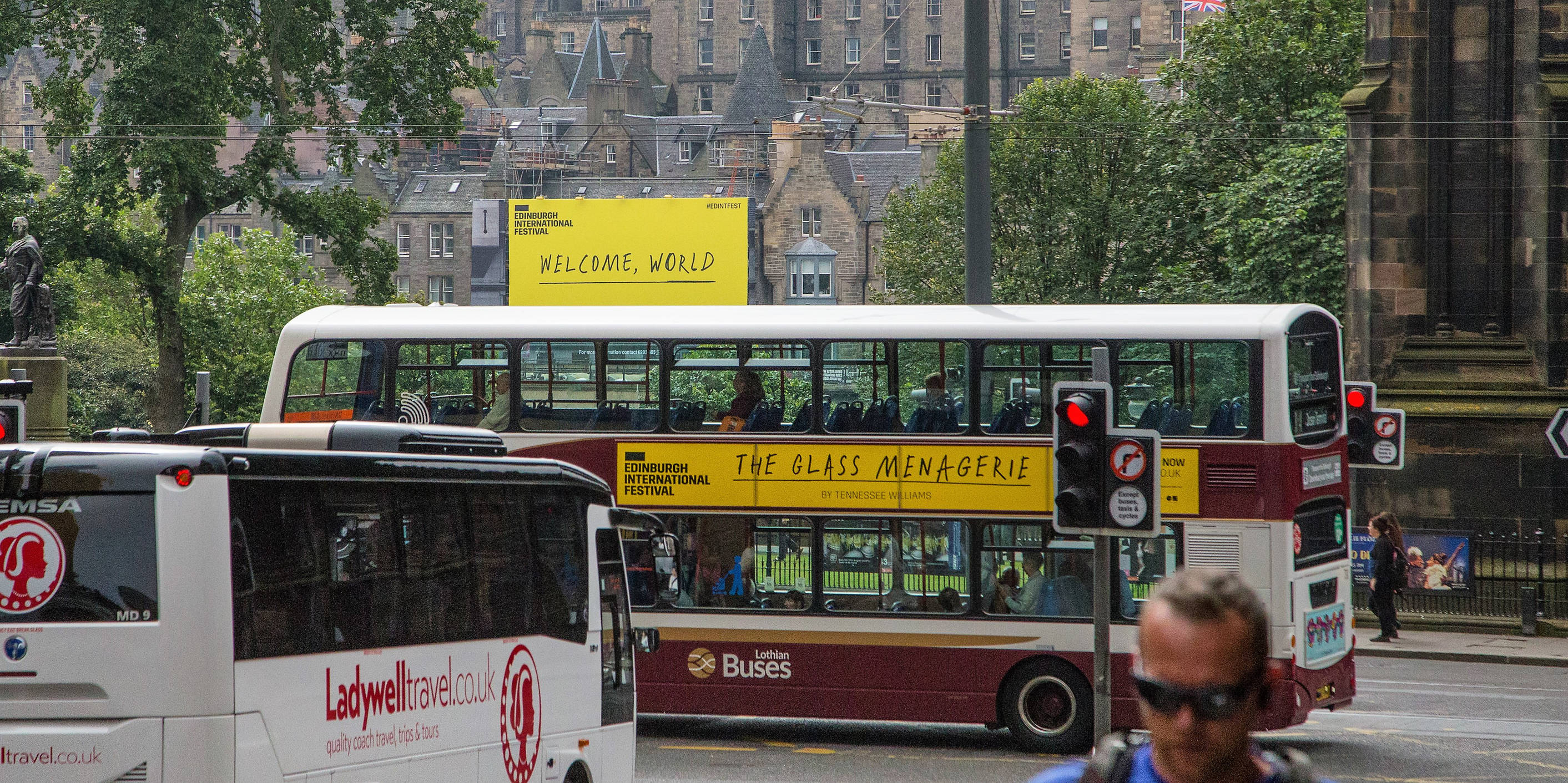
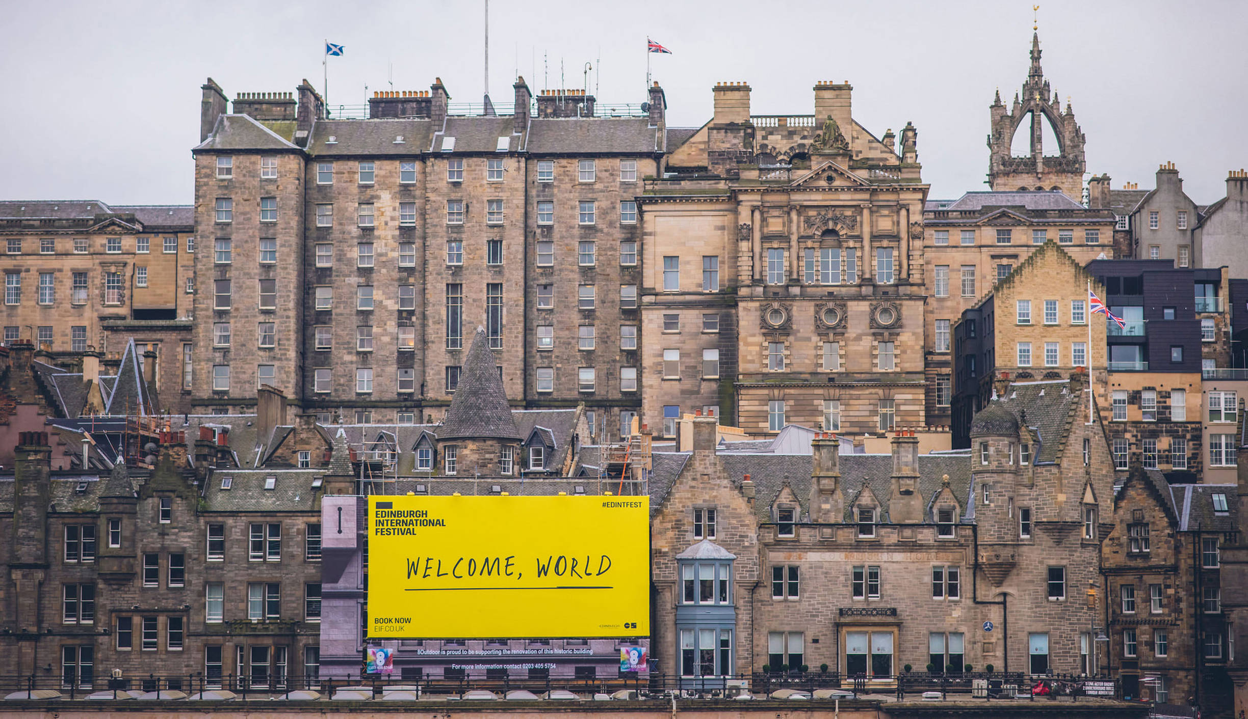
Edinburgh is coloring yellow
The result is a new identity and communication style that really stands out. All the shows are connected through the new identity, which makes the city turn yellow. And which makes people come back for more.
more tickets
more visibility for visitors