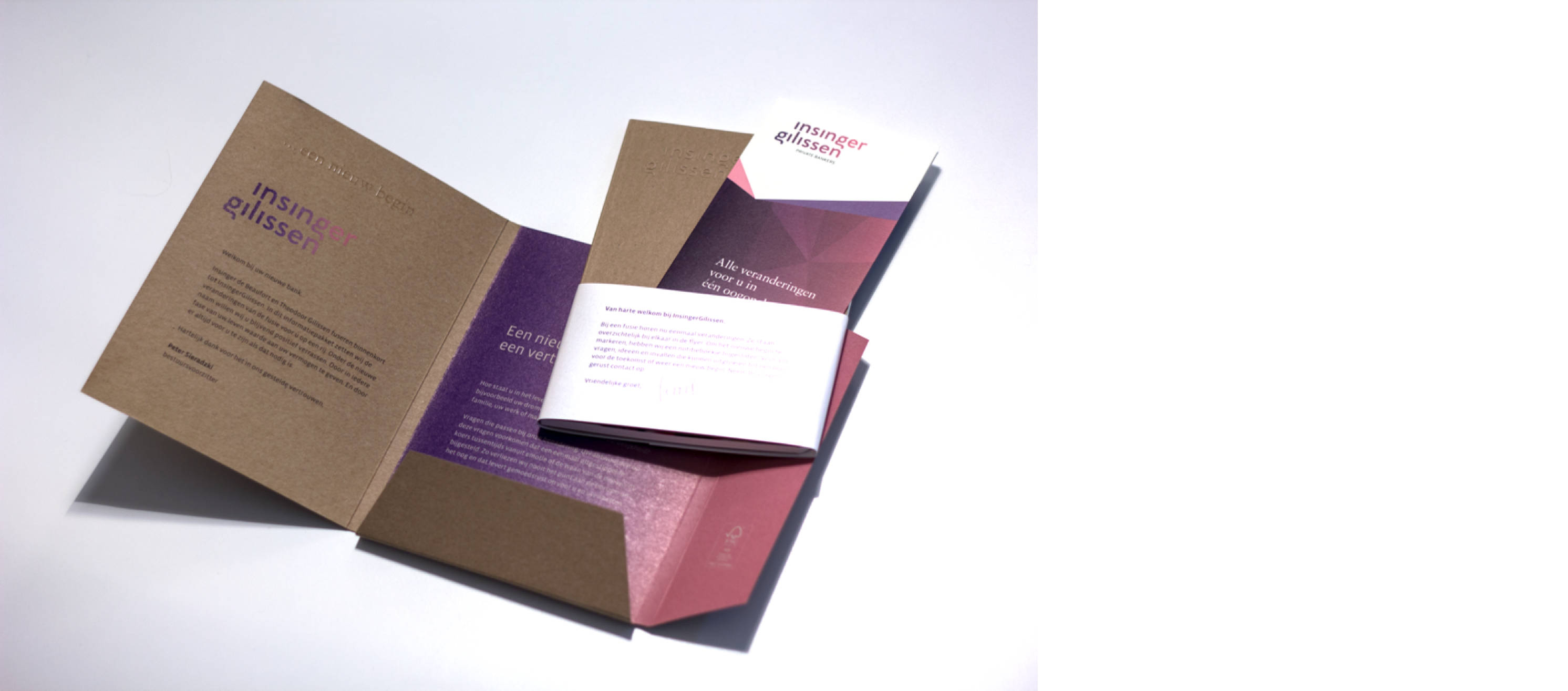
A tailor-made solution for InsingerGilissen
What do you stand for? Why do you do what you do? We helped InsingerGilissen to define their new brand. The new logo was the first visible consequence of the imminent merger. When the employees saw this image, the new course that had been taken really became a reality.
Men in black suits, leather armchairs and stately office buildings: a typical view of a private bank. That is precisely why we chose surprising, progressive colours as the basis for our visual identity: pink and purple. At the same time, these colours give a sense of the personal attention for which the two banks are known.
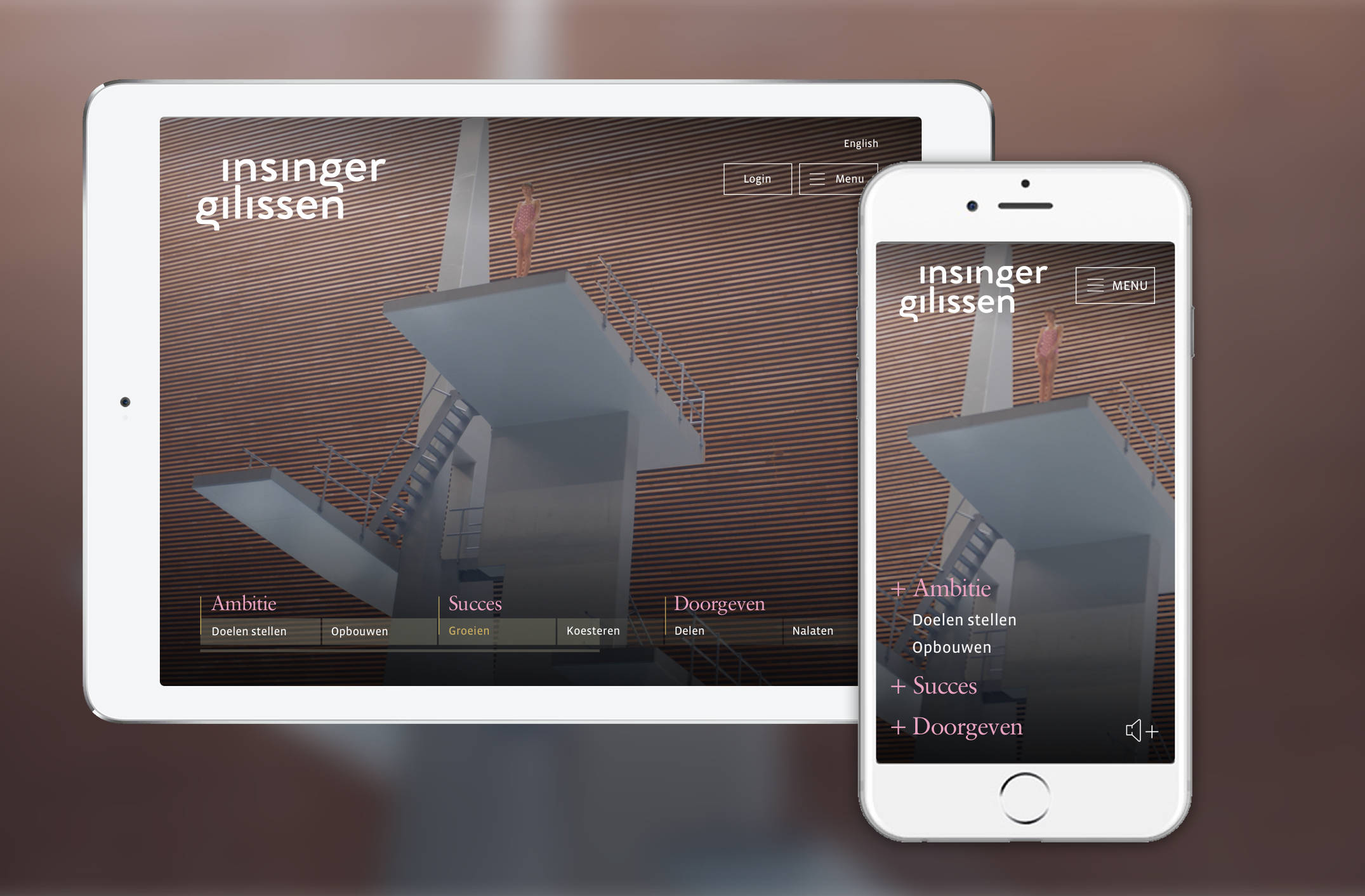
Brand strategy 'Layers of Life'
The website opens with a short film, based on the brand strategy 'Layers of Life'. This video is supported by a timeline, which focuses on the three phases that customers go through. The timeline also functions as a navigator: when you click on a phase, you land on the corresponding InsingerGilissen services. Images from the video can be found throughout the website. We also drew up guidelines for photography. In this way we ensure a perfect connection between image and design.
InsingerGilissen is ready for the future
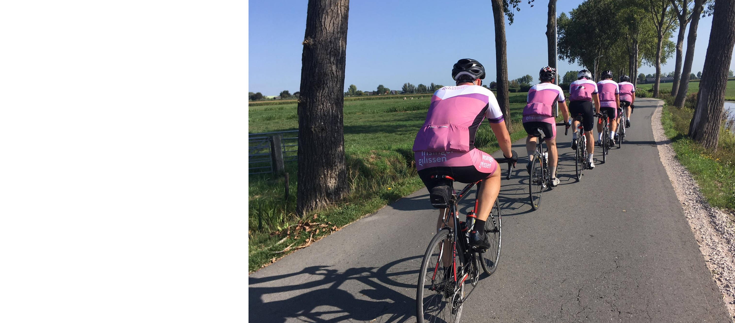
The new visual identity not only shapes the new InsingerGilissen brand, but also appeals to new target groups: children of older clients and young entrepreneurs. The bank is ready for the future.