Do you know where the knives are?
On the first day of our vacation in a rental a few weeks ago, my five-year-old daughter watched me thoughtlessly grab a knife from the cutlery drawer. "Mommy, how do you know that that’s where the knives are?" Good question. How did I know? That's just the way it works in most kitchens. Often there is one drawer, not too high, right under the kitchen countertop. And that's where the cutlery is. It just turned out to be the most practical spot, so that's how we do it. A great example of how the UXer’s invisible hand can also be of help in physical space.

It’s just how it works
Just like when we design a shopping cart for an online store. You want to buy something online, put it in your shopping cart, go through some predictable steps and get it delivered a few days later. Why do we design those steps that way, and in that order? Because it's convenient, it’s just how it works. Don't deviate too much, don't create too much noise, because then the buyer might abandon their purchase. People very much want recognition; it is deeply rooted in all our actions.
You will also encounter this in public spaces. Have you ever wondered why platforms at train stations always look more or less the same? Space is limited and we want passengers to be able to board the right train easily and swiftly. There is a bench, an information sign, a trash can, an escalator and/or elevator if necessary, in a predefined pattern defined by the designer. If you are lucky there is a kiosk or similar, but that’s about it. This is how it works. Because it works. It gives people something to hold on to. Patterns we unconsciously recognize and unconsciously use.
Gets pretty boring and meaningless, don’t you think?
Yes. If we approached everything that way, the world around us would become very predictable and boring. The trick is to be aware of where and when you may - or rather, should (!) - deviate from the familiar patterns. For online stores, you do this when potential buyers enter your digital domain: social media and landing pages are where you want to show who you are and what you have to offer. Those pages and posts are about brand, about inspiration, about connecting to your user's world. Where your brand becomes meaningful.
At train stations, you will typically find this deviation when you enter or exit, the space where you move from the building into its surroundings. This is where concepts such as identity, interaction, encounters, and a pleasant stay play an important role. More and more train stations are offering a mix of functions in the transition area from the immediate urban environment to the more functional part of the station. This area is often spacious, easily surveyable, a place for travelers to stretch their legs. At the same time meaning is given to the area in other ways by, for example, providing space for temporary cultural activities. The location thus acquires meaning for the many different users; travelers, local residents, passers-by and the people who work there.
A mix of functions in public space
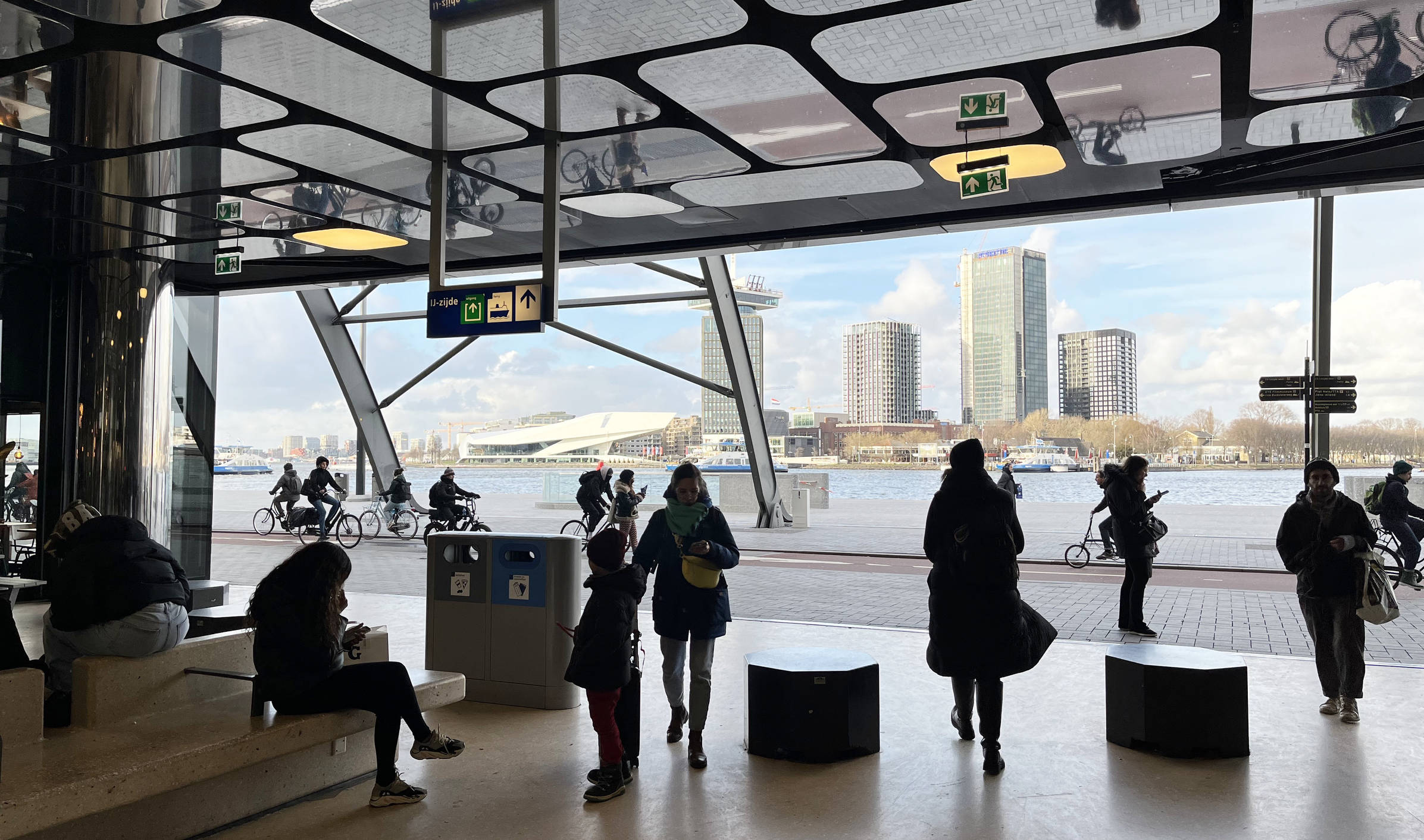
I like the example of the IJ Hall on the north side of Amsterdam's Central Station, designed by Wiel Arets Architects. Here, the station is in open connection with the unfinished, but promising, boulevard along the water of the IJ. These kinds of building features are on the rise. The public, often outdoor, space extends into the building, which then gains added value through a meaningful and surprising interpretation of that public space. A wonderful development, because it means our inner cities once again gain attractive places where people enjoy spending their time.
User experience in public space
When designing and constructing public spaces and buildings, you are dealing with a wide range of clients and stakeholders. At Fabrique, we specialize in defining the use and experience of public spaces in co-creation with these stakeholders. We believe in a knowledge-driven and methodical approach and always look to the future.
We investigate and map the context of use by observing, interviewing and organizing workshops with different stakeholders such as local residents and visitors. We focus on the intended users and apply techniques from service design such as the user journey map; we map the user experience over time, indentify the pain points and make recommendations to improve each step the user goes through. As much as possible, we test potential solutions in the final context with the intended users by creating sketches, or cardboard or digital prototypes, whichever works best. All this from the holistic view of design that is so important to us.
Whether we are designing for the digital domain or for the physical world around us, the quest for balance between the predictable and the surprising always underpins our work. Work in which the user's experience is always our guide. And that cutlery drawer? It's fine right there under the kitchen countertop.