How do you design an app millions of people will trust?
When there is a crisis, it is only human to see technology as the solution (carbon capture will solve the climate crisis!) or as the cause (5G is making us sick!). The Covid-19 apps that are being developed by governments around the world are a good example of ‘technological solutionism’. But even if the technology works well, there is a bigger challenge: how do you get the vast majority of a population to trust the app so much, that they will keep using it? That is not a technical problem, but a user-experience problem. And that requires good design. What should governments take into account?
Does Bluetooth even work?
If Google and Apple have even joined forces to make it easier to use Bluetooth for ‘contact tracing’, then you would think this technology must be useful. But I am quite sceptical. Even its inventor has said that Bluetooth was not designed for this. From our experiences at Fabrique with Bluetooth beacons in venues like the Rijksmuseum, we can confirm this. Bluetooth allowed us to approximately determine people’s location relative to the beacon. But it’s not precise enough to know if they are standing in front of Rembrandt’s Nightwatch, or the painting next to it.
It’s not about technology, but about a design you can trust
Let’s say that Bluetooth tracing will work well enough to be useful. Then comes the real challenge: the app can only be effective if the vast majority of the population (sixty percent is most often mentioned) installs it. So the main question is: how do you get everyone to (1) download the app, (2) actively use it and (3) keep it on their phone, for as long as necessary? That’s a matter of good design, not of technology. Because poorly designed apps won’t be used, or not downloaded at all. In Singapore and Australia, where these apps have been published, adoption is no more than 20 percent.
S0 how do you design for 100% percent of the population? What should governments pay attention to? And how do you approach such a complex task? In this article I’d like to give five tips that I believe will greatly contribute to an app that everyone can trust. My thoughts are aimed at any government (including my own) that is developing a contact tracing app. But my advice is not limited to Covid-19 and governments. It applies to any organisation that wants to use digital means for a large and diverse user group, with a collective benefit.
1 - Find the right frame
Whether you’re a government or a private company, if you start a digital project, it is important to realize that designing the solution is not the most influential step in the process. The most influential step is framing the assignment the right way. When people started talking about ‘Bluetooth apps’ to fight the pandemic, the focus was immediately on the technology (Bluetooth) and on the solution (a smartphone app). I see this all the time in my work at a design agency, when clients want a new app or website. They talk about the assignment in terms of features and technologies. But these are just a means to an end. What really matters, is what goal the technology serves, and within which conditions we have to work.
Reframe the question.
So the first step should be to ‘reframe’ the question. My suggestion would be to go:
- from: ‘develop a contact-tracing app using Bluetooth’
- to: ‘develop an automated diary that helps infected citizens to support healthcare workers’.
This shifts the focus from something technical (Bluetooth tracing) and the solution (app) to an understandable concept (an automated diary) and a human-centered goal (citizens helping healthcare workers).
A simple concept
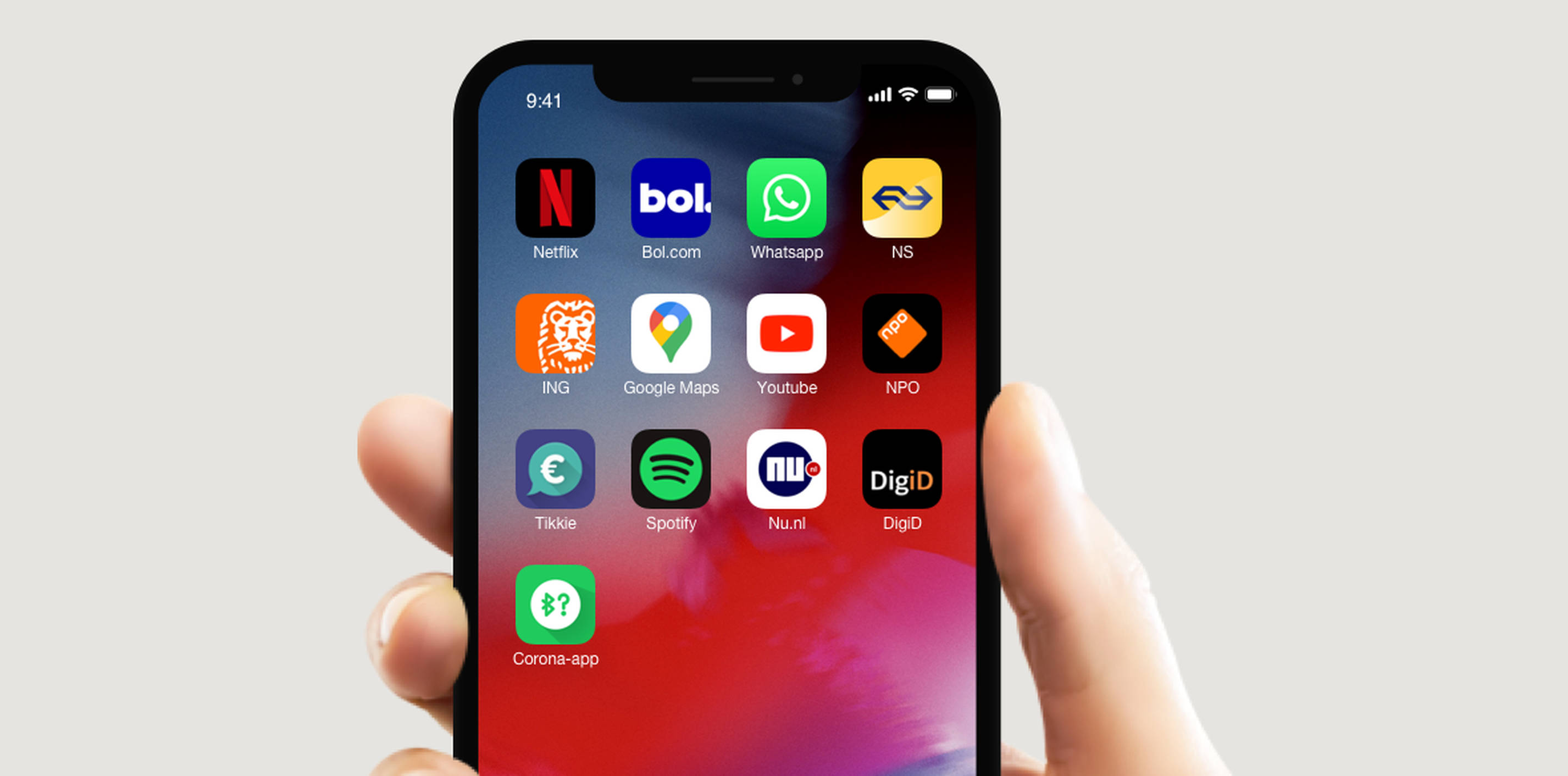
You can’t trust what you don’t understand. While it’s actually quite simple: the app is a diary. You use it to keep track of all the people you were close to. But instead of writing it down yourself, this diary does all the work for you. It’s fully automatic. It forgets no one, and you don’t even have to know the other people, because it’s completely anonymous. Old pages are automatically deleted. And like a real diary, it is your diary. You only transfer its contents if you want to and only when it is needed. A smart diary with superpowers! Not only is this framing clearer, it is also more positive. Governments would be smart to use this frame whenever they communicate about their app. A good metaphor will help in everything, from the design of the user interface to the campaign, and from the interface copy to the name of the app.
A good name sets the right expectations
Most contact tracing apps have names that do not necessarily have the associations you want. Names like Covid-19 Alert (a Dutch proposal) and COVIDSafe (the official app in Australia) emphasize the disease (negative) and create a false sense of security with words like ‘alert’ and ‘safe’. Creating names is a craft in its own right, so I advise governments to hire naming and branding specialists. While that is not my expertise, I do know that ‘Distance Diary’ has a whole different ring to it than ‘Covid-19 Alert’.
2 - Privacy by design
The notion that safety and privacy are opposites is wrong. After all, privacy is a form of safety. But how do you design an app that handles personal data and at the same time absolutely protects your privacy? It’s not easy, but it is definitely possible if you look further than just the functional aspects.
Principles are there to make tough decisions
Should we ask the user for an extra confirmation? Do we show the time of each encounter? If you need to choose between different design options, you want to have ‘privacy principles’ to fall back on. In the Netherlands, a group of critical privacy experts have written this set of excellent principles that can be directly applied in the design. Principles have to be sacred, so you use them mostly to make tough choices. Take user-friendliness. Of course the app has to be incredibly easy to use. But reducing friction is not everything. Why is Zoom such a privacy shitshow? Because its creators were so focused on an effortless user experience, that they forgot to consider the possible negative effects of their choices. Setting a password on your video call may be a small inconvenience. But now that many meetings are being ‘zoom bombed’, it proves to be more important than you’d think.
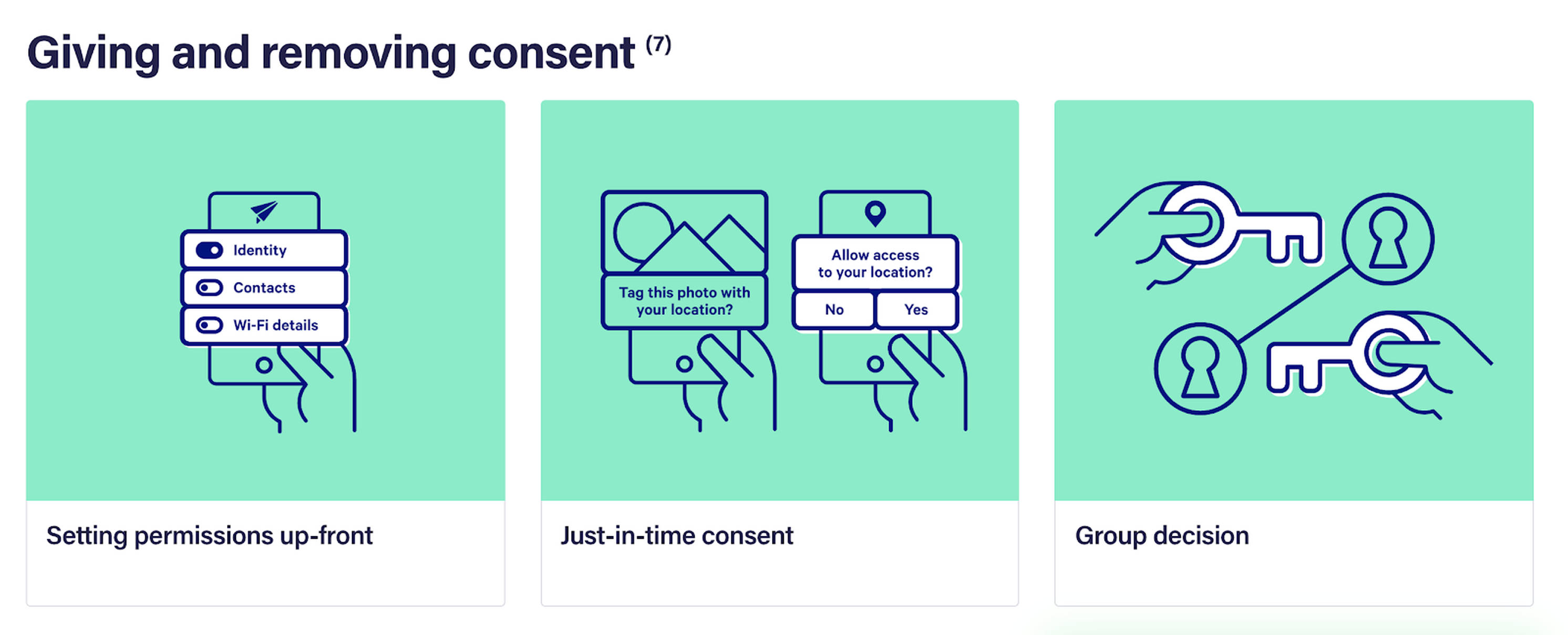
Not a black box, but transparency and control
A lot of digital technology has become a ‘black box’. It does great things for you, but you have no idea what’s happening inside the software. Not good for our trust in technology. It is much better if a user can actually see what an app is doing. As a company, Uber is not exactly a beacon of trust. But there is something to learn from the interface of their app. Why do I trust the app more than a traditional taxi? Because I can literally see where the car is, and what rating the driver got from other users. Most contact tracing apps exchange anonymous codes (tokens) with other phones. So let me see those codes — even if they are gibberish to me. And if I don’t see certain codes after 14 days, I am assured that they have been automatically deleted. Ever deleted an embarrassing photo? You don’t trust that it is really gone, until it has disappeared from your camera roll (and Recently Deleted), right?
The app should not only be transparent, I also expect to be in control. If my Uber is not showing up, I just cancel it and find another driver. What if I am concerned that the Covid-19 app will register my neighbor’s Bluetooth signal? In that case, I want to be able to turn off automated logging of nearby phones when I’m at home. By applying data patterns (such as those from the excellent Data Pattern Catalogue) it is very doable to give transparency and control to the user.
Temporality can be built in
Can you trust that your government will stop the app after a while? You don’t have to, because temporality can be built in. The app could deactivate itself every two months, unless the user activates it for the next period. Like a free subscription. One that is automatically canceled after the trial period instead of charging your credit card. It is then up to the app to give the user a reason to extend it. If the app asks for trust, it should also give trust.
3 - Inclusive Design is more than ticking boxes
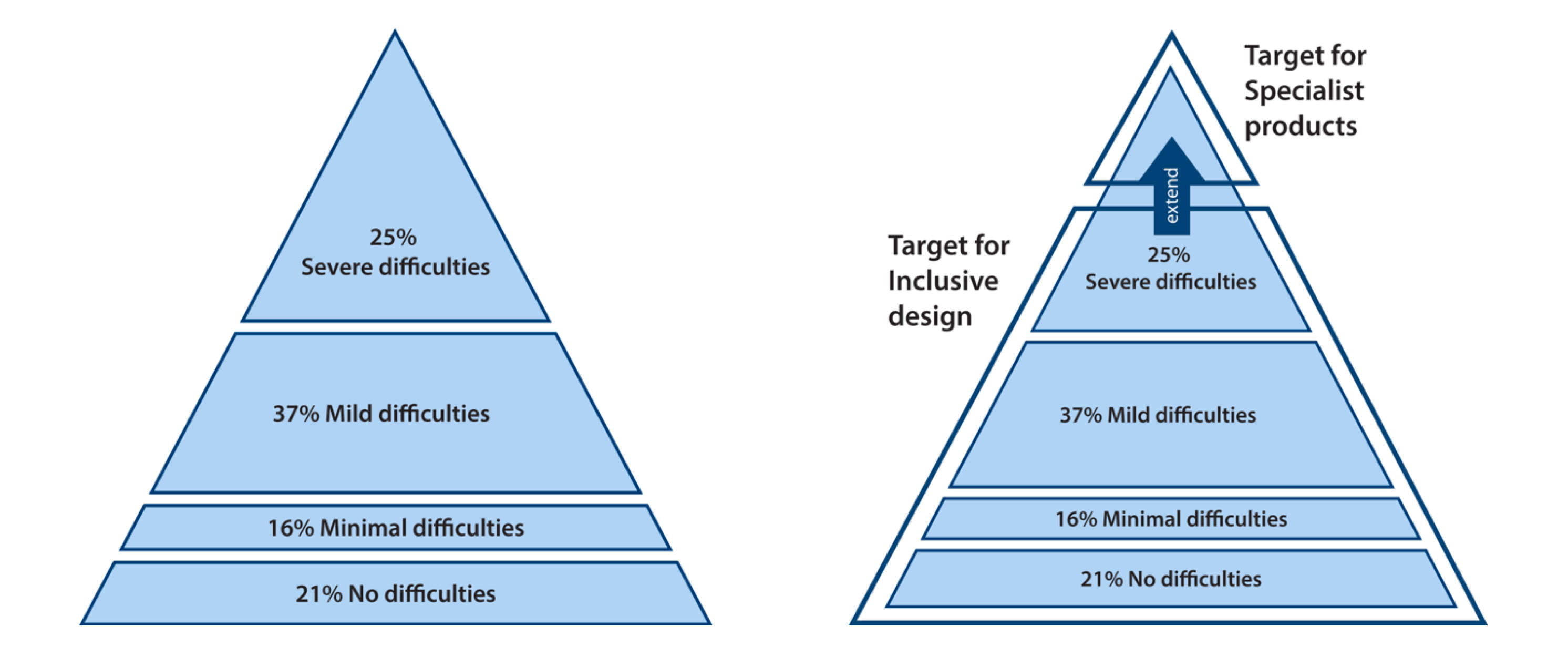
Trust begins with respect for every user. Accessibility and the broader term ‘Inclusive Design’ are too often seen as checking the boxes on a list of criteria, like standards for legibility and contrast. Those are absolutely important, but the essence of inclusiveness is to not exclude anybody. This is an opportunity for governments to show that they are there for truly everyone. Young and old, poor and rich, white and black. So that the app does not become yet another way in which minorities are more affected by the pandemic.
Everyone has a ‘disability’
Designing for diverse users starts with a diverse team. The more diversity, the better the odds that different perspectives and backgrounds are taken into consideration. The last thing we want is another racist soap dispenser. In the Netherlands, the government has formed a team of design and development experts to help create the app. The fact that it consists of eight white males is not very encouraging. Inclusive Design starts with the understanding that the designers and developers are not the average user. In fact ‘the average user’ doesn’t exist! Even in the Netherlands, which is one of the most ‘digital’ countries in the world, there is a large group of people who struggle with digital means. Or have a physical limitation. Or are illiterate. Or own an old phone with a small screen. Or don’t understand the native language. Or are simply stressed from sitting at home for months and aren’t paying full attention when opening the app for the first time. If we add up all these groups, we can conclude that almost everyone has some kind of ‘disability’. The design has to take all those into account.
Continuous user research
The only way to know for sure if the app works for people, other than those who are working on it day after day, is to test it with representative users, often. One usability test simply won’t cut it. (It is a myth that one user test with 5 to 8 people is sufficient.) Testing is something you do all the time, from Day One until, well… the end of time. After launch you simply never stop testing. And you should not only test the user interface but also how you communicate about the app. Writing the Frequently Asked Questions at the beginning of the project is a good idea, rather than right before launch. Testing designs is all about finding flaws that you can’t predict otherwise. Luckily, you can reduce errors in the design by keeping it really simple (but that’s really hard to do).
It is a myth that one usability test with 5 to 8 users can find every issue.
Simple language, in multiple languages.
If you are reading this, you probably have a good comprehension of the English language. But did you know that the word ‘infection’ is already difficult for many people? To write understandable language for most of your population, it needs to be written at B1, or even A2 level. That limits the words you can use. Writing in an accessible manner is a profession in its own right, so any government developing a tracing app should enlist the help of specialized copywriters. But also translators. Because you can bet that there are many people who speak a different language than your country’s official language. It would be smart to offer the app in other languages as well, even if they are not the ‘official languages’. In the Netherlands, that should include at least German, Polish, Turkish, Arabic and English. Translating a whole app should be feasible if it does not contain too much text. But in fact, text is not the most important carrier of information.
Make it visual, with a familiar look & feel
Visual stimuli enter our brain the fastest. Before we have read a single letter, our brain has already judged what is on the screen: can I trust this app? What is happening here? What is expected of me? The following advice is completely obvious, but (when looking at existing contract tracing apps and proposals) apparently still very hard to put into practice: make the app as visual as possible. In the Netherlands, but also in other countries, I am seeing many app screens with lots of text. And designs that look okay but with an unfamiliar style. These things should be the other way around: the app should contain brief copy and have a look and feel that is familiar and trustworthy. It makes sense to apply a government’s existing visual language, so it is consistent with existing official apps and websites.
The app should also follow the guidelines and patterns of Android and iOS as much as possible. Like with websites, the user ‘has learned to use your app by using other apps’. Using native design patterns (buttons, navigation elements, etc) and things like scalable fonts also ensures better compatibility with the accessibility features of smartphones.
4 - Design for negative scenarios
The most important test of a car is how it crashes — not how you get in and drive off. Of course the ‘onboarding’ of the app should be very well designed, or users will quit before the app can function. But that is conditional. The really interesting use cases are hopefully rare, but at the same time, crucial to design for.
How you get a notification makes all the difference
Not only should everyone install the app, everyone should also perform the actions that are recommended, when necessary. The 1.5 meter (or six feet) rule has shown us that following advice is easier said than done. Consider the notification that you get when you have been near someone who turns out to be infected, and the steps that follow. How these are designed matters a lot. Think about it:
- The notification should stand out among the many you get in a day
- The notification should not be misunderstood
- The user should not get unnecessarily worried, or panic
- The user must be able to understand and take in the recommended actions, and not delay them
- The user must be motivated to perform the actions, which includes sharing data
- The user must perform the actions correctly and successfully
There are many points where this can go wrong, with the consequence that other people are not notified. You can see it as a webshop’s checkout funnel where the conversion rate has to be 100 percent. Good copy is essential. There is a big difference between
“Watch out! You may be infected with Covid-19!”
and
“Yesterday, for 20 minutes, you were close to a person who now has been tested positive for Covid-19 by healthcare officials. Find out what you can do.”
Sure, the second sentence is a bit long, but it is factually what is happening. The challenge is to choose exactly those words that people can understand and that motivate them to action.
See it as a webshop checkout funnel where the conversion rate has to be 100%
How will people misunderstand the app?
In the Netherlands, there is a well-known clip from 1998 of our Prime Minister at the time holding a computer mouse like a remote control. There will always be people who misunderstand what a product is or how it works. If it can happen with face masks, it will happen to the app as well. A good exercise is to try and predict wrong interpretations. An app that works with alerts and wireless signals, can give the impression that you will get a warning every time you walk past someone who has Covid-19. As if the smartphone is ‘scanning’ nearby bodies for the virus. Maybe people will even move the smartphone over their own body, like a tricorder from Star Trek. Sound unlikely? Some people believe the coronavirus is caused by 5G antennas. There is nu such thing as ‘dumb users’, only designs that haven’t been thought through enough. The toolkit ‘Ethics for Designers’ offers great prompts to think about these things.
If face masks can be used incorrectly, then so can the app.
Anticipate abuse
Apart from unintentional misuse, we can also expect malicious people who want to abuse the app. Out of boredom, or with real terroristic intentions. Zoom has shown us what happens if abuse is not anticipated. With a large user group, we have to take these things into account. It is essential that users cannot autonomously mark themselves as being infected with the virus. Otherwise, after ‘Zoom bombing’, there might be ‘Corona bombing’: walking around crowds and intentionally ‘infecting’ as many phones as possible. While abuse can never be fully prevented, we can make it really hard for malicious users, by anticipating them. If you leave the house, you don’t leave the key in the lock, right?
We now have a much broader set of users who are utilizing our product in a myriad of unexpected ways, presenting us with challenges we did not anticipate when the platform was conceived.
5 - Open iteration and validation
A good design is not only a matter of what you design, but also of how you approach it. For such a big and impactful project, a smart design process is more important than ever. In the Netherlands, our government took a very public approach: everyone could see how selected parties presented possible solutions during an ‘appathon’. This led to enormous amounts of criticism, as the proposals had lots of flaws. But there was also a great upside to this public process: it allowed the government to learn very quickly and be accountable to its citizens. I hope this open approach will be continued. Perhaps it will even be a new standard for large government tenders. Developing an app to fight a crisis may be a turning point for governments with digital ambitions. The Dutch government has a poor reputation on this matter, so they need to have more knowledge of how to handle digital projects. Governments who want to be leaders when it comes to technology need to keep two things in mind.
Validated Learning to deal with uncertainty
How do you cope with the many uncertainties in such a complex project? What is the best design? What will work, and what won’t? The ‘lean’ way is to apply Validated Learning. You prioritize activities not based on what you believe is most valuable or the most work, but on what are the biggest assumptions. Testing prototypes and proof-of-concepts are just a few ways to do research. There are many low-threshold methods, like interviews, street scans or simply discussing sketches with users. As long as you apply feedback loops widely and frequently. By continuously alternating research on the one hand and design and development on the other, you can tackle ever smaller uncertainties. Until there are so few left, that the app can be launched responsibly. That requires not only technical and design specialists, but also orchestrators of the process.
Open source design and peer reviews
You can let the public vote for the best or prettiest app (like the Dutch government tried during the ‘appathon’), but this is not the Eurovision Songcontest. Design is not a democratic process, so ‘design by committee’ is a recipe for failure. Still, I think a country’s design community can be of great value when their government is developing a tracing app. Among developers it is common to make their code ‘open source’. So that everyone can benefit, but mostly so that other developers can detect flaws in the code. This principle could also be applied to the design of the user interface. A couple of Dutch designers have initiated such an ‘open interface’ that anyone can see and contribute to. The fact that some of them have been invited to be in our government’s expert team is encouraging.
If we choose to make not only the code public, but the design too, then the whole design community can help to improve the app.
And it looks like they want to continue this ‘open source design’. But how do you discern the signal from the noise? Why not organize it as ‘peer reviews’? In the scientific community, it is common to have your work reviewed by other scientists. In fact, it is the only way that leads to robust scientific knowledge. So don’t ask for feedback from the entire internet, but only from other (selected) design specialists, who know what they are talking about. Not open comments, but feedback to specific questions. Do not ask ‘What do you think of this home screen?’, but ‘This is the flow in which we ask the user to activate Bluetooth — how can we minimize drop off?’. Many countries have strong design communities. If governments manage to organize this process well, their country’s collective brainpower might result in a much better design.
Will an app be effective?
Maybe your country already has a contact-tracing app. Or like in the Netherlands, your government is developing one. The question remains whether or not an app will be effective against the crisis. In Iceland, where almost 40 percent of the population has installed their official tracing app, it does not seem to have much effect. And in the Netherlands, scientists of the Utrecht University are not convinced that an app is more effective than other, less obtrusive, measures.
Perhaps it is better if we don’t rely on an app. If we do not need technology to save the day, wouldn’t that be great? If we could say: remember the pandemic in 2020? At first, we thought we needed an app to get back to a normal life. But eventually, the government decided to hire thousands of people who lost their jobs because of the crisis, to assist with contact tracing. It even started a whole different way of looking at our healthcare system…
So this is my last advice to governments developing a tracing app: don’t fall for the sunk-cost fallacy. Have the courage to stop the project if it is clear that it will not work. Because the most advanced technology and the best design can’t solve a crisis. Only people can do that. Only together.
Patrick Sanwikarja is User Experience Director at Fabrique.