Design as a cure for 'innovation pill’ side effects.
Well-intentioned innovations in healthcare often do not have the intended effect. In fact, eHealth projects often have negative side effects. Here are four insights from design practice to prevent these side effects.
We're all busy innovating in healthcare. EHealth, cybermedicine, virtual healthcare... everyone is taking the 'innovation pill'. Over the past ten years, it has made us all a little bit high. And like any drug, the innovation pill has side effects. What are these negative side effects?
Apps
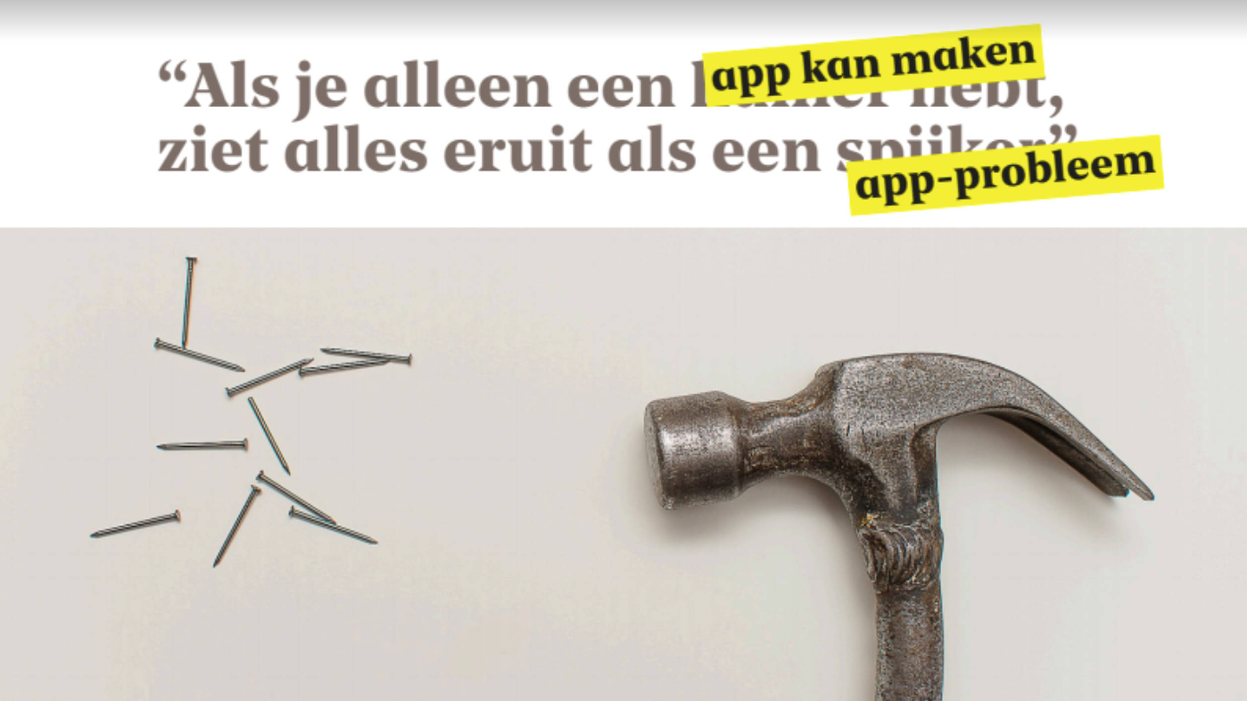
Let's start with apps. It sometimes feels like 'app' has become synonymous with eHealth. Someone has an idea to innovate and that always seems to mean building an app. There are no fewer than 350 thousand healthcare apps. Nobody wants twenty apps on their phone for their health. So, the first side effect of the innovation pill: innovation does not always make life easier.
Accessible
Another side effect is that electronic healthcare is by no means accessible to everyone. Even in this day and age, 22 percent of Dutch people have trouble with computers and the internet. Almost thirty percent have limited 'health skills’; they have difficulty knowing what is going on and being able to act accordingly. As many as 4.5 million Dutch people have some kind of limitation, from low literacy to colour blindness. Often these limitations are not visible and have developed later in life. It is important that we - highly educated and working with the Internet - realise this. The danger of eHealth that ignores this diversity in our population is that it further widens the digital divide. That's not progress.
4.5 million Dutch people have some kind of limitation, from low literacy to colour blindness.
Privacy
The third side effect concerns privacy issues. As soon as information becomes digital, and security has not been properly considered, a leak may form. That can lead to high fines, but worse: it's unethical. In healthcare, patients must be able to rely on the protection of their privacy.
Unused innovation
The final side effect - and perhaps the core of the problem - is that there are an awful lot of innovations that are not actually used very much in the end. Because they were developed with the technology in mind, but have no clear added value for the user. As a designer, I see it as my responsibility to create applications in healthcare that will actually be used.
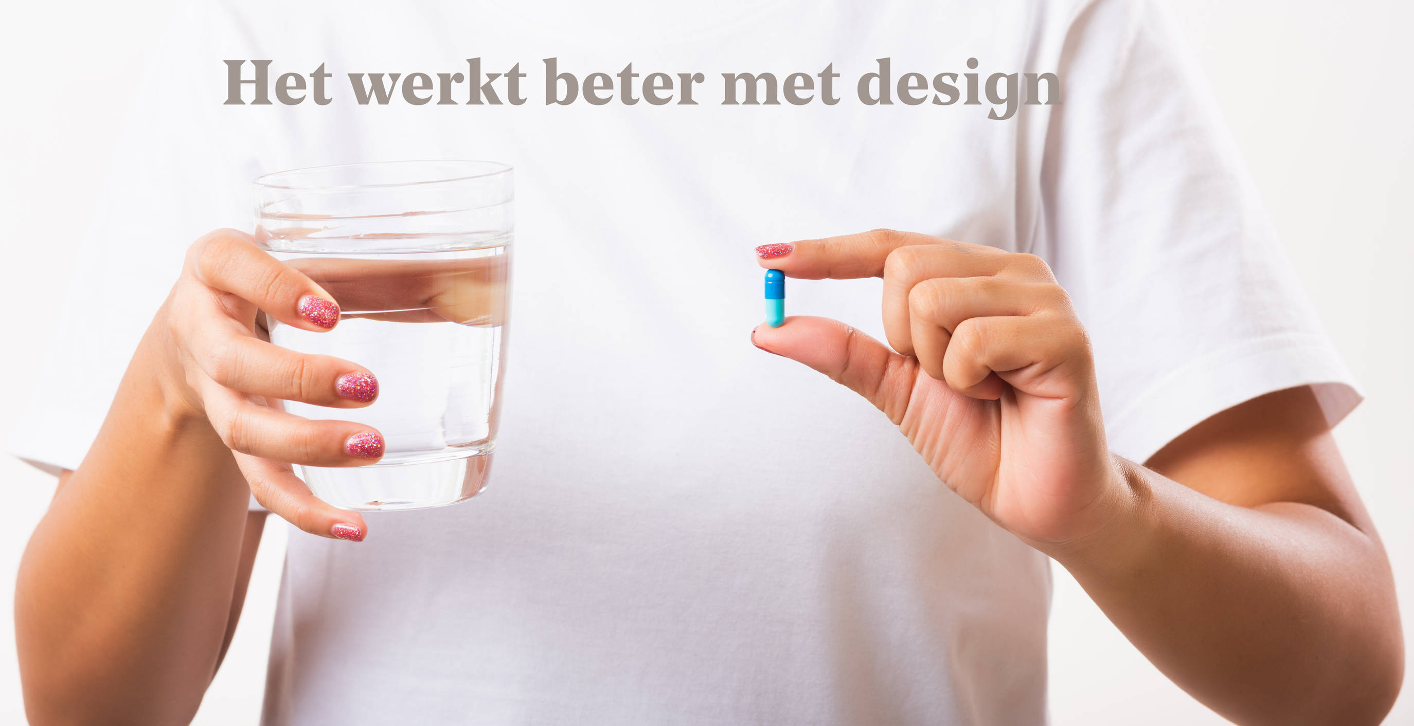
So what is the cure for these innovation pill side effects? Well, not another magic pill. I think the answer is design. Design is like the glass of water with which you swallow the pill: it helps make innovation go down better. What can design mean for innovation if the two are allowed to go hand in hand? The essence of design is thinking ahead. After all, 'by design' means ‘according to plan’.
The trick is to 'design the opposite' to counteract the four side effects.
Let's go through the side effects one by one.
Integrated by design
You want innovation to make life easier, to be integrated into the user’s life and into existing systems. An example is Fabrique’s collaboration with UMC Utrecht. This Dutch hospital sent letters and leaflets by regular mail, meaning the patient got all the information at once. Neither personal nor relevant. Because the leaflet you're getting now is about something you won't be experiencing for another month. The question was how UMC Utrecht could better support its patients, using the power of digital. Focused on the person but at the same time in a uniform way, because UMC Utrecht should feel like one hospital, regardless of which department a patient is visiting. Together we looked at the whole patient journey: from the moment someone starts having complaints to the moment they are discharged from hospital (or have to learn to live with an illness). We wanted to design something for every possible case. Patients with stomach problems, lung problems, heart problems or any other problem, they should all be aided by the service.
The first step was a Design Sprint for a small part of the patient journey. From there we designed a detailed service for the whole patient journey. Not an app, but a web environment. Well secured and only accessible to the patient. Notifications play an important part. Patients can choose if they prefer to get emails or text messages. So we can send them the right information at the right time, instead of everything at once. An intuitive timeline combined with information from different departments in one screen. The information is tailored, comes at the right time and meets the preferences and level of the patient. We are now in the process of developing this using the existing patient portal as a base. We're not going to make something new that people have to get used to again - that's exactly what we don't want.
Accessible by design
How do you make eHealth accessible to everyone? Accessibility is no longer a nice to have, it has become a must have. This year, the European Accessibility Act was adopted, which obliges companies offering services to comply with accessibility rules. We already think it's normal to have lifts as well as stairs. This kind of accessibility requirement now also applies to digital resources. A good way to achieve this is to seek help from agencies such as Pharos. They know how to design for people with disabilities. But even more important: do your own research on your users. Literally take a look at who they are. Only then will it really dawn on you that you are not the user. Bring your stakeholders along too. The people who control your project need to see and hear with their own eyes and ears what it's like to use the product.
We did this for the Municipality of Rotterdam, for example. They wanted to learn how to communicate better with their citizens. We gave a number of letters to some people with low literacy and let them evaluate what the letter was about and what they thought of it. Participants could indicate their thoughts with words, but also with icons. With our help, municipality employees conducted these interviews themselves. Suddenly the municipality understood that these letters, which were completely logical to them, were not easy to understand for everyone. "Tax statement? I have no idea what that actually means.” So: do your own research, there is no alternative.
Privacy by design
Nobody wants to be responsible for bad privacy, but somehow it creeps in anyway. How can you make sure your users’ privacy stays protected? Ethics for Designers, developed by our designer Jet Gispen, is a toolkit that teams can use in their design process to deal more consciously with privacy and ethics. By doing the exercises (together with the client) you will be guided in thinking about your design’s intentions, but also about the unethical consequences it might have. That may sound strange, but it's good to think about your responsibility while you're designing. For example, we concluded with the Municipality of Rotterdam that we are responsible for clear and direct language, but not for people taking offence at that directness.
How can we better handle data? When starting to use a new service, currently users are often asked in advance for permission for all the things that could come to pass. It would be better to ask for that permission only when it is applicable. And there are more smart alternatives like that, which are also more user-friendly. You'll find a lot of these design patterns in the Data Patterns Catalogue. We've learned that if you give your user the choice, there's a lot you can do. But you do have to make that choice a part of your design. This way, the GDPR won’t paralyse you, but will offer ease of use and privacy.
Desirable by design
And finally: perhaps you have created an eHealth application, but nobody is using it. Research for a pharmacy showed that their app users felt that the app was still in its infancy, and they ignored it after trying it only once. Conclusion: an app creates expectations. Our advice is: make sure that what you put in your app really works. It is better to have fewer features, but a better experience. Less, but better.
A good example of how we developed an app that actually got used was our project for Generation R. Generation R is a large study by Rotterdam-based hospital Erasmus MC, in which 10,000 Rotterdam children have been followed and examined since before their birth. When the children became teenagers, the researchers wanted to do something with the children's smartphones. That way, the teenagers wouldn’t have to visit the researchers and the researchers could collect more data remotely. In this way they could perhaps make connections between, for example, hearing damage and how often someone listens to Spotify. They had created an app that could track volume and pass it on to the researchers. But the app wasn't used, because it had no added value for the children. What's more, the app ran continuously in the background, draining the battery. Still, the desire to do something with smartphones remained. So together with developer Innovattic, we made an app that children did want to use, by making it into a kind of game. No boring online questionnaires, but a nicely designed app where players can pass different levels. And so it did not feel like a burden for this target group to fill in questions. Result: a lot of data is being collected, and the researchers now want to use the app for other things, too.
Innovation pill
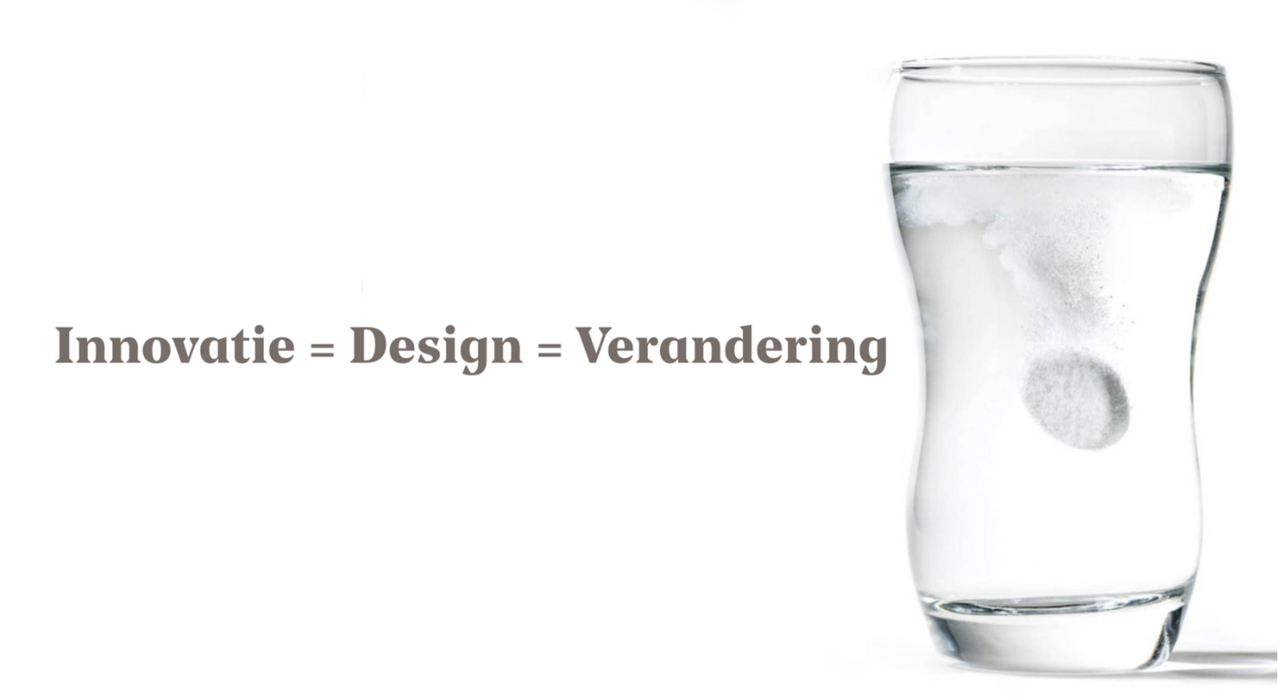
Back to the innovation pill. It's a good thing that it has made us high, because innovation is badly needed when it comes to healthcare. So we have to keep swallowing it. But it's not really a pill. The innovation pill is more of an effervescent tablet. When you put it into a glass of water, it mixes and becomes a solution. The water and the tablet become one whole. In our view, there is no difference between innovation and design. They're both words for the same thing: change.