Let’s Challenge Conventions
Conventions in UX have flattened our digital landscape. All friction has been eliminated and over-optimized into uninteresting and common flows and interfaces. I would like to urge designers to challenge conventions in order to create truly new digital experiences.
Eliminating friction
Clicking a logo will get you back home, a rotated triangle means "play", and green means "go"! Conventions in UX are commonly used patterns, shapes and colours that help users understand interfaces quickly. These conventions work in a very effective way. Websites and applications that follow these conventions are easier to understand, and tasks are performed much faster here. Because we have learned to use and love them, they now make up most of our digital experiences. They have created a universal design language that can be found across all types of platforms, touchpoints and even brands.
But now when these conventions have reached almost all digital spaces, we find a digital landscape of bland uniformity that isn't very exciting. It doesn't scare, confuse or surprise much. And in most cases this makes a lot of sense, especially in contexts like finance and health. In these cases, the appearance of the user interface is directly related to the performance of the digital product or service and should therefore be transparent and easy to use. Sticking to what people know and understand makes a lot of sense here.
But I don't think that we have to be this strict in all cases. In many digital spaces we can afford a little tension or surprise. Especially in digital spaces that have less of a functional goal. Think of goals that are more experiential, like exploratory, engagement and entertainment purposes. I would argue that these spaces could benefit from some tension, surprise or occasional moments of confusion. I think that as designers we should take more risks in order to create truly unique and never-seen-before experiences. Surprise the user, make them think, or purposely get them lost. Is confusion a thrill? I think so.
Convention evolution
Another thing that we have to realize is that conventions are not at all conventional. They are prone to change, and adapt themselves to changing surroundings. They were designed (by one of us) in a time and place in which they were needed and made sense. Over time, some conventions taught users enough about a specific functionality that the convention itself became irrelevant. This can be seen in Apple's iPhone UI, where actual buttons are now replaced by plain text. The outline of the button was once needed to instruct users that this was a clickable item. Now, users have become so acquainted with the UI that the visual cue of a button is no longer needed.
In other cases, some experimentation was needed with features or interactions before we cracked the code. A good example is the interaction of scrolling through a list on a touchscreen. In the first few iterations, moving your finger down the screen would result in moving down the list. Now, the most established interaction is the complete opposite: moving your finger down means going back up the list. This is very good news for us designers. We get to experiment with new shapes and interactions to create truly new digital experiences. And when we do well, these might even replace current conventions.
Designing for digital natives
The relevance of using conventions also depends on the people you are designing for. Adapting to change doesn't come easy to us all. And we have to account for those that have a harder time using digital products. But the amount of people that have been brought up surrounded by digital interfaces is huge, and this amount is increasing every day. They have become accustomed to working with new interfaces, and navigate with ease through the ever-changing digital landscape. They are flexible in adapting to change, and seem to follow intuition before rationality when using new interfaces.
A company that understands this is Snapchat. The social media application is not afraid of change, and continuously updates and experiments with interaction and navigation. They also don't spend too much time explaining changes, and make you feel it before they talk about it. This means that you might stumble upon new features when using the app, making discoverability an important experiential goal of the Snapchat application. This is both in line with the Snapchat experience and the target audience they serve.
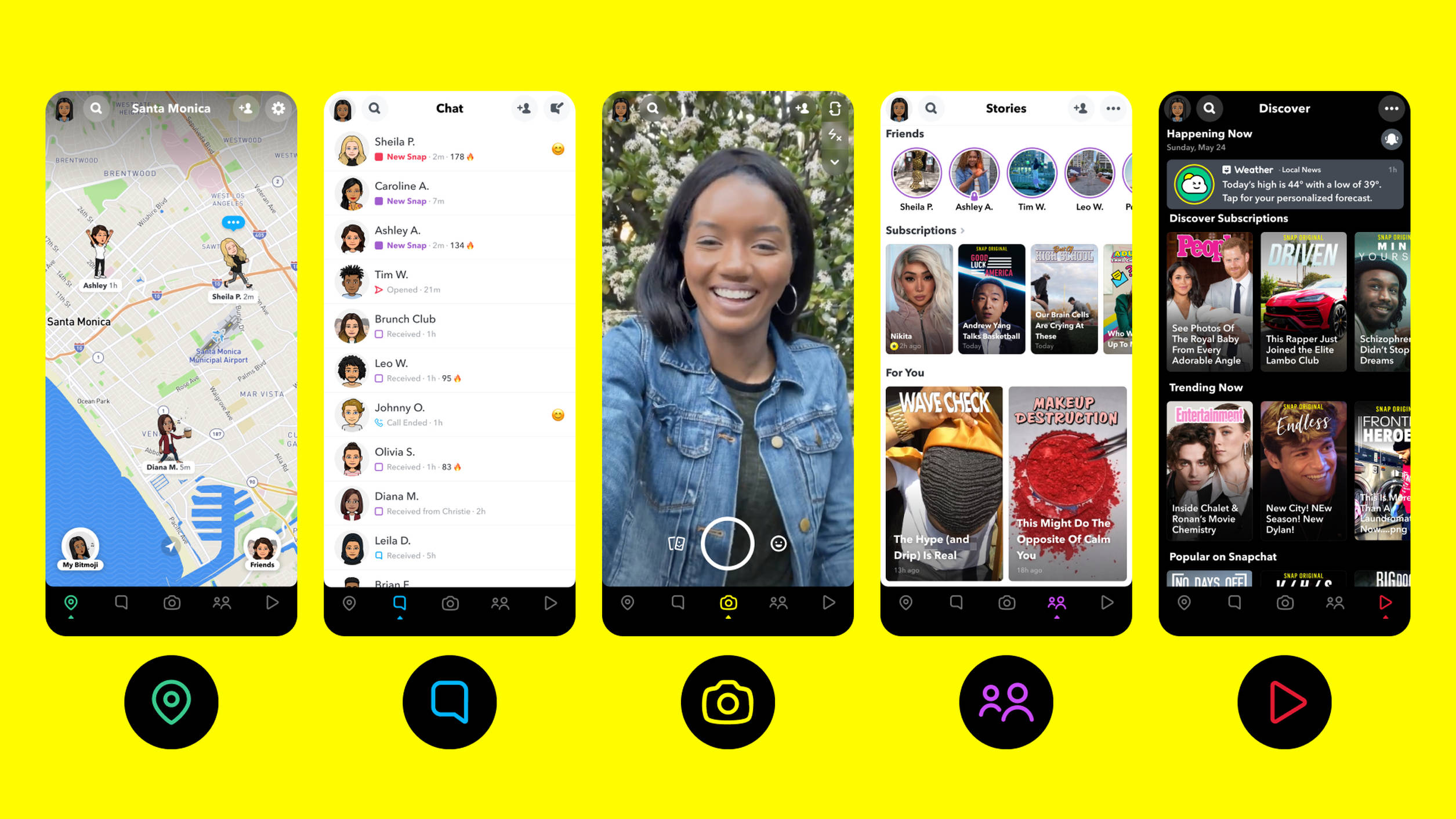
Not very user friendly, right? But this might not be bad design at all. And maybe it was born from more than just experimentation. Because when you think of it, the value of a digital space only for these younger generations increases the relevance of the app. It means you don't have to worry that your parents might invade this part of your life. It is secretly secured behind a wall of user interfaces that are designed to keep them out. This also makes you part of an incrowd and dictates the style of communication that is clearly different.
Design change
Take risk, stage conflict and think new. Look for spaces that need uniqueness, and design without constraints. Conventions are crucial but ever-changing, so challenge the status quo and make them better! This will not only advance the digital landscape, but will also make it an exciting one.