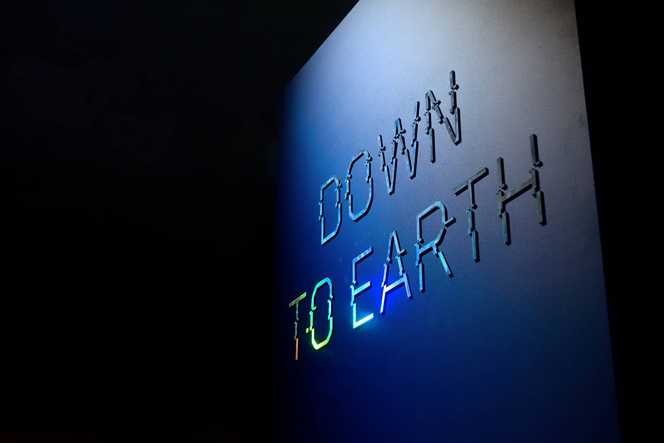
To Mars and back again
When a year ago, the Design Museum in London chose Fabrique and NorthernLight to design their next exhibition, I was thrilled. Not only do I love the museum (I am a designer after all), the exhibition was going to be about Mars! Being a big fan of sci-fi and space travel, this sounded like my ideal project.
What’s more, the museum wanted it to be an experience, rather than an exhibition. And because the exhibition would open in the winter (the museum’s most important season), it had to appeal to a broad audience — not only design enthusiasts. A pretty big challenge for our team!
So how did we take visitors to Mars and back again? In this article, I will give you a behind-the-scenes look at designing the exhibition ‘Moving to Mars’.
We approached it like a movie
How do you entertain people for two hours, around a central idea? Well, what is perhaps the most popular ‘experience’ worldwide, for all kinds of people? Movies! When you consider the price of a museum ticket, and how long people spend there, going to the cinema is actually quite similar to a museum visit. So rather than compete with other museums, our goal was to design an experience that competes with the zoo, an attraction or the cinema. Educational and fun at the same time.
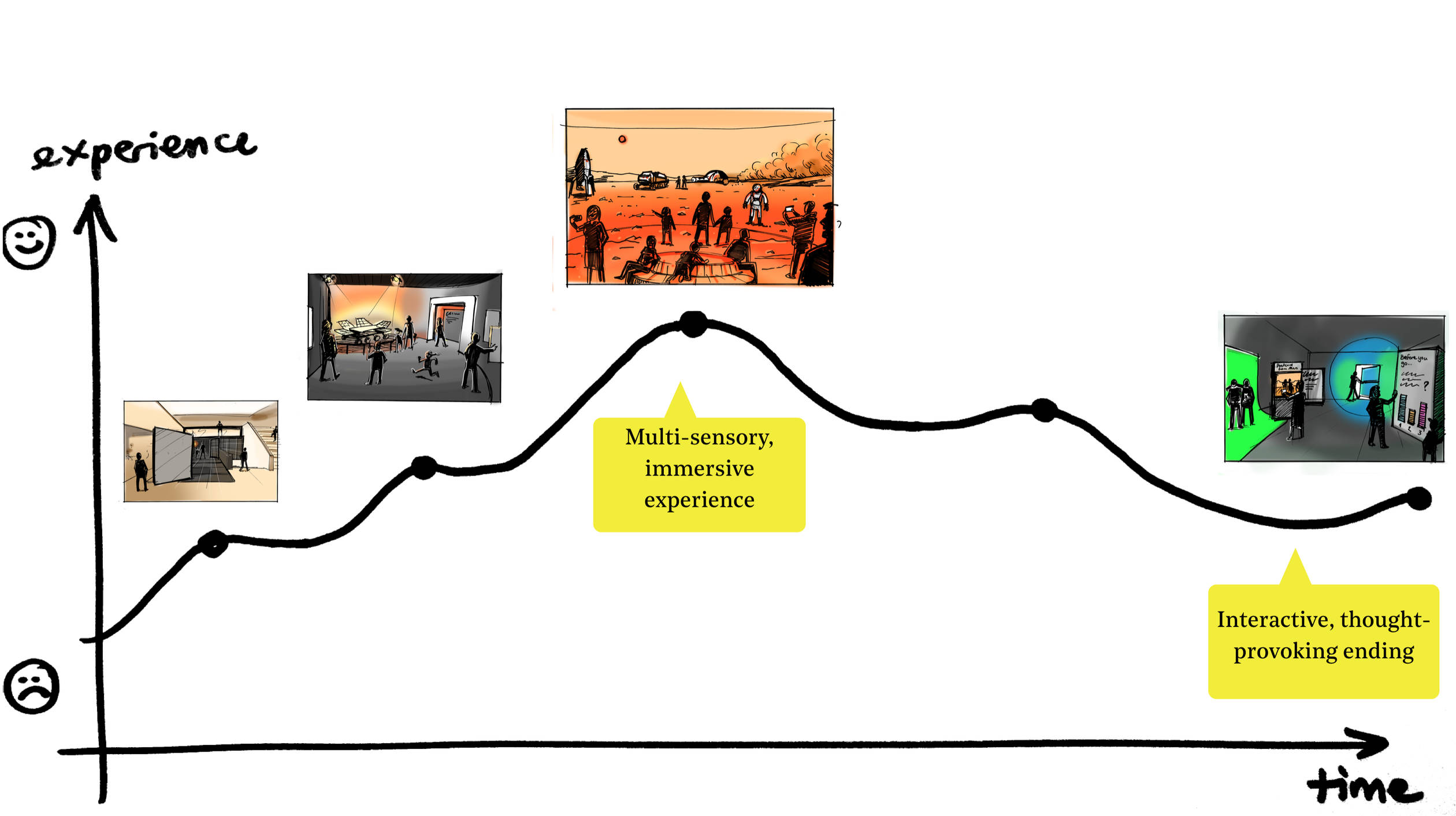
This approach helped us to keep our focus on the experience, not on the objects — though there were going to be many unique objects on display. We used filmmaking as an analogy for telling a story. We applied methods from filmmaking and we even timed sections of the experience to end up with approximately two hours of family fun. And like with a movie, we made sure there is an emotional story arc. We applied the Peak-End Rule: a clear highlight and a strong ending make an experience memorable.
Start with the end
One way to look at an experience is that it is what people say about it. A rollercoaster? Frightening and exciting at the same time! A vacation? Relaxing and enjoying. So, what did we want our visitors to say about our exhibition? In a kickoff workshop at the start of the project, we imagined our desired ‘visitor take-outs’. We did this with the core team from the Design Museum, including the curators, but we also asked stakeholders for their views.
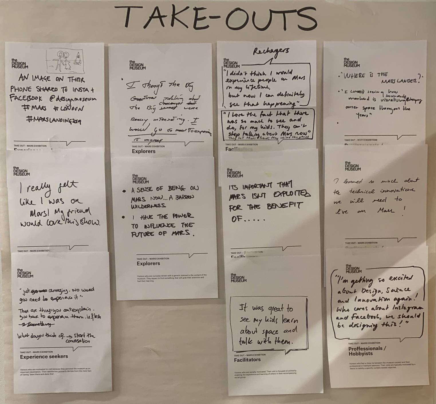
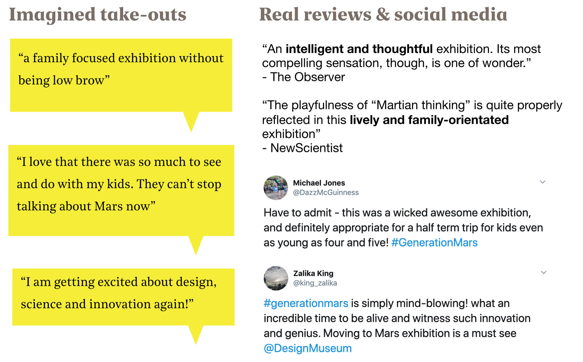
This resulted in phrases like “a family focused exhibition without being low brow” and “I really felt like I was on Mars! My friends would love this show!”
Knowing what we want visitors to say is one thing, but what story did we want to tell? We knew the exhibition was titled ‘Moving to Mars’. It would be about humankind’s desire to travel to Mars and colonise another planet. And the curators already had a list of many interesting objects that they wanted to put on display. We also knew the Design Museum wanted to offer an ‘immersive experience’ — to give visitors the idea that they visited Mars, without leaving London. But what does that really mean, ‘immersive’? And what aspect of space travel should we focus on? The technical challenges? The red planet itself?
The Big Idea as our compass
To answer these questions, in the same kickoff workshop, we co-created our Big Idea: a short text that serves as the foundation for everything we do. Not just the exhibition itself, but also the campaign and other communication. This was our Big Idea:
“Mars, an Earthly adventure”
It is the ultimate adventure for our generation and generations to come: travelling to and living on Mars. But even if we never go there, there is much to learn on Earth from designing for another planet.
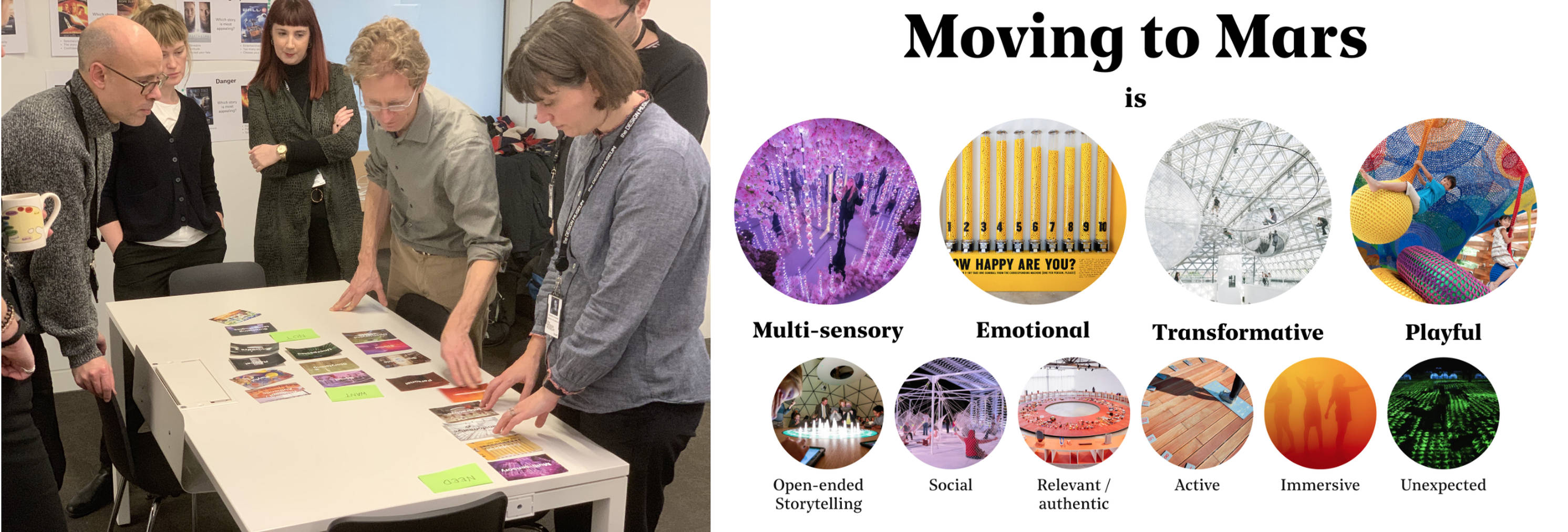
Secondly, we deconstructed ‘immersive’ into different key design values. These starting points served as our compass for all decisions down the road (and there were going to be many!). So, with our ‘true north’ in place, did we start drawing and designing from there? Not quite yet…
It’s all about the story
Like with a good movie, a memorable experience is all about the story. But with so many stories to tell about Mars, what should be our narrative structure? The curators came with the idea to use the different stages of going to and living on Mars: Arrive (how do we get there?), Survive (how do we not die there?) and Thrive (can we create a colony and society there?). From this, we created a Visitor Journey Map, extending the experience to before and after the visit. A story is not just about what happens, but also about the emotions you experience. So for each ‘chapter’ in our journey, we determined what should be the main emotion for our visitors. From Curiosity at the start of the show, to Awe when we experience Mars, to Reflective at the end.
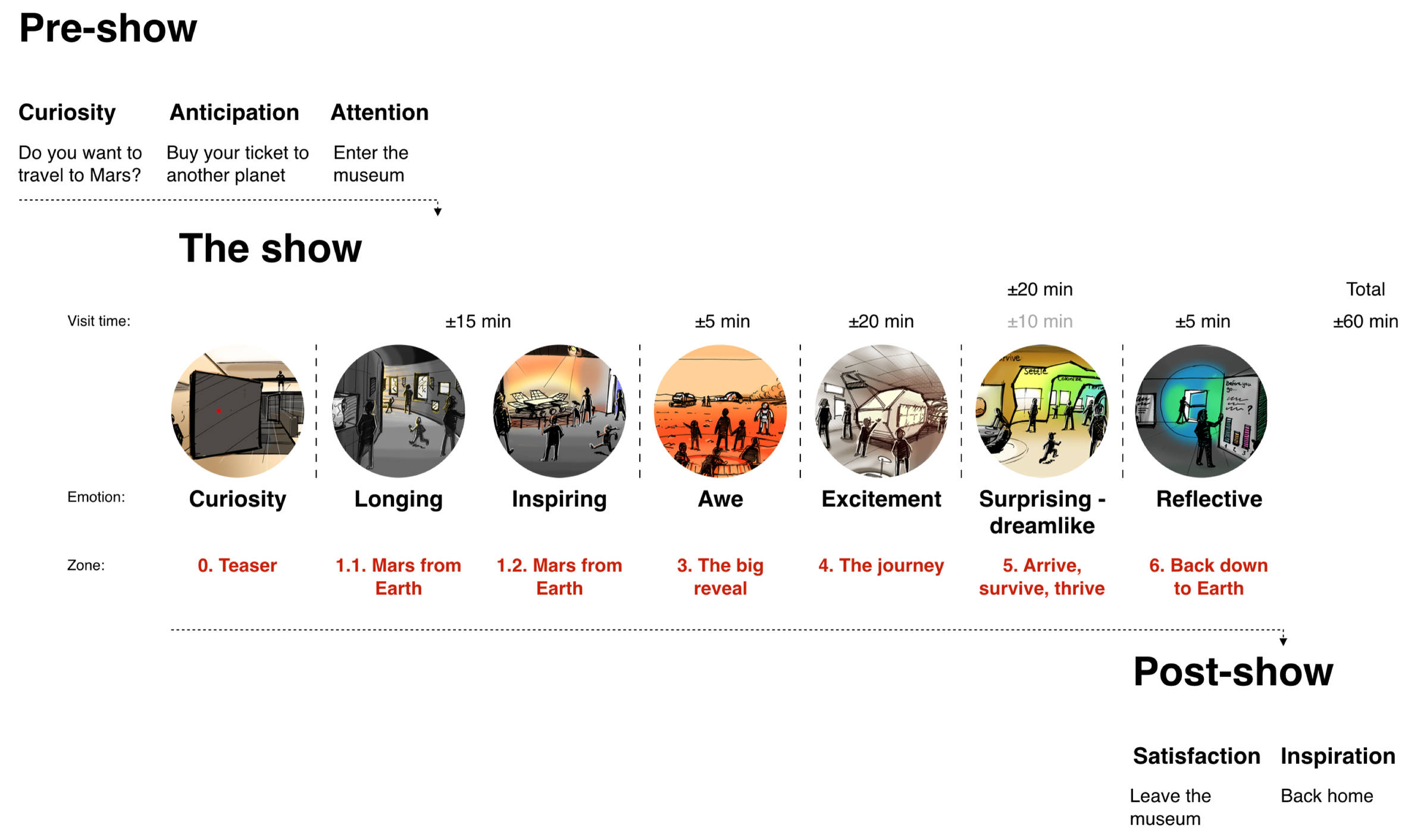
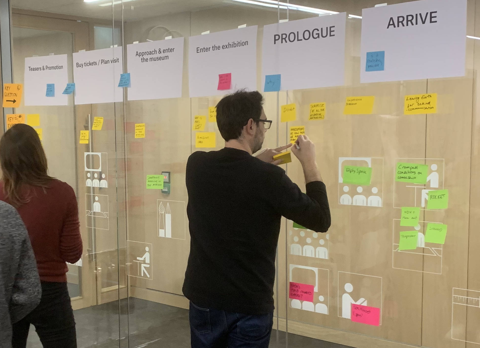
Again, this was teamwork: in the kickoff workshop we mapped out the entire journey, together. We took the biggest wall in the room and used post-its to combine everyone’s input about the story, emotions and key objects for each phase. We consolidated all this into a digital version, which would be our guiding framework for our project.
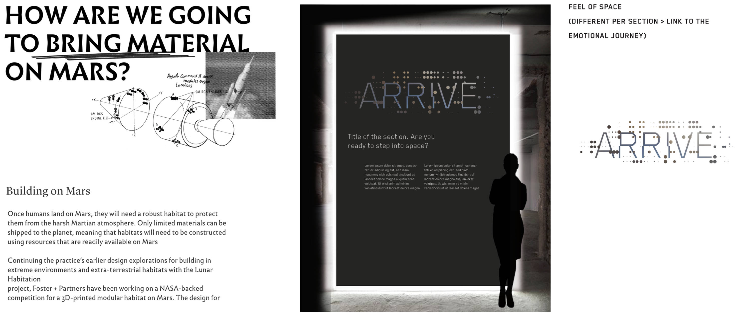
Scripts and Storyboards
So, how did we translate our Visitor Journey Map into a tangible spatial experience? What would our visitors see, hear and feel when the enter the exhibition space? We started with a brainstorm, coming up with lots of ideas and rough sketches. We took into account the curators’ list of objects, but we still didn’t focus on them too much. Instead, we wrote a script from the visitor’s point of view, describing the different rooms the visitor would walk through. Using just words, we forced ourselves to focus on the experience, not on specific things. Also, a written script was easy to understand for the Design Museum. At the same time it also left room for imagination. After all, we had just started and didn’t want to pin things down yet.
Here is an excerpt from the script we wrote, which describes the highlight of the show (a room that simulates being on Mars):
“You wonder what Mars is really like. Eager to find out, you walk into the next room.
You are surprised by the feeling of rocks under your shoes and when you look up you realize: I am on Mars! Everywhere around you, you see a Martian landscape. You are in awe. You have been instantly transported millions of miles to another planet.
This must be what Mars is like, this very moment. It is familiar, yet different from what you thought you knew.”
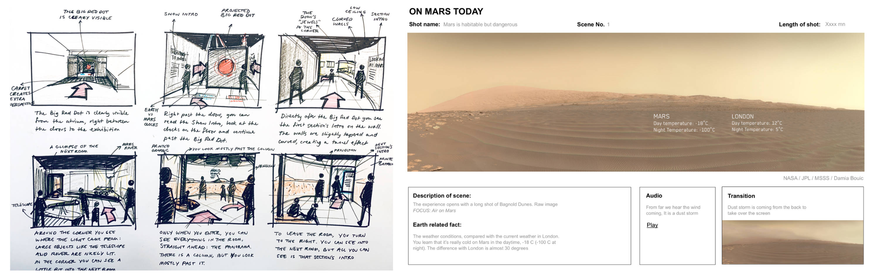
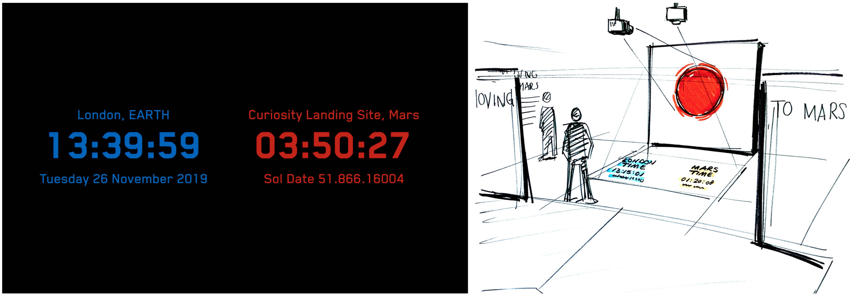
Note that the script says nothing about how we realise this. Is the landscape a large printed wallpaper? Digital screens? A projection? Is the floor made of real rocks, or something else? Those are practical things, not the experience itself. (Eventually, after considering many different ways, we chose using a large panoramic projection of real photos from Mars and a 3D-printed floor as the best way to realise it.)
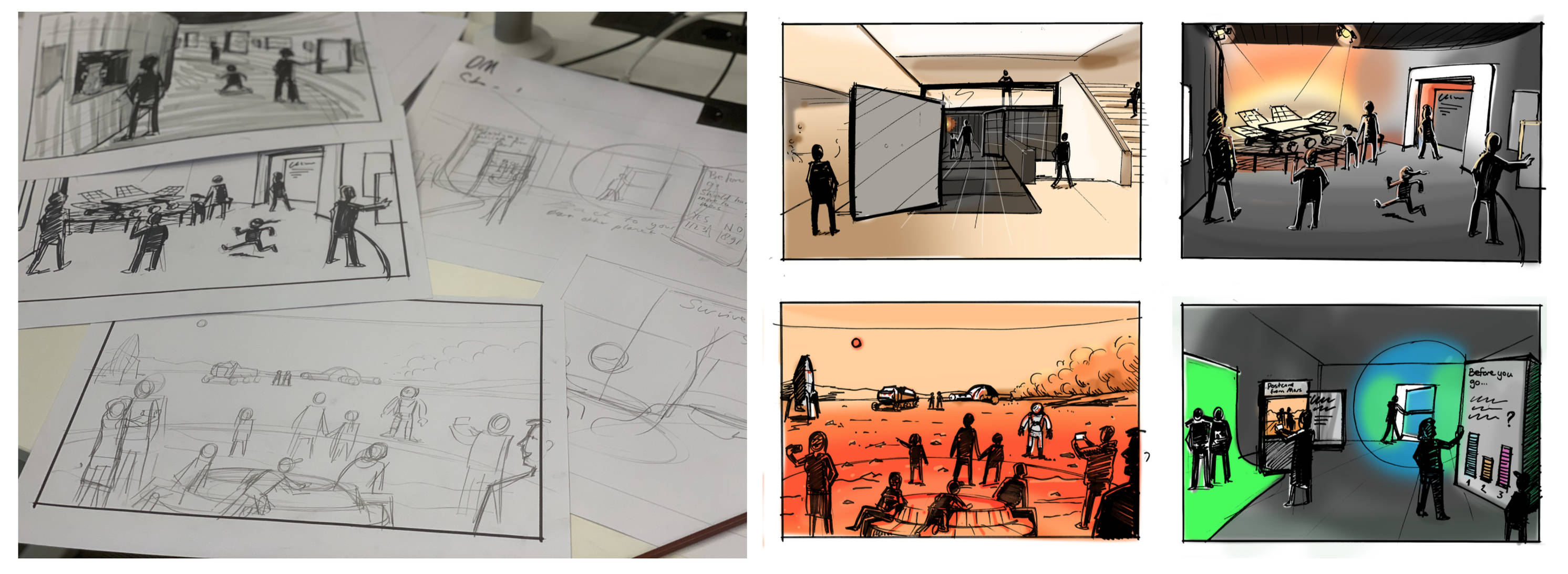
Of course, words alone are not enough. We visualised the script with storyboards, drawn from the visitor’s perspective. In the concept phase, our storyboard visualised the key moments of the entire exhibition. In later phases, we also applied storyboarding to visualise specific flows and to direct the panoramic video that would be projected in our ‘Mars room’.
Scripts and storyboards proved to be very useful techniques from filmmaking. Our next similarity with filmmaking is less literal, but was also crucial in designing the experience.
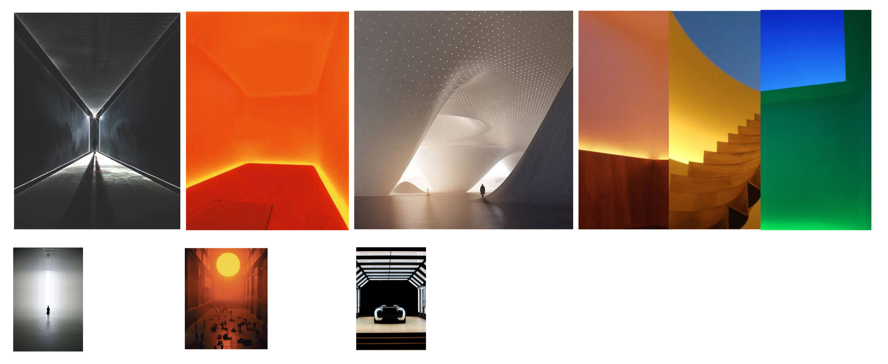
Colours, light and materials: our ‘cinematography’
In filmmaking, cinematography is the art of creating a visual mood that matches the story of a film. Filmmakers use light, colour and framing to direct the viewer’s emotions and attention. For our show, we also set out to create the right visual language for our visitor’s journey to Mars and back to Earth.
Very early on, we concluded that each section in the exhibition should have its own mood and atmosphere. Should the room be dark, or bright? Should the lighting put the focus on the objects, or on the space itself? Should the walls be smooth, or rough? This meant creating mood boards and colour schemes, and thinking about textures and lighting. We worked with 3D and Lighting Designers and a graphic production company to get the colours, materials and the feeling in every room just right. At the same time, we created a single graphical language, as the continuous thread throughout the exhibition. This could be applied to introduction texts, infographics and panels.
Building our sets: using miniature prototypes
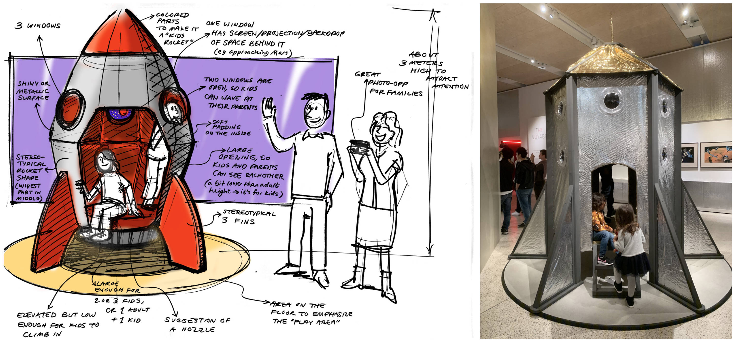
An exhibition is a very spatial experience. But how do you design for a space that is not yet available? After all, the exhibition space in the museum is constantly occupied with different exhibitions. It wouldn’t be available until two weeks before the opening, and all that time would be needed for building. Of course, we did have the building’s floor plan, and we had a look around in the exhibition space when the previous show was open. But we still wanted to have a better feel for the three-dimensionality of the space. And while we did use 3D design software like Sketchup, we mostly relied on a very old-fashioned technique: making scale models out of foam and cardboard.
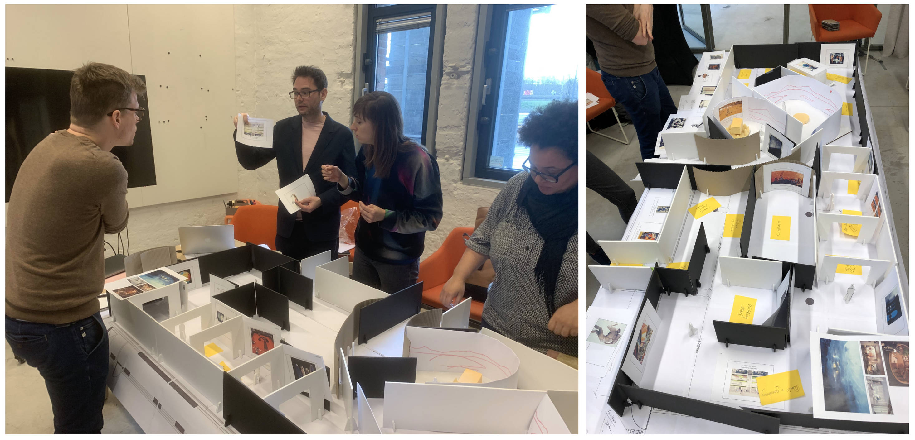
In the concept-phase, one of the curators visited our design studio to discuss our designs. We created a scale model the size of a large table to create the puzzle together of where objects and people should go in the space. Being able to walk around the model, discuss and try different layouts was incredibly helpful for a shared understanding. It was also a lot of fun to make and to co-create the space with the curator. We even took pictures from inside the model with a 360-camera. This allowed us to virtually walk through it, six months before the opening of the show! Later, we created a more refined and slightly smaller model to present to our stakeholders. We built it in Rotterdam and took it with us as a big puzzle set to be assembled in London.
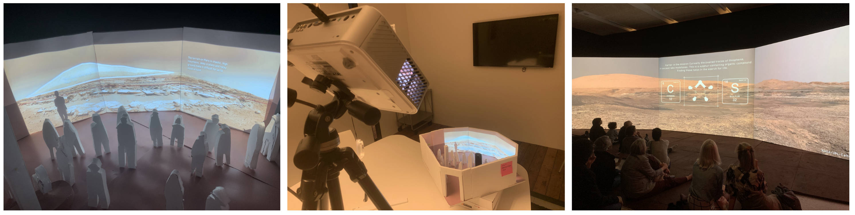
The highlight of the show would be the panoramic projection that we described earlier. To learn if our ideas for this room would work, we made a scale model and used a real projector and projection mapping. Is the size and layout of the room right? How many people will fit, without blocking the screen? What will you see when you enter the room? Again, we used a 360-camera and a VR-headset to put ourselves ‘in the miniature’. Often times, the design of an exhibition ends up being different from what everyone in the project was thinking. So we forced ourselves to keep seeing our designs through the eyes of our visitors.
Know your audience
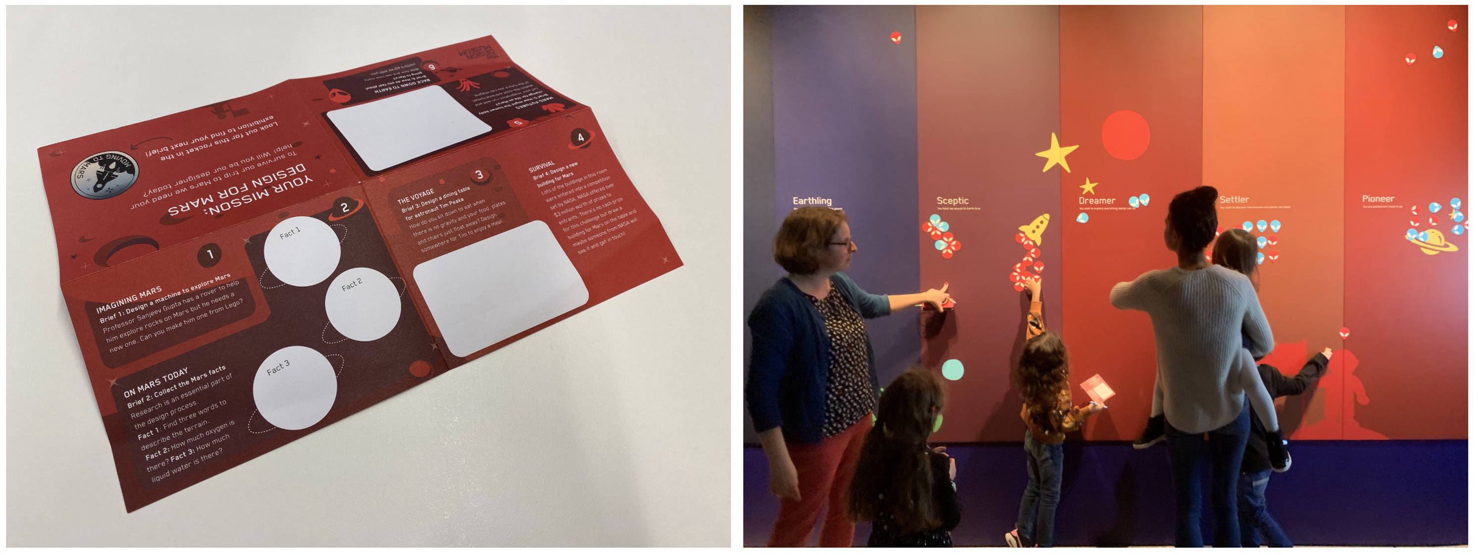
Making a visitor-centred exhibition is not just about a compelling story. It is also about making it very accessible and ‘easy to visit’, especially for families. After all, appealing to a larger audience was one of the Design Museum’s key goals. That’s why we took a ‘Family-First’ approach. If you are familiar with digital design, you may have heard of ‘Mobile First’: start designing for smartphones and expand from there to larger screens. Similarly, ‘Family First’ implies it is easier to make a family-friendly experience interesting for expert visitors, than the other way around. This meant we incorporated some important basics, which tend to be often overlooked in exhibitions. What is the best flow? How do people find their way? How do we handle large crowds? How do we entertain children, while their parents have time to look around? How do we stimulate social interaction?
From previous exhibitions the Design Museum learned that people are easily confused about where to go, in an exhibition space. Even though we tried out many different layouts, we ended up with the most simple one: a linear flow. This was also the best fit for our narrative, which is very sequential: from past to present to future. To engage children with our story, we created a ‘Mars Mission’: a series of design challenges throughout the exhibition that puts them in the designer’s seat. We created places in each room where they could work on this, like Lego and drawing tables. We also made sure that there are enough places to sit and rest throughout the exhibition. And lastly, we wanted to stimulate social interactivity: things people can do together, like our interactive, tangible wall at the end of the show.
Focussing on families helped us to make an exhibition that actually works for different visitors, on different levels. The visceral level (appealing to the senses), the behavourial level (easy to understand and navigate) and the reflective level (interesting and thought-provoking). But getting there wasn’t always easy.
Kill Your Darlings
Design can be a messy, frantic process. Our project depended on many different parties and stakeholders. And on a big, looming deadline: the exhibition’s opening date, which was already set before we started! Like with most movies, a lot of our ideas and designs ended up on the ‘cutting room floor’. There are always too many ideas, or ideas that turn out not to be feasible. So Experience Design is also about accepting imperfections, and ‘Killing Your Darlings’. Looking back, our biggest challenge was to create a memorable experience with limited resources. After all, the budget (while quite serious) was only so big. The exhibition space is only so large and the exhibition would only be temporary.
Luckily, having our Big Idea, Key Design Values and our Story helped us to make some hard decisions. Having the intended experience to go back to in reviews and discussions kept us focused on the visitor, not on what we liked. But did our visitor-centred process actually work?
How did our story end?
Remember we started with fictional take-outs? Almost a year later, we can see what people are actually saying, in reviews and on social media. And it looks like we reached our goals. Visitors’ reactions match up pretty well with our desired take-outs!
The exhibition is still open and attracting visitors and we are still evaluating its success. But it is safe to say that a structured and visitor-centred design process has worked for this niche museum. Applying experience design on an exhibition was a big step for the Design Museum. This project has kickstarted many transitions for the museum. From thinking about objects to thinking about the story. From taking the curator’s view, to taking the visitor’s view. And from focussing on design enthusiasts to focussing on families. Designing ‘Moving to Mars’ has been a challenging journey for us as well, teaching us a lot about creativity and constraints. In that sense, there are many parallels with a mission to Mars: from the start, we know it is going to be difficult. But if we really want it, we will get there!
We hope you get the opportunity to experience ‘Moving to Mars’ yourself. After its run at The Design Museum, 'Moving to Mars' will go on an international tour. Its first stop will be Sweden: from July 4, the exhibition can be experienced at Tekniska Museet in Stockholm (Sweden’s National Museum of Science and Technology). Or have a look at our design case.