Museum for people of today, and of tomorrow
The museum, located in Eindhoven, the Netherlands, is not only for art connoisseurs. It's a museum for everyone. With surprising and experimental exhibitions, the museum pushes the boundaries of its five floors. Everything to give art breathing space. To expose and reduce divisions in society. All this should be accompanied by an accessible website about the themes the Van Abbe Museum considers important.
Critical of the modern era
Van Abbe Museum is critical of the modern era. How can a museum of contemporary art show this? By exploring themes such as decolonization, climate change, inclusion and identity. By giving different voices a platform. Voices that have been forgotten or deliberately unheard by earlier generations. And by featuring all of these on their website. To inspire and connect all visitors, even those who don't visit the museum.
You cannot capture art, but you can give it space.
A new tone of voice to be truly accessible
Van Abbe Museum writes for people of today and tomorrow. That means being positive but honest. Inviting and contemporary. And as much as possible at B1 level: understandable for everyone. But fair is fair, the themes explored by Van Abbe Museum are complex, so if a B1 level doesn't work, we at least explain what it all means.
The design process
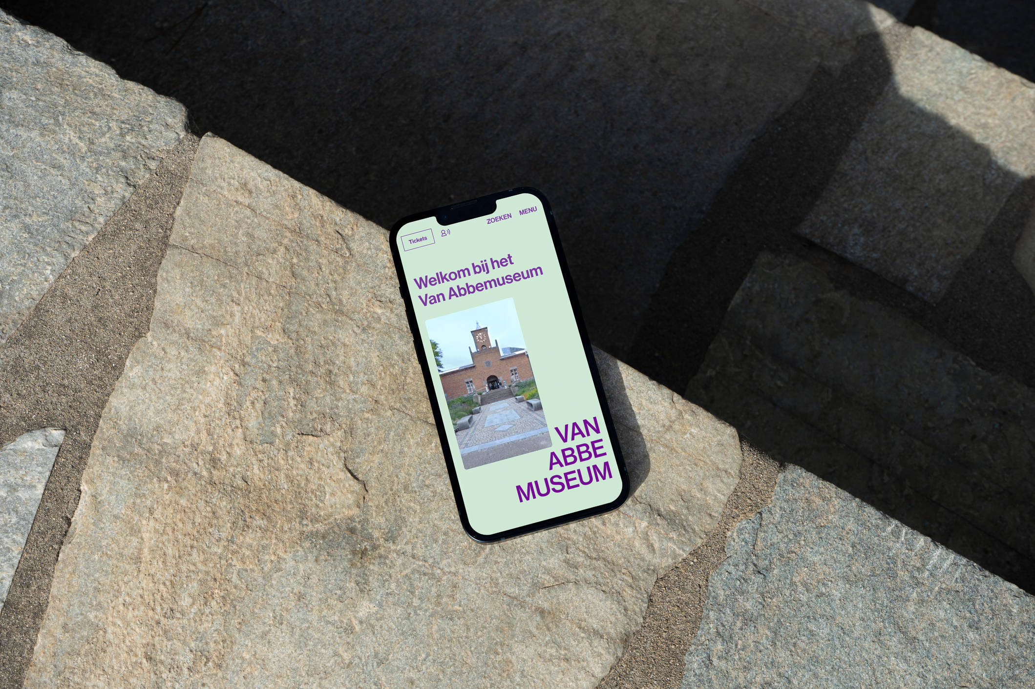
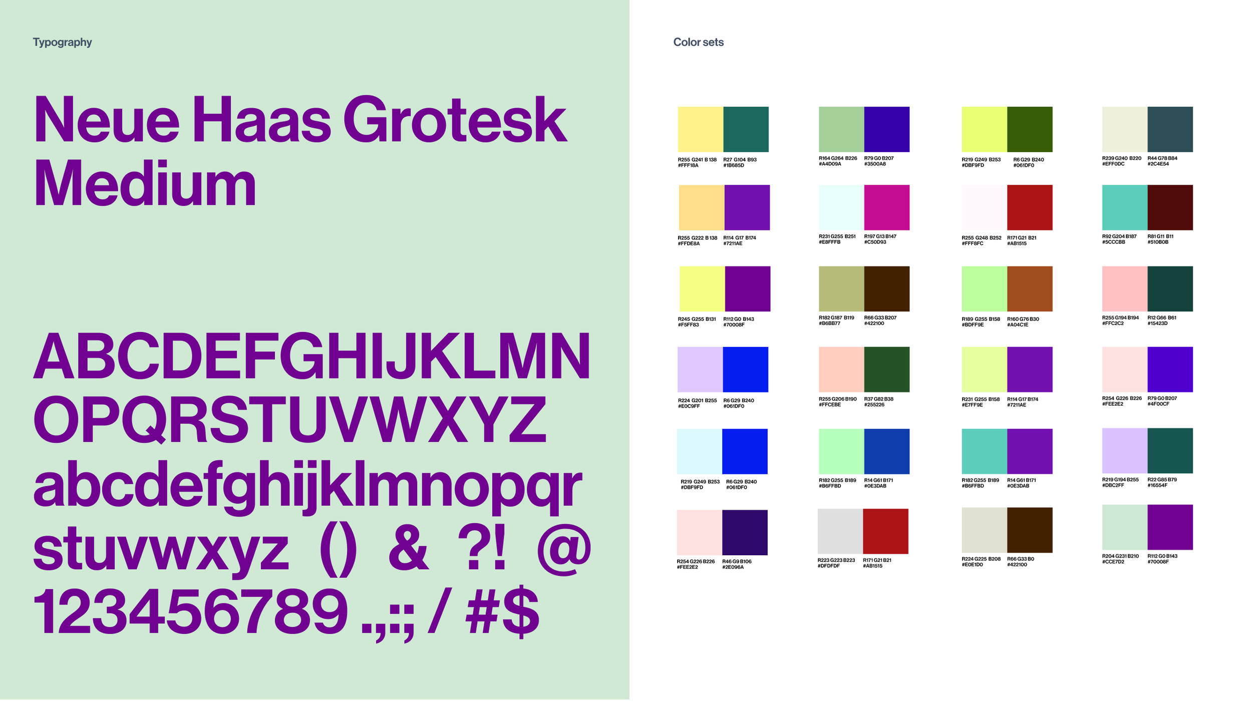
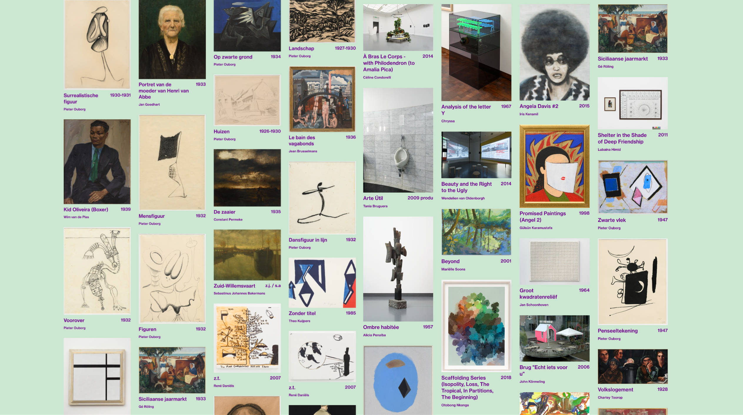
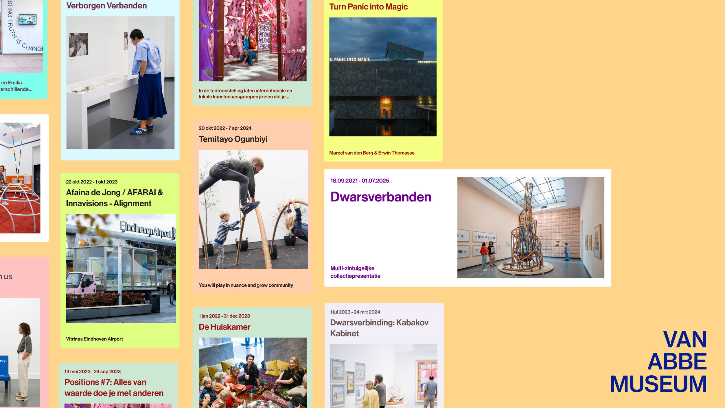
The museum chose Rotterdam-based agency 75B for their corporate identity design. Fabrique transformed the vibrant style they created into an engaging digital space. The online identity embraces playful color palettes and an uncomplicated use of typography, using only one weight. These elements, along with the rich museum content, form the pillars of the visual design.
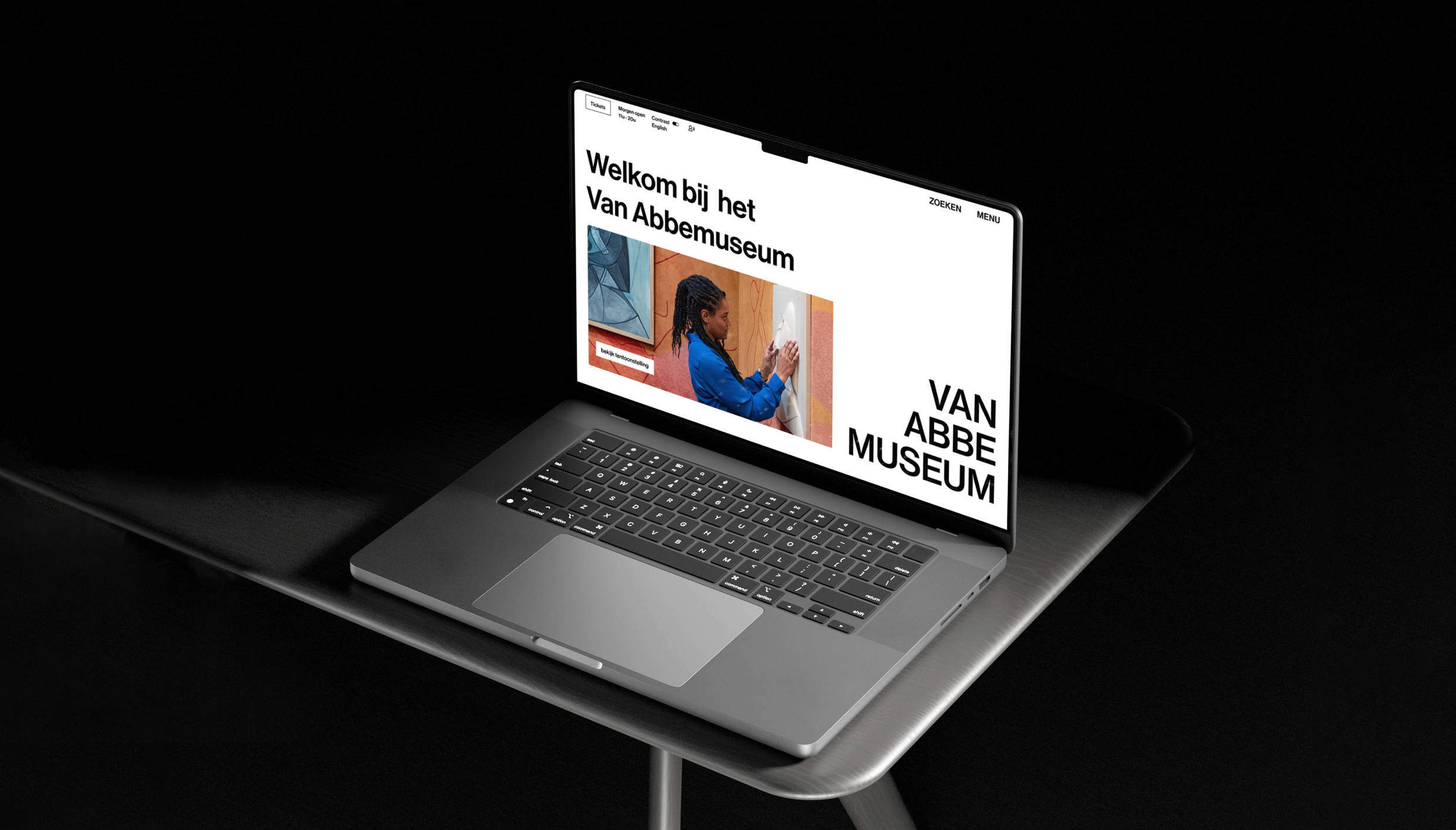
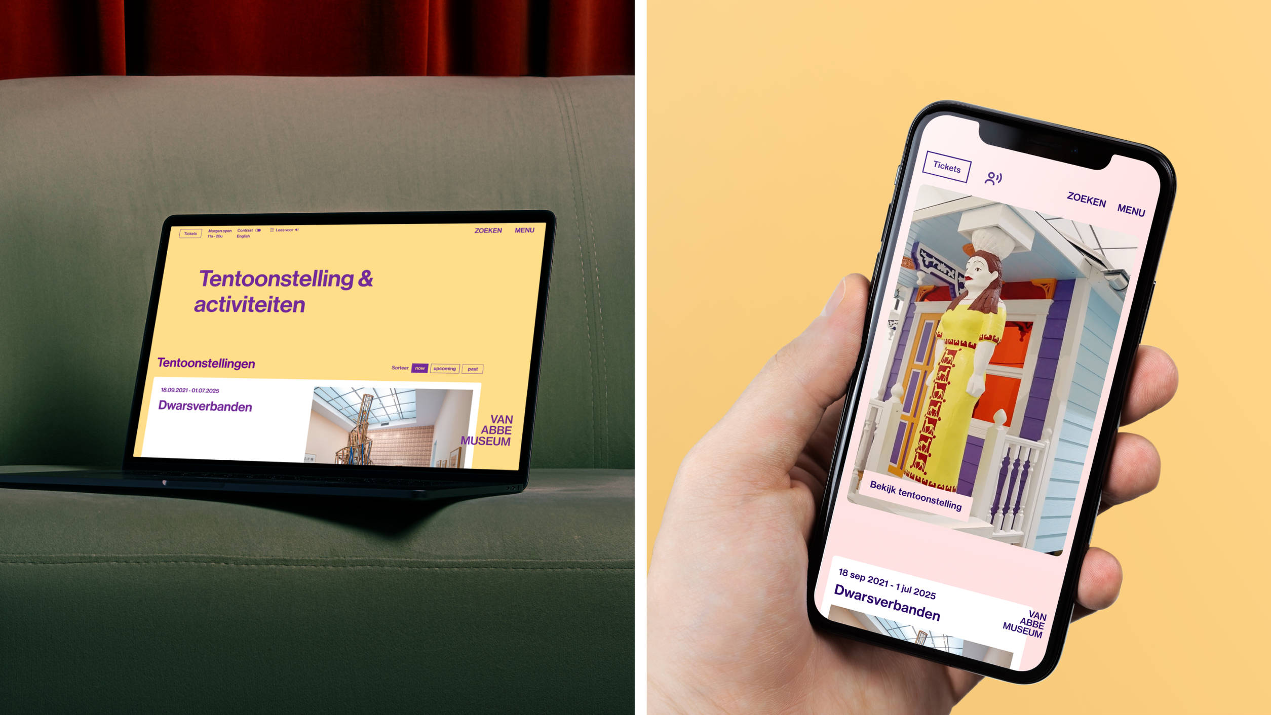
Our goal was to make visitors feel as if they were personally exploring the museum. Inclusiveness was central to this design process. The use of white space, bold layouts and an extensive spectrum of primary colors helped create a website that offers an inviting and versatile experience.
Designed by Fabrique, built by INTK
It was with great enthusiasm that we created the design of the new site. INTK was responsible for the technology, in collaboration with our design team.