Five things I learned while designing a ticket vending machine for the modern age
My heart skipped a beat when I heard that I would be co-designing the next generation of GVB ticket vending machines. GVB is the municipal public transport operator for Amsterdam, and this was the first time they had hired a design studio to develop the machine; the old machines had been designed by technicians and engineers. This time, ease of use was the main objective, also with an eye to speeding up customer flow. Together with my team of Fabrique industrial and UX designers I was ready to meet the challenge!
1. Hit the streets
I hit the streets to observe and question people. My goal was to learn how the current machines were being used, who used them, where they were located, which environmental factors were important and what the biggest user issues were. That led to insights on a surprising number of levels.
For example, many foreign tourists failed to recognise the machines as a place to buy tickets because they were labelled verkoop en opladen in Dutch. I also saw that it was unclear to people what many parts of the machine were for; for example, there was a prominent slot in the machine with the label “do not enter card here”, begging the question what a customer was supposed to do with it! Instructions were either incomprehensible, or they were somewhere outside the customer’s field of vision (probably pasted onto the machine later). A lot could also be improved concerning matters such as the products on offer, the design of the digital interface and the copy-writing. All of that was to be expected. But because I gained insights on so many other levels, too, I have learned how valuable this kind of hands-on research really is.
2. An integral approach is essential
How can all the ticket vending machine elements, together, ensure that users will confidently buy the correct ticket and quickly make way for the next person in line? An integral approach, I have learned, is essential. The software-hardware combination in this project made this doubly so. It all comes down to forging connections between every component, so that the user interface is experienced as one easy-to-understand flow.
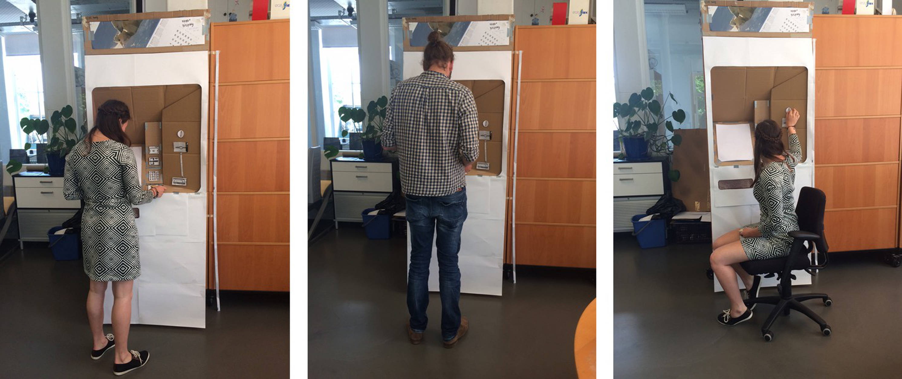
3. Keep it simple; one starting point for every transaction
Together with industrial designer René Bubberman, and other colleagues from our Public & Industrial Design studio, we created a cockpit with all the interface elements (software and hardware) grouped compactly; like a 3D Tetris puzzle.
The starting point for each transaction is the touch screen on the left. By orienting the touch screen with the long side up there is enough space for the various payment components on the right. Moreover there is also space to clarify the connection between the instructions on the screen and the physical elements.
4. Movement reinforces connection
We make the connection between the screen and the payment components by making a fluid, well-timed movement from the touchscreen to the physical component. In one fluid movement, a moving white rectangle with an arrow on the screen guides the user’s viewpoint to the component next to the screen which is then illuminated by a LED. A simple instructional text tells the user how to use the component, in understandable language.
Of course, this transition takes time, about one and a half seconds. But what it does for the user is striking; it reduces the time needed to find the right component by several seconds. This taught me once again that taking your time at the right moment often saves much more time later on.
5. Let website conventions go
Digital interfaces often feature arrows in order to make something feel clickable. I quickly realised that in the context of this ticket vending machine, these arrows now point to something tangible next to the screen. And where a white background is often used to create a calming effect online, the blue GVB machines actually allow white to be a salient colour. It turns out that many patterns and conventions which work really well on the internet do not work in software-hardware combinations. They need to be let go.
It is fantastic to work on such a visible product that will be used by so many people in Amsterdam. We have to wait and see when they are going to appear in the streets, but I’m convinced that we have designed a really user-friendly machine that even foreign tourists will be using with ease.
Anna is UX-lead at Fabrique. She studied industrial design in Delft and her interests lie especially in UX challenges with a broad user context, software-hardware combinations and projects that cannot be realised without design research.