Competing goals in public space
At the Vakbeurs Openbare Ruimte 2026 in Utrecht, everyone wanted the same thing: places that are inclusive, green, sustainable, safe and lively. But these goals clash, with each other and with the regulations meant to safeguard them. If you only follow the rules, you can design a place that works on paper but fails in reality. After all, there is no standard for usability in public space.
Shared space
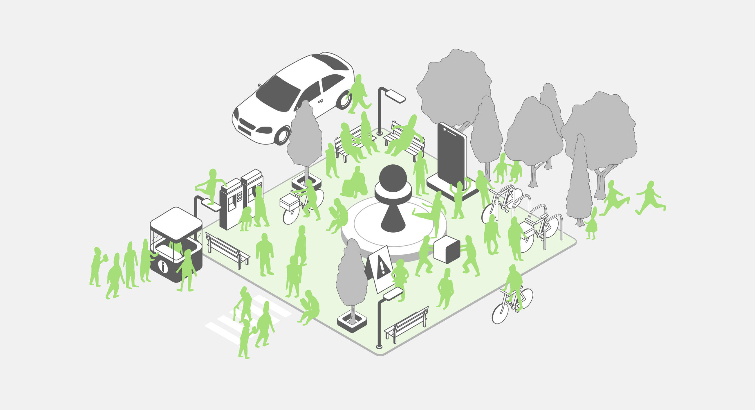
In a country with little space, we have to make the most of the space we have. Traffic engineer Hans Monderman came up with shared space for exactly that reason: a space without signs, traffic lights or kerbs, where functions and users come together. Because everyone has to negotiate with one another, everyone becomes more careful. And it worked: at the De Kaden junction in Drachten, the number of collisions dropped from 30 in seven years to four in two years.
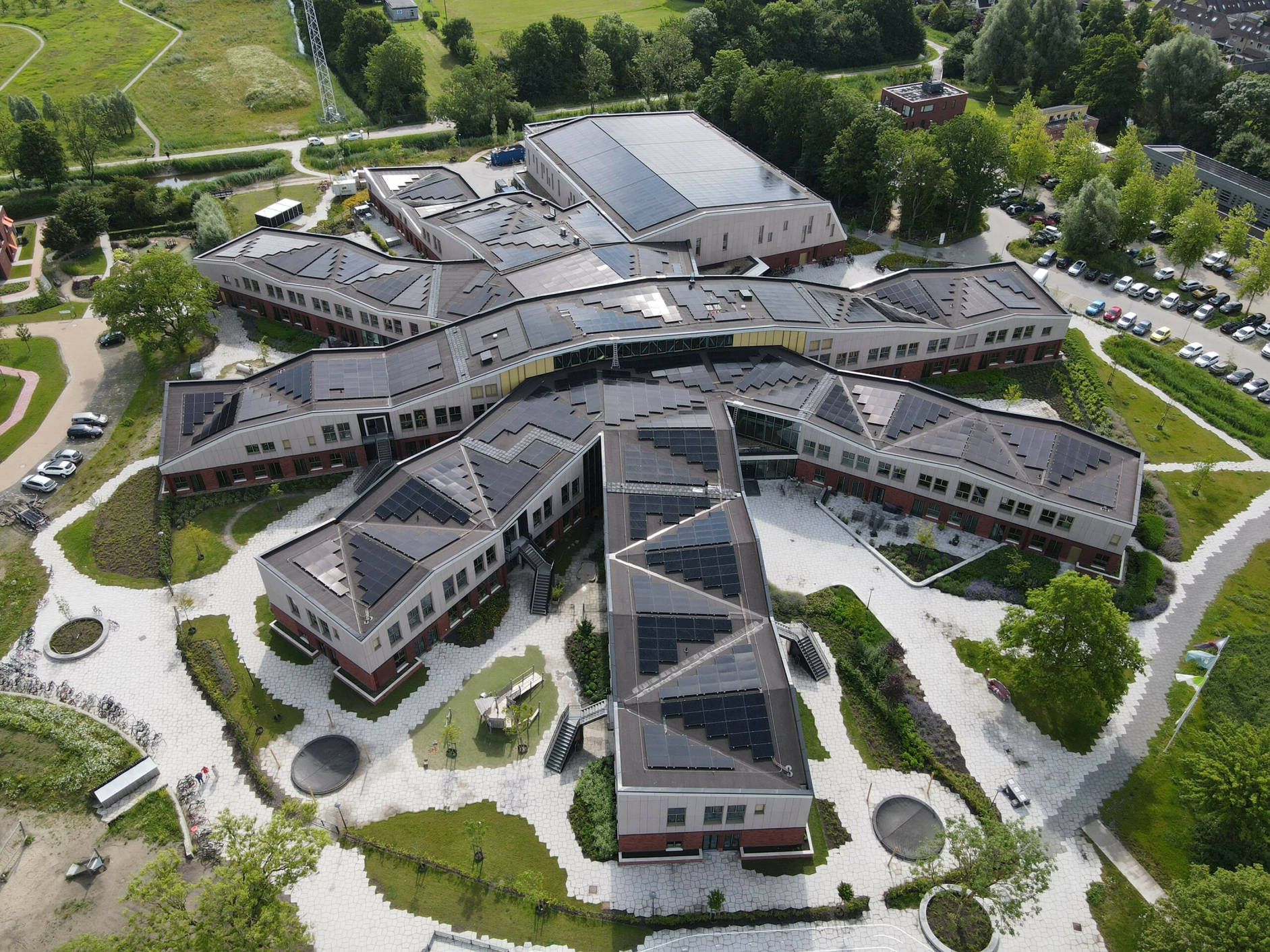
Shared space asks a lot of its users. Without rules and guidelines, the space is harder to read. For many people, including those who are blind or visually impaired, older people who aren't used to it, and people with dementia, it is difficult to anticipate how others will behave. How do we deal with goals that conflict this much?
The potential of in-between
Places under development often go through a period in which the space is barely used, if at all. Seen with fresh eyes, a vacant lot is a giant sandpit, or a venue for a neighbourhood party. By opening up these places, we add value right away. For designers, it's also an opportunity to prototype in a low-threshold way and involve residents early on.
But here, again, we find friction: grass, sand and loose ground aren't accessible to someone in a wheelchair or with another disability. Are we excluding those people? And is that a reason not to open the space at all?
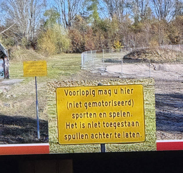
Side text: In the session by Marjanne Steenhuis and Dianne Scholte of the Kenniscentrum Sport & Bewegen (Knowledge Centre for Sport & Physical Activity), a telling example came up: a sign at a site that had been temporarily opened to residents. The initiative is exactly what many residents want, a place in their neighbourhood they can already use. But the sign itself shows how easily things go wrong from there. It reads: "For the time being, you may exercise and play here (non-motorised). Leaving belongings behind is not permitted." The invitation quickly reads as a warning. Usability, or the lack of it, also lives in how we communicate about a place.
Feeling unsafe on the bike
The death of Lisa, a 17-year-old girl who was cycling home from Amsterdam last year along a route long known to be dark and unsafe, sparked a wide conversation about women's safety. That conversation could be felt at the fair. Many municipalities respond by following the standards even more strictly. In practice, that often means: more light.
Yet more light doesn't automatically mean safer. Strictly following the lux standard in an underpass often results in bright lamps shining straight down. The ground is well lit, but dark corners remain, there's little overview, and there's a harsh transition from light to dark that your eyes have to adjust to. What people actually need is overview, the ability to recognise faces, and consistent lighting. It proves once again that rules alone don't guarantee safety: you can meet the standard and still design an unsafe place.
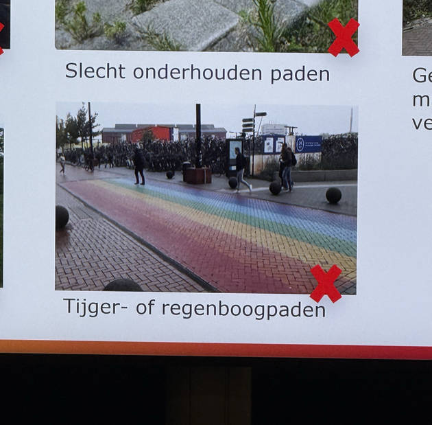
You see the same thing with a rainbow zebra crossing. It's a sympathetic and visible signal of inclusion, but look at it from the perspective of different users and you also see the downside. Someone with dementia may not recognise the colourful stripes as a crossing. And for people who are visually impaired or colour-blind, the contrast is less clear than on a classic black-and-white zebra crossing. A gesture of inclusion can end up excluding certain groups.
A standard for usability
Public space is extremely complex, and every good goal comes at a price. The existing standards provide direction, but they also reveal what hasn't been standardised yet. We have good accessibility standards for public space, but accessibility is not the same as usability. Accessibility is about whether you can reach and use a place. Usability is about whether you understand that place, feel comfortable there and know what's expected of you.
At Fabrique, we research how children, older people, people with disabilities and women cycling home at night experience a place. Especially where goals and rules clash, that makes the difference. We design from the user's perspective without losing sight of the larger system. This way, we make sure people understand a space, find their way and want to come back.