Museum wall text
Now that there have been subsidy cuts, the business model for many museums has had to change: they need to attract more visitors, preferably ones with deep pockets. The recipe: make the museum more accessible. Digital guides, paper guides, options for before and after the museum visit and - my chosen subject - wall text. Over the next few months we'll read what the walls have to say.
Trust us, this is art
Years ago, the Rijksmuseum launched 'Art is Therapy', a project by the self-proclaimed philosopher Alain de Botton. In his opinion, texts on signs in museums are 'factual' and 'boring'. That’s not the point that I want to make. Those little signs should be factual. I want to focus on the wall texts that introduce an exhibition. Not always, but often, those texts are long, far too long, and leave little room for interpretation. A pity, because although introductory knowledge is useful to appreciate an exhibition, the final verdict is up to each individual visitor. Questions such as “What is art?” simply cannot be answered unequivocally. Is quality an intrinsic value, or is it a value that we assign to something? It is no coincidence therefore that it is precisely those museums with a collection that is not (yet) automatically labelled by everyone as unparalleled, that you will find the longest and most complicated texts. Because they are trying to say: “We want you to know that all of this is art, including that picture of a gentleman who is putting his ding-a-ling into a veggie burger. Yes, really. You see, the artist is confronting the viewer with entrenched Western ideas about identity.”
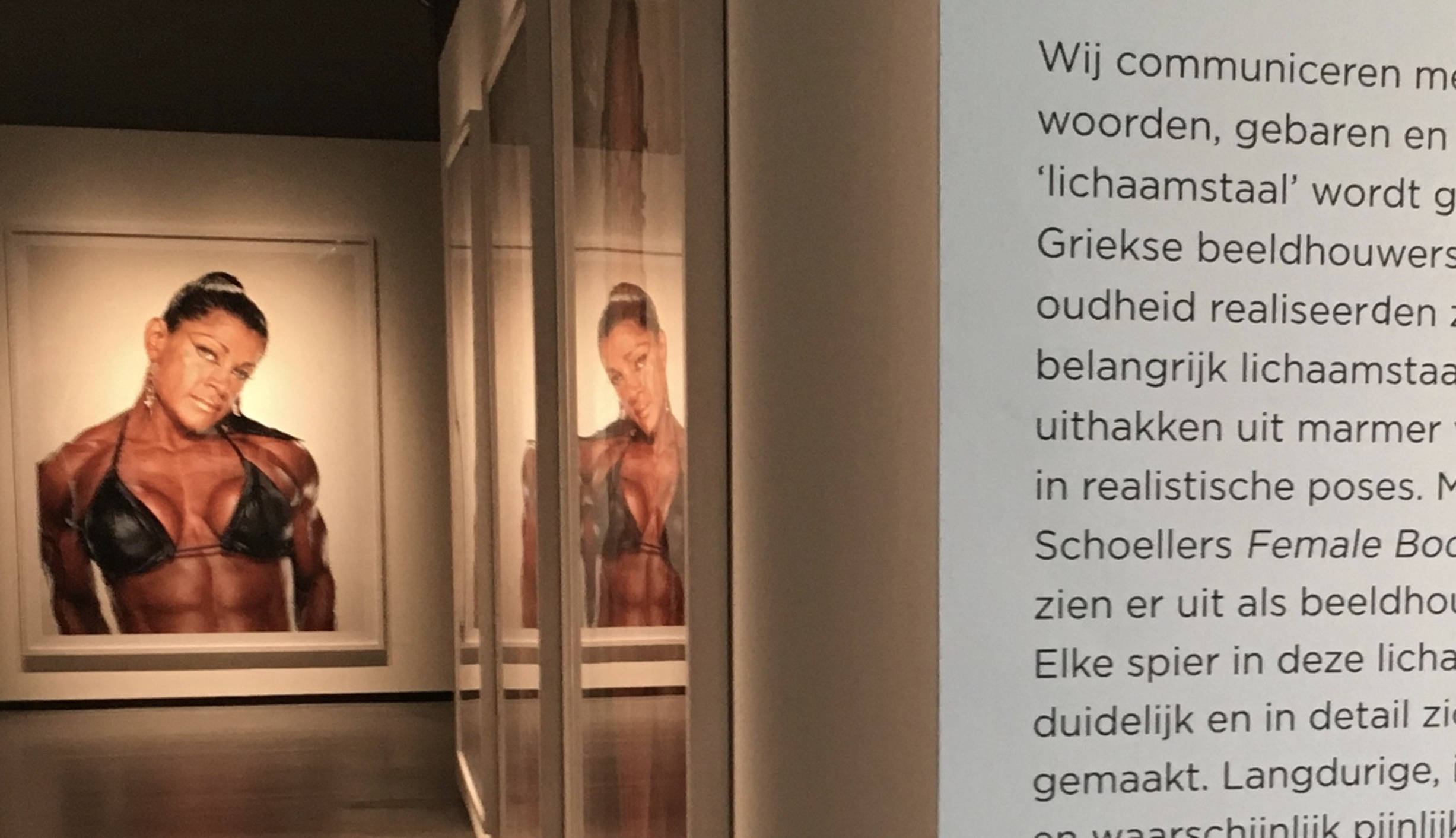
An example. Big Heads, in Nederlands Fotomuseum in Rotterdam, is a wonderfully accessible exhibition with texts that ruin everything and create distance rather than give an explanation:
Portraits like these raise questions about the supposed 'uniqueness' of our identity. From a different perspective, these portraits also question our identity and uniqueness as results of our genetic origins, education and life experiences.
Or an example from the Kunsthal, which was displaying extravagant objects by Joana Vasconcelos. If you could have just walked past them, you would have been able to think about what they meant, about why they felt repellent or attractive. But you weren’t given the chance to do that, because right at the beginning there was this huge text. With passages like:
It is only on closer inspection that humour and irony, but also seriousness and dedication, reveal themselves. Her enlarged objects flirt with the society of spectacle, showing her emptiness and celebrating her energy at the same time.
This is the curator or the education department speaking. This is not making the art accessible for everyone, this is justifying the exhibition for the incrowd.
Easy-to-process chunks
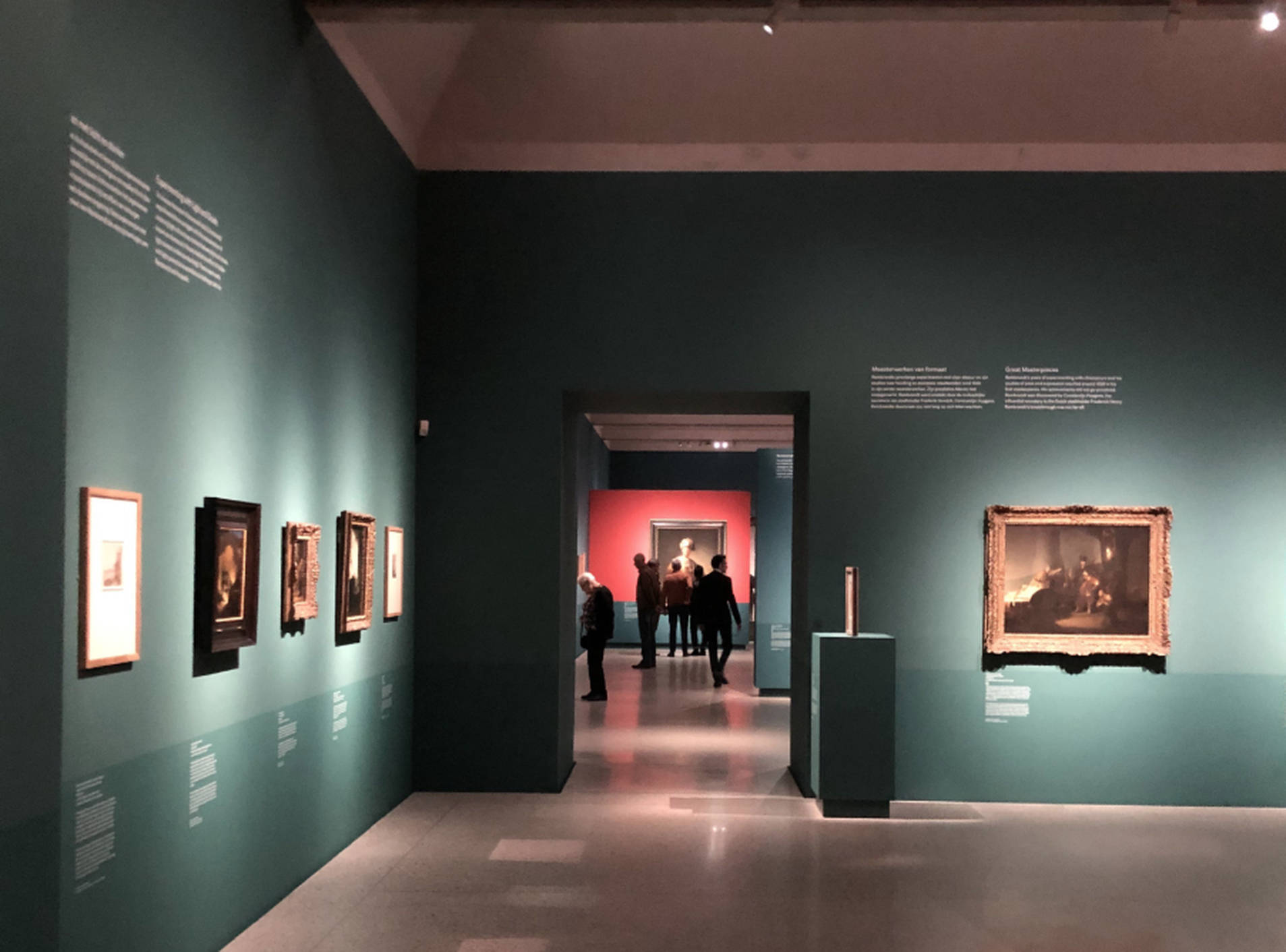
Time for something positive: the exhibition Young Rembrandt - Rising Star in museum De Lakenhal in Leiden. This time there’s no entire tome on the wall as you enter, but there are short paragraphs that guide you through the exhibition. Visitors can choose to read the general points above the works of art, or, for those looking for detailed information, there is text under the paintings. It makes for a varied picture: some visitors stooped close to a painting, others walking by while reading from a distance. The texts are worth reading: factual and narrative. But - let’s be honest here - Rembrandt does not need any explanatory or prestige-enhancing texts.
The text will put everything right
Sometimes a museum attracts a big name that is not synonymous with art. An interesting premise, but apparently that's not enough: the big name must stand for great art. Solution: let the text put everything right. Here is an example from the Bonnefantenmuseum, where film director David Lynch exhibited as a visual artist:
[...] But his work as a visual artist is much less well known. This is strange to say the least, since Lynch himself has always stressed that he sees himself above all as a visual artist.
That’s funny. Suddenly the man we know as the director of Twin Peaks is a visual artist. And it's our own fault we didn't know, because he sees it as self-evident.
Follow us, do it for the art
Art deserves plenty of attention. Attention from museums and from visitors. The fact that exhibitions are becoming more accessible is a great thing. But imposing a judgement does not do art justice. That's why in the coming months I will discuss one exhibition at a time on the basis of wall text. Let's all copy the good examples. The art and the visitors deserve it.