Inclusive Design (part II)
8 hands-on tips and tricks for an inclusive design approach.
In part I of this series, I stated that designing for all makes your service better for everyone. In this post, I share eight tips and tricks on how to design inclusively.
1. Close your eyes 🙈
What would your website or app tell you if it could talk? How would it sound? And how would it interact with you?
Many users with impaired vision use screen readers. Screen readers are systems that speak aloud information from a computer or phone display. So how can you design for that? Ok, here we go.
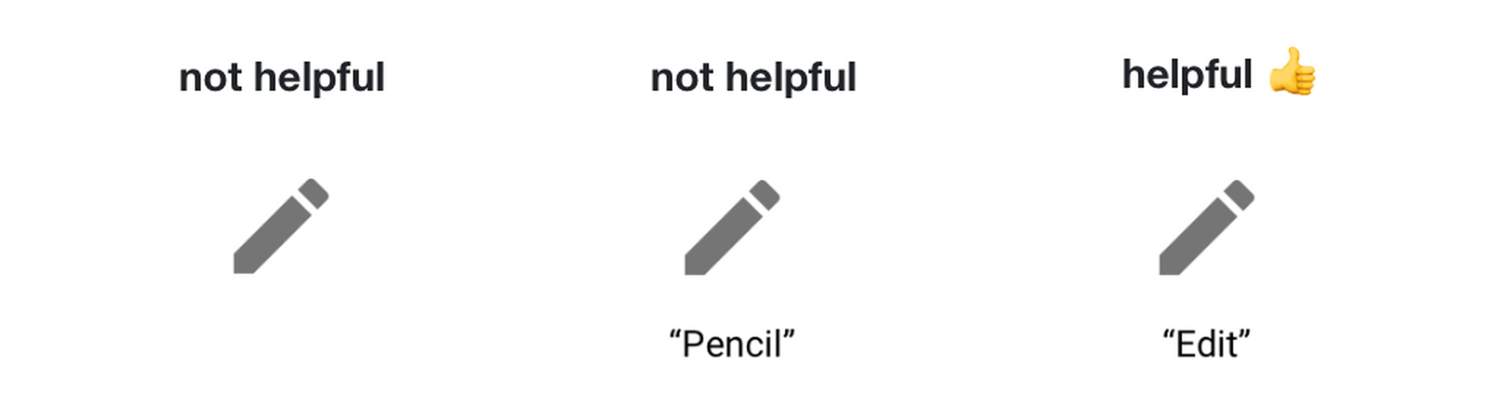
The most important thing to keep in mind while designing for screen readers is the order of the interface elements. Below you find two design variations of a search bar. In the example on the left, you would type something, then go to the next item on the page and completely lose the context of the search field. In the example on the right, you would type something, then go to the next item on the page, which is the search button and use that button to start searching.
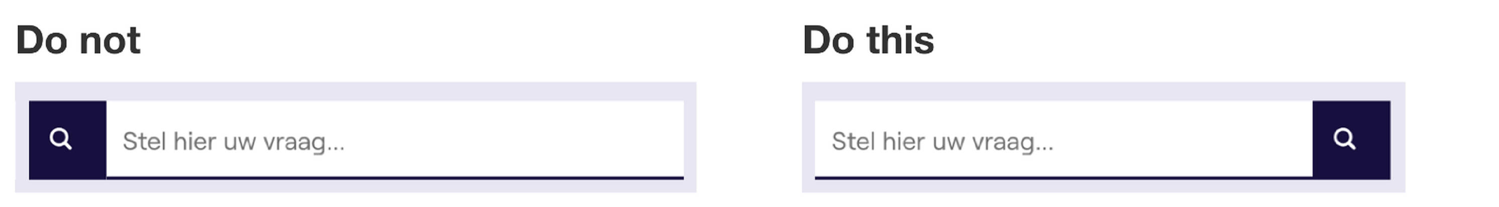
Placing the search button on the right-hand side of the input field is not only helpful for users with a screen reader, but also for people using a keyboard to navigate.
The importance of logically ordering interface items on a page also applies to the basic structure of a page (H1, H2, body, etc.) and your site or app structure in general. Not only does it make it easier to use your website with a screen reader, but it also makes the site more easily scannable for reading users and is good for SEO 🙌
2. Use your smart designer brain
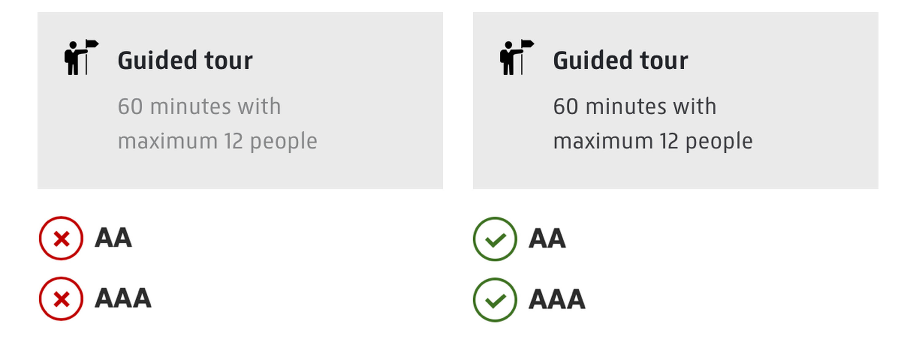
When designing, make sure your interface elements, especially typography, has good colour contrast. If in doubt, a tool like Stark could help you out. Use the result as a guide though, not to check the boxes. Use your smart designer brain and be honest with yourself about usability vs. ‘this just looks nice’.
“Standard accessibility guidelines are just that: guidelines. They’re the minimum. But we’re not here to check a box, we have to work across the organization to provide the best user experience.”
3. Icon + colour + text
Visual feedback such as labels, colours, and icons help users understand an interface. Icons do not provide clarity by themselves. What do the icons below try to tell you? Probably you have a pretty good idea about two or three of the four icons. Would you be surprised if I tell you the rectangular icon is the exit sign?
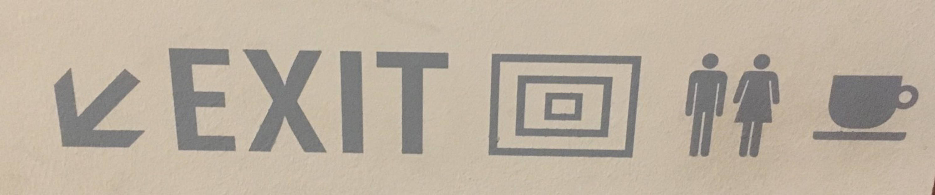
When you use text labels to clarify the icons’ meaning, it helps everyone, including people with slight mental handicaps or colour blindness.
4. Form follows function
A much-discussed topic. This principle basically tells you a chair should look like a chair and not like a goat. Makes sense, right…?
The beauty is in the functionality that you’re designing. A button looks like a button and a video block has a play button. Explore and use your creative freedom to the max, but don’t change overly clear interaction patterns without thinking about it twice. Sometimes life can be that simple, I love it!
If we look at this principle from an inclusive design perspective, we will see that all people, not only those with disabilities, are able to use a product faster and more intuitively.
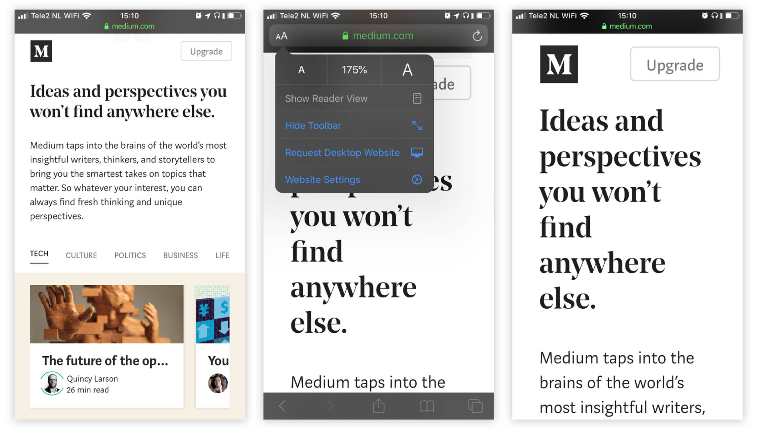
5. Design for scalable fonts
Ask around, for sure a couple of your colleagues or friends use a bit bigger font setting then you do. You will find your mum is no exception with her 150% font size setting.
As designers, we make interfaces look nice, scannable and usable. For example, we try to make it easy for you to first scan and then read a story. We do this by creating visual hierarchy through various fonts and font sizes. Make sure your interface doesn’t break when adjusting the font size or scaling with browser functionality. Medium does this quite well.
6. Content is king
Content plays a big role in making a nice and usable service, website or app. Things that matter most are:
- Make sure you communicate important messages in text and not only in images or diagrams.
- Write proper descriptions for images (called alt-texts), so a user can hear what the image contains. Tip: don’t make the screen reader skip the images even if they are decorative. Users will vaguely see an image, but won’t hear anything about it.
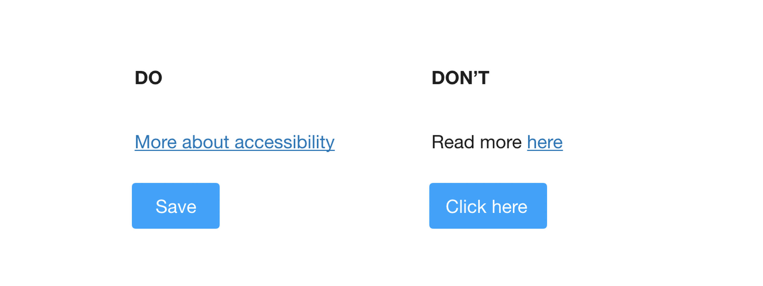
- Write short and useful copy and link texts. A button that actually tells me what it will do when I click it, is not only better for users that use a screen reader tool; it makes the page more scannable for all users.
7. No automatic changing content
Do not use automatic changing content, like an automatically sliding image carousel. It is extremely distracting for people who cannot focus easily. Apart from that, we know from usage data that most users scroll past these carousels before they will ever see slide 2 or 3 anyway.
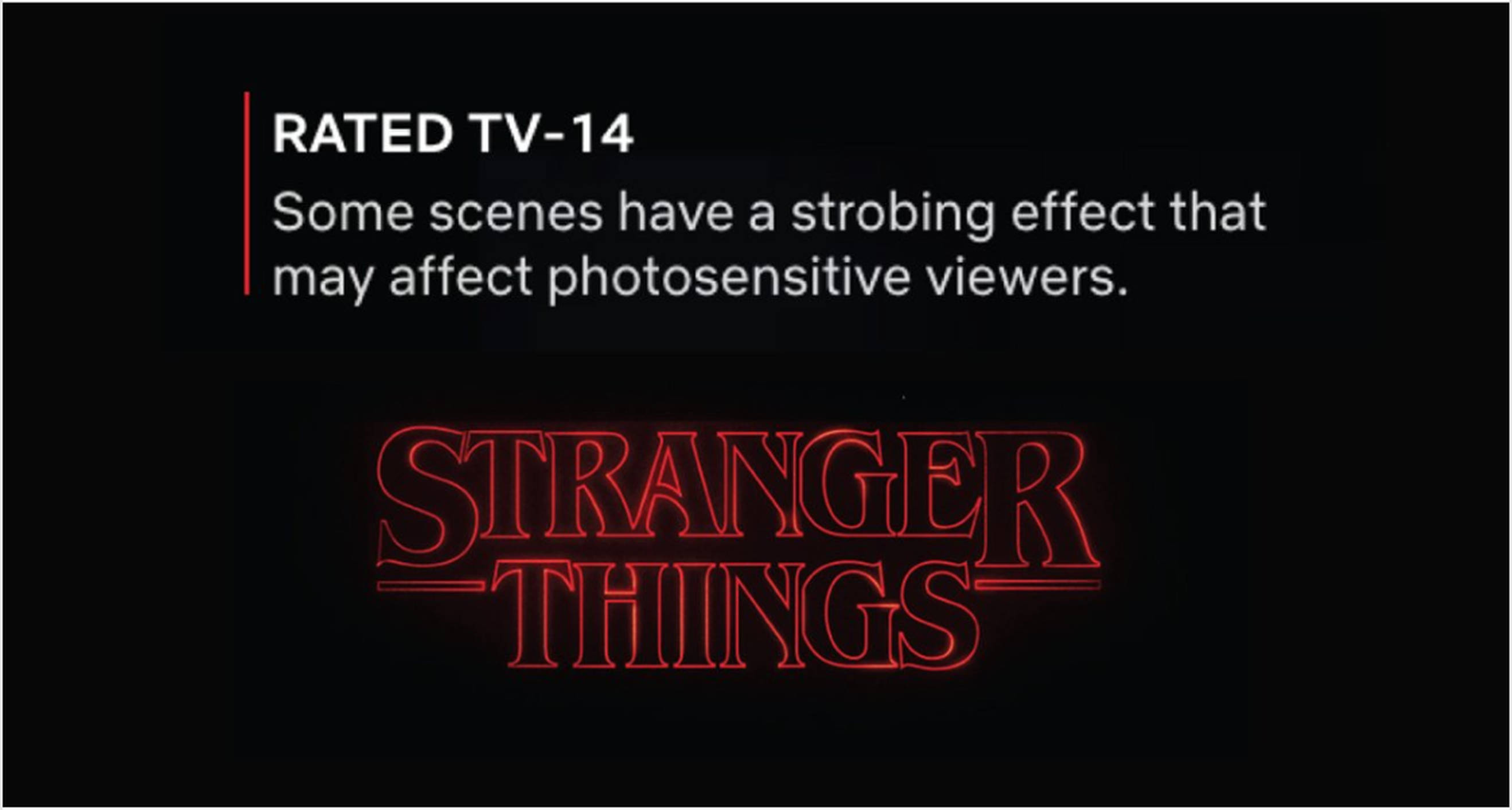
Be thoughtful about blinking or flashing content. You don’t want anybody to get an epileptic seizure from your service, game, website or app. Also, many people have trouble processing quickly changing information. This results in unusable product features and a noisy user experience. Can’t take it out? Allow users to disable it — or at least warn them. Below you find an example of Netflix, warning for people with migraine, epilepsy or other conditions that may cause seizures.
8. Your mum thinks you’re great
The last and most important point I want to make is to test your work. No matter how shitty (or shiny) your designs are, your mum will always tell you that it’s great. Ok, she might use a scaled font size on her phone, that doesn’t make her an objective respondent. Testing your designs with real people helps you find basic usability problems. The same goes for testing with people with a form of disability.
Woohoo, you now know the basics! Awesome 🙌

One more thing
Inclusive design is about delivering outstanding user experiences. It can spark innovation by looking at things differently. Take gender-based marketing as an example. You could increase your sales majorly by not asking your users if they are male or female, but make your targeting even more personal and learn about the type of products your users are interested in in a different way. Gaby Barrios shares her insights in her Ted Talk on this topic.
Thank you for reading this post! In the next blog post, I will tell you what we learned from the usability test with visually impaired users that we are organizing this month. Stay tuned!
Further reading
Microsoft.com/design/inclusive/
Inclusive design — the what, why and how
Q42’s podcast on accessibility (in Dutch)
Hi there. I’m Wendy Steffens, a UX designer at Fabrique digital agency. I truly believe everybody plays a role in the journey towards a more inclusive web. What’s yours? Let me know via wendys@fabrique.nl