“Oh, there’s an app for that? AND IT’S FREE?!”
More and more apps, designed for specific locations - think airports, shopping malls or museums - are being released. And it often seems that the project stops at the moment the screens are finished. We've designed a lot of apps for cultural institutions and museums, for example the Rijksmuseum, the Van Gogh museum, the Tate Modern gallery and Museum Catharijne Convent. And with every project we discovered new things and tried to do it even better next time. Time to share 8 tips and tricks on how to (better) introduce your location based app to the analogue world.
The biggest insight that triggered me to write this article is: The success of an app depends on more than a smart concept and good design. Take for example a museum visit. For a lot of people that is still a very physical, analogue thing. Thus, if you design a super-awesome new app for a museum, you need to trigger the average museum visitor and make them curious about your service. You need to close the gap between the app store and the tourist that is waiting in line. When it comes to services for specific locations, our secret ingredient is called offline-onboarding: a crucial step within the user journey that refers to the offline moment / time / place / touchpoint in which you introduce your user to the app. It includes lots of small things you can do during the project that are smarter and cheaper than traditional advertising means. A step that is crucial in a project and unfortunately often neglected. So, let’s go offline again!
1. Make it a thing before it’s a thing
To make sure there is enough attention, budget and time, include offline-onboarding as an extra step within your project proposal and process. Think about what is needed to successfully onboard your users. How will the app be introduced? Where and when will people come into contact with the app? If visitors have any questions, who or what will answer them? If you think you can avoid these questions through intuitive design or in-app onboarding screens: the skip button is there for a reason. Users tend to only think about their goal, and about reaching it as fast as possible. They use the first and best solution they can find and skip the instructions. (This is called the production paradox, a concept which was introduced by J.M. Carroll and M.B. Rosson at IBM in their seminal 1987 article ‘Paradox of the Active User’). Thus, if nobody reads the explanation, it all depends on self-explanatory design. If users get stuck in your service and there is nobody on site to answer their questions, they will probably delete your app and leave a bad review...
2. Make smart use of (free) resources
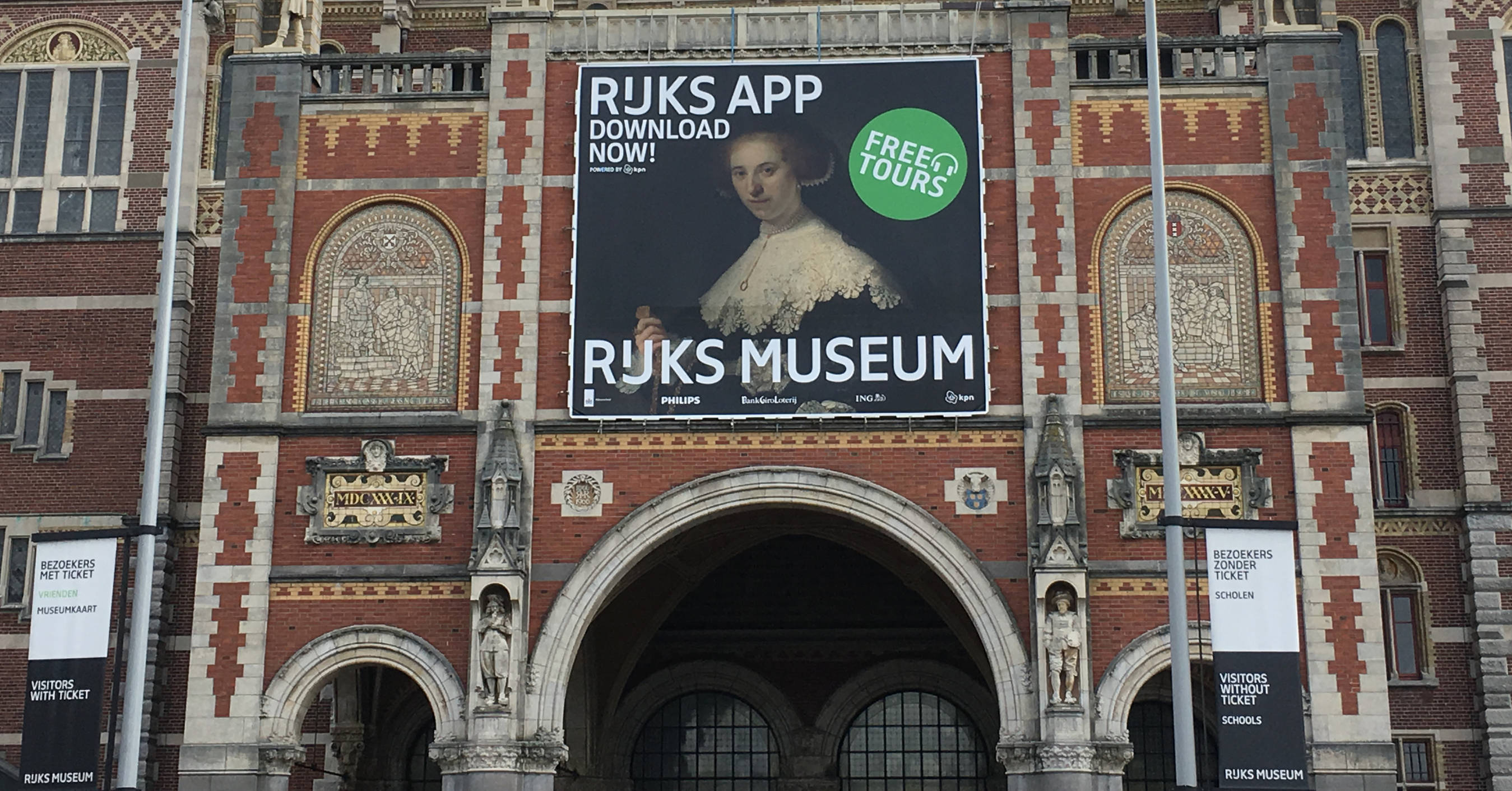
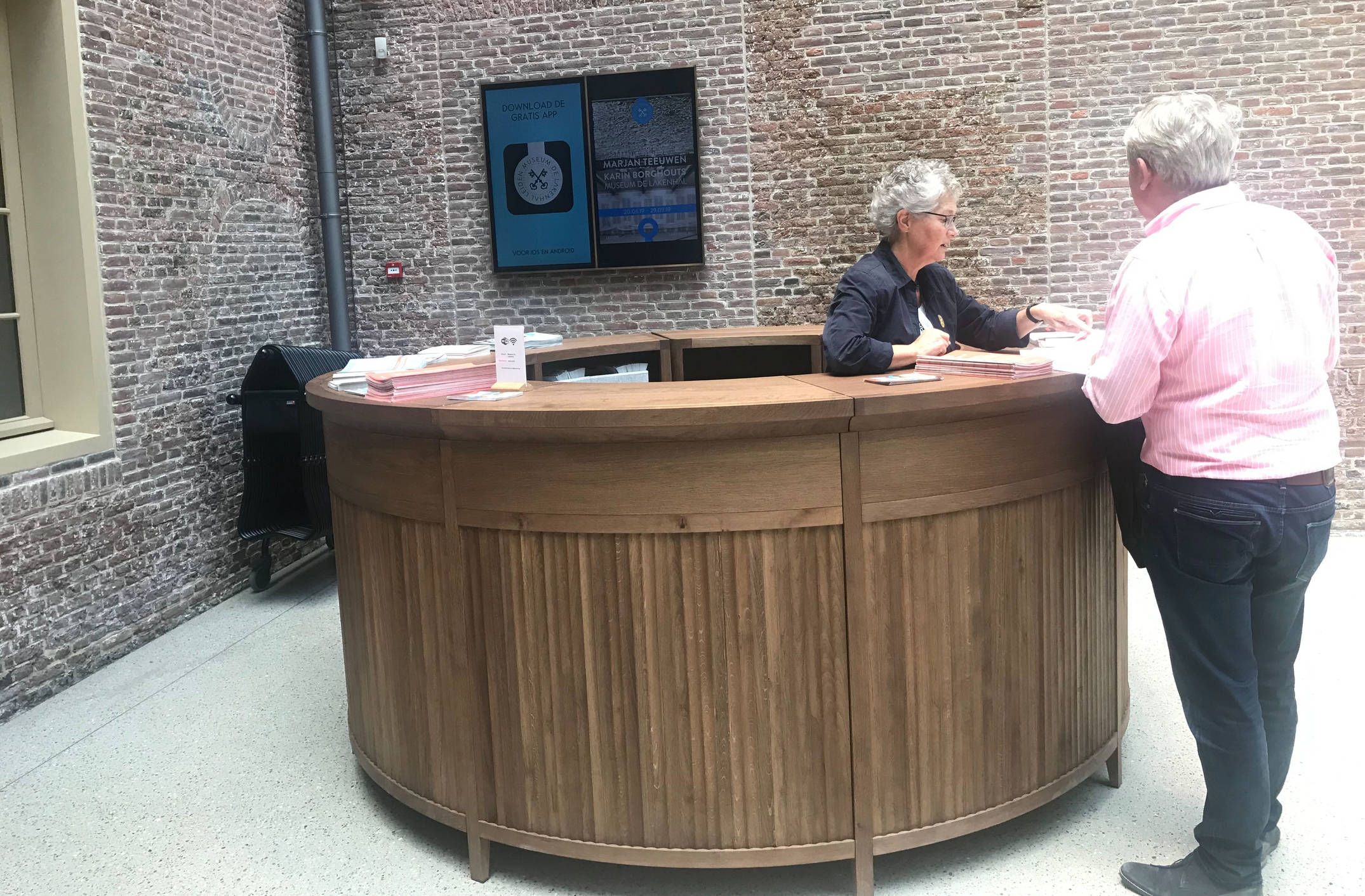
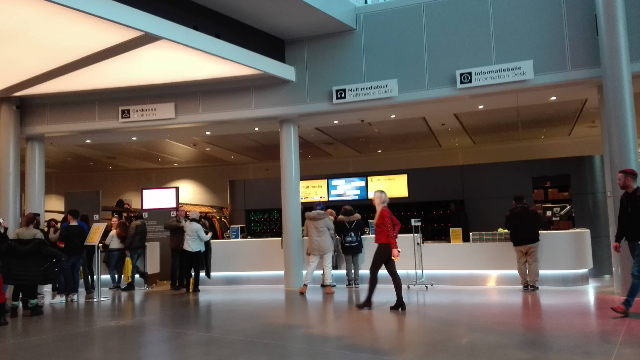
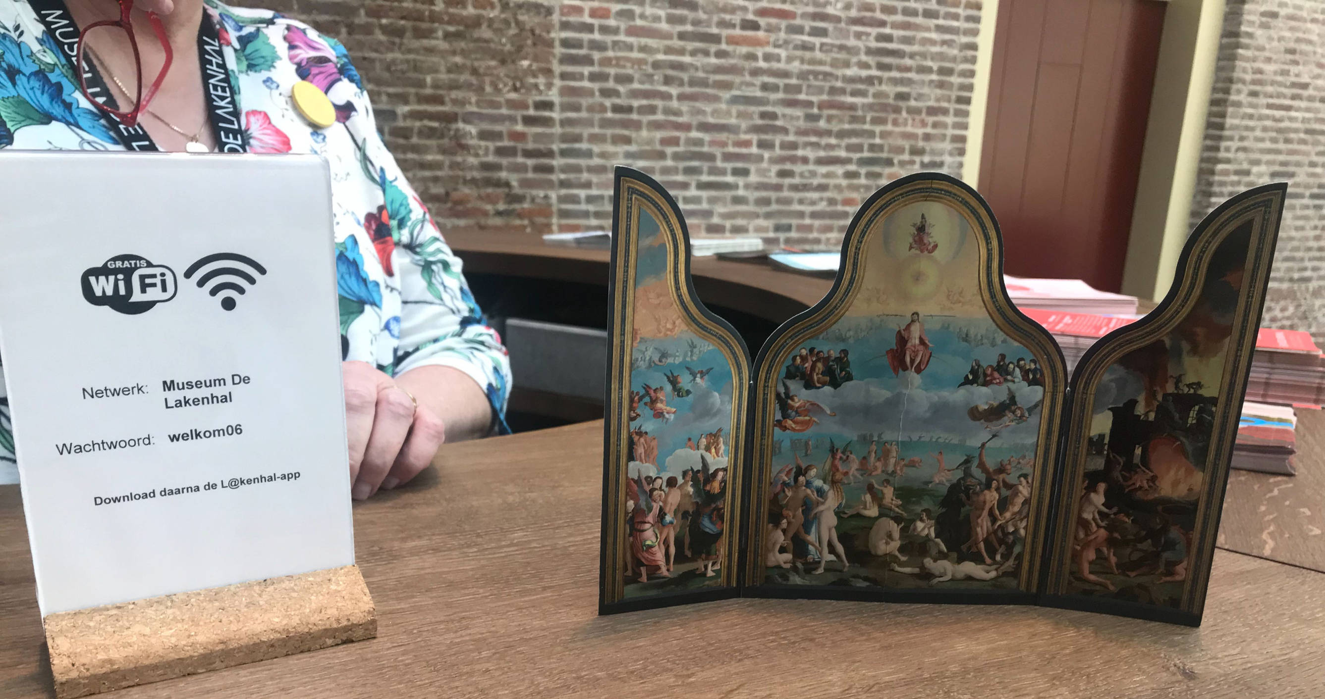
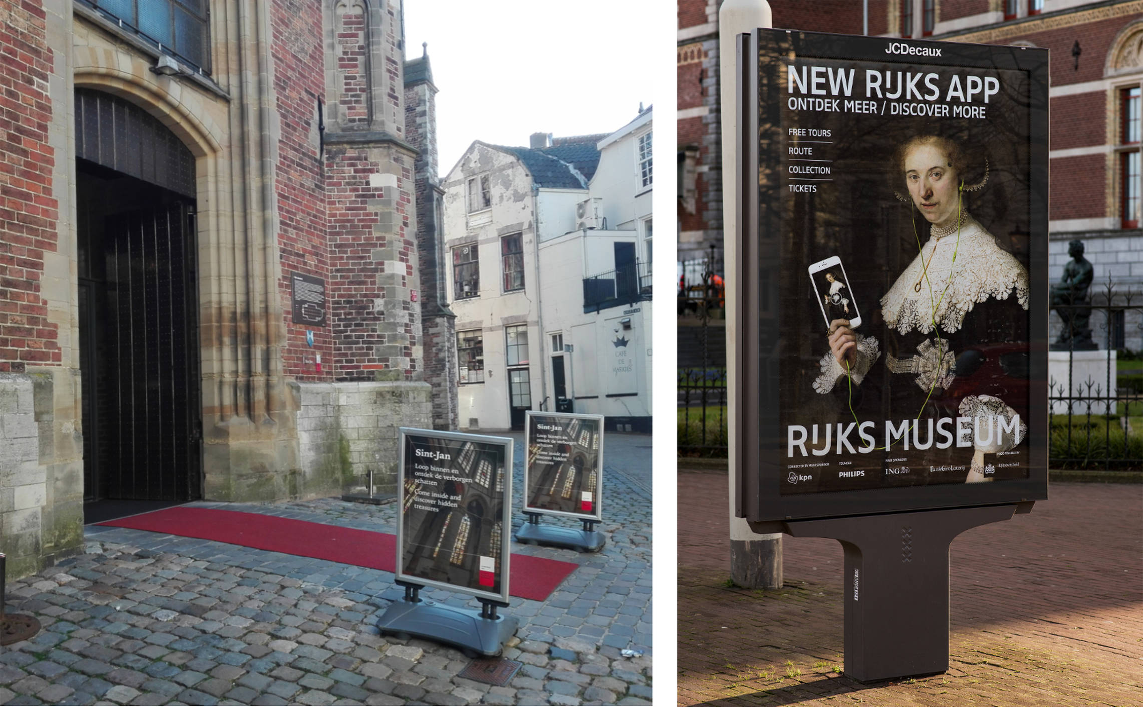
Visit the location where your service will be used and observe how you could use the surroundings to your advantage. Where is the first touchpoint between the user and the app? What's the visitor’s route through the building? Investigate possible touchpoints between the user and your product - take a good look at the entrance hall, the ticket and multimedia counter and the architecture of the building, to discover possibilities for advertising, personal guidance, test facilities. Even better: visit the location at the beginning of the project and integrate these steps into the product's customer journey.
Another smart way (but not free) is to offer the app on a rental device at the multimedia counter. Especially in museums with foreign visitors, a lot of obstacles can keep people from using your service. Tourists are afraid to waste their data plan on downloading the app, afraid to run out of battery or simply don’t speak sufficient English. A rental service with devices that offer the app in multiple languages can be a profitable service for a museum. It is certainly a bigger investment, but a few onboarding challenges can be solved by the employees behind the desk. They can introduce the visitor to the app, answer questions and find bugs. Therefore, they are also a good resource of user insights for future projects.
3. Time it!
The moment to offline-onboard can also be timed – just like a supermarket arranges 'nagging products' next to the kassier - because they know you will stand and wait. Now that you’ve investigated the different steps a visitor takes within your location, figure out when would be the best moment to present the app in the user journey. Observe where visitors have the time to check out your app. Where are they standing in line for a ticket? Where do they take a break and when are they having a coffee? For example, use the relaxed visit in a cafe, the row in front of the ticket office or even print something on the ticket for the wardrobe. As long as people are waiting...
4. Manage your user’s expectations - emphasise when they should download your app (and when not)
Users tend to compare unknown things to something they already know. It’s called 'the assimilation paradox' (2nd out of the '5 paradox of the active user' I referred earlier to). It’s works the same if you taste something unknown and you’re thinking “kinda tastes like….”. Bringing this back to museum apps, a lot of museums apps offer the same functions like a highlight tour or a map. So when visiting a new museum visitors are so used to these functions, that they often expect them to be fulfilled. There will always be a visitor group that your service serves better. Unfortunately, the other 'disappointed' group will more often leave reviews than the happy customers.“A good review is no review” as one of our developers jokes around.
Thus, if you want to design something that is a step ahead of the known features and patterns (an overview map, a highlight tour or a tab menu in case of museum apps), try to handle these deviant expectations in the offline-onboarding. Try to help the user to decide, whether this app will service his/her needs or not. For a museum visitor, getting to know about the app should be like choosing a restaurant - you first take a look at the menu and then you enter.
5. Let visitors 'Try before they buy/download'
More fun than explaining stuff is letting people find out for themselves. Think about how to actively involve your user in the onboarding. Let’s say your service offers a new, unknown feature that the user needs to understand in order to be able to use it. By emphasizing the onboarding and making it a fun activity, you can guide the user through the first time use and answer questions at the same time. This way he/she will get to know the app properly and mistakes are avoided.
6. Include the whole organisation in the handover
Make sure the rest of the company knows about the project and the benefits for the organisation. Don’t leave it up to the product owner to take care of the handover of the project within the organisation. This is a step that can be crucial for the success of your app. Especially the word-of-mouth part amongst employees is often underestimated. When employees become excited about the service, chances for follow-up projects grow. If everyone is informed, you can avoid visitors asking employees about the app and getting “Oh, I did not know we had such a service” as an answer. Which brings us to the next step:
7. Train the trainers
Not all touch points are designed; don’t forget to make us of the human touchpoints. Especially employees on-site, such as security guards, cashiers, and cafe employees can facilitate between the user and the digital service. Make sure these people are able to help a lost visitor and answer his/her questions. This way, you can take away obstacles and guide the experience to minimise confusion and disappointment.
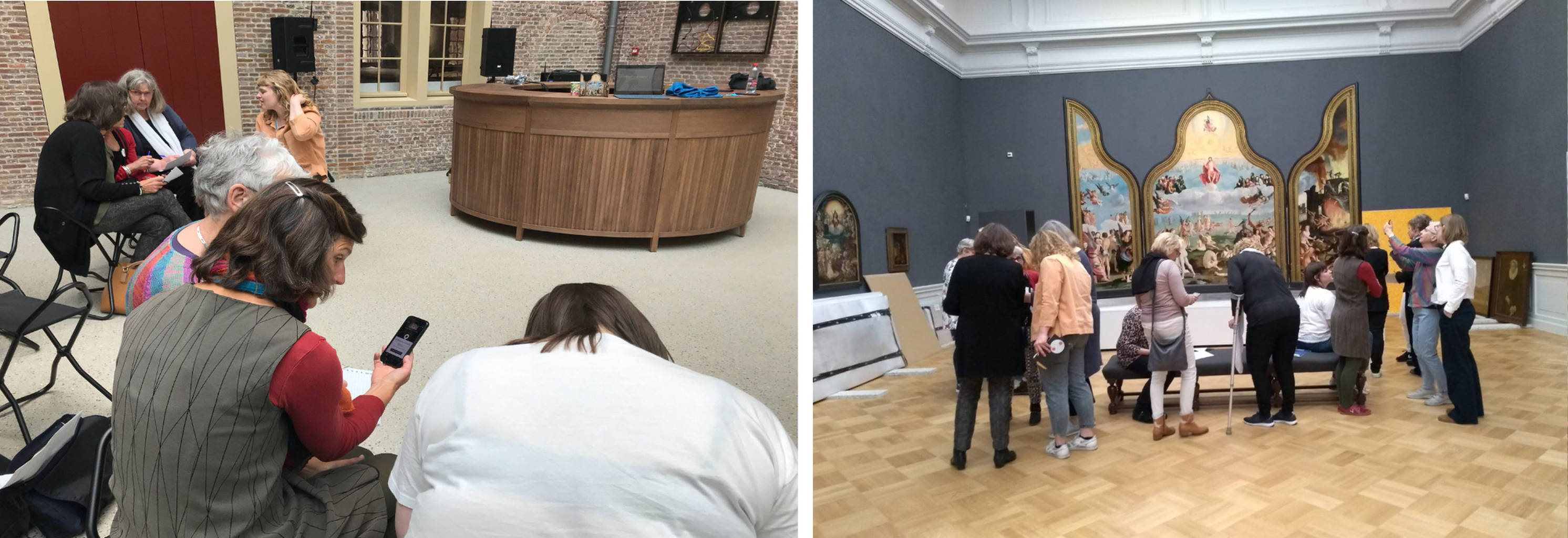
One way to do this is a workshop at the end of a project. Reserve some budget and invite the volunteers and employees within the organisation. Walk them through the functions of the app and explain your reasons. Maybe even create a presentation / explanation sheet for all future employees. The advantage of this moment is that employees will fully understand the service and the intentions behind it and excited employees could become ambassadors of the product.
The workshop at the museum really helped our volunteers to understand the hows and whys of the app. And also a good last user test before we released the app.
8. And last but not least: Keep promoting the app - even after the launch
Besides the option to buy a ticket online, you would be surprised how often people still don’t expect any digital service when going somewhere. Certainly most of the bucket-list tourists in the Rijksmuseum don’t. They are too busy preparing for the trip to focus on one app for one single stop.
Therefore, make people aware in real life that your service exists. Make it a fixed part of the museum visit. The biggest hype, advertisements and online campaigns are created for the first weeks after the product is launched. Then the advertising and internal attention vanishes because "people use it so they know it’s there", "the counter should look clean", "people can ask for it", "this is old news", "we released that … months ago”. But how is a first-time visitor supposed to know that there is a service if it isn’t mentioned anywhere? Did you pay so much money for a service just for it to gather dust in the app store and only be used by people who search for it?
If offline-onboarding is included in the project proposal, there is also time and budget to think of a nice, elegant and integrated way to catch your visitors' attention.
Conclusion
For future projects: make it a habit to think about the offline-onboarding and integrate it in the project process (*Hello service design...) to get a more complete and better result. And to minimise user tantrums in the app store review area. For previous and running projects: it’s never too late to optimise the offline-onboarding. Use an empty moment in your schedule to revisit the location and see how your service is being used. Wander around like a novice user, watch the public use your app, talk to employees, read online reviews to be able to draw further conclusions for improvement. It’s never too late to start thinking about offline-onboarding!